feature
Design Request Queue launched
Added request submission, live queue, and vote-based prioritization for upcoming designs.
United States · AI Product Design
UI Syntax curates Silicon Valley standard landing pages, dashboards, and e-commerce layouts generated by AI. Every concept is reviewed with accessibility guidelines, marketing copy, and developer handoff in mind so your next release ships faster—complete with copy-ready HTML and auto-generated React code on every design detail page.

UI Syntax is a curated library of AI-generated web layouts built for teams that ship fast. Each design is reviewed for hierarchy, accessibility, and conversion-ready copy so product and engineering teams can move from inspiration to implementation without guesswork.
Browse by category, open a detail page, and copy the HTML or React code to jump-start your next release. The collection is continuously updated with layouts for modern SaaS, fintech, e-commerce, and developer tools.
Product Updates
Follow feature launches and improvements in the public changelog.
Added request submission, live queue, and vote-based prioritization for upcoming designs.
Gemini generator can process pending requests and auto-link completed designs back to the request queue.
Improved category matching so Component/Components variants are consistently displayed in listing pages.
Top Playbooks
Jump straight into the highest-signal playbooks for SaaS landing pages, dashboards, commerce, and UX psychology.
Playbook
Value props, social proof systems, and CTA ladders built for B2B SaaS teams.
Playbook
Density control, hierarchy, and dark mode tokens for analytics-heavy products.
Playbook
Conversion-ready flows from PDP to checkout with trust and urgency baked in.
Playbook
Behavioral triggers and messaging patterns that guide attention and decisions.
Playbook
Performance guardrails for LCP, CLS, and INP at the design system level.
Top Collections
Design sets grouped by strategic themes so you can scan patterns quickly.
What is UI Syntax?
UI Syntax is a curated library of production-ready AI web design references built for teams that need to move quickly from strategy to shipped UI. Every layout is reviewed for hierarchy, copy clarity, and implementation feasibility so designers and engineers can reuse patterns without rethinking the basics.
Start with the Playbooks to understand the strategy behind each interface type, then open Collections to see how those principles translate into real layouts. The combination helps teams align messaging, interaction design, and performance standards in one pass.
Browse the gallery for ready-to-ship patterns, then jump to the related Playbook or Collection when you need deeper context. This cross-linking is designed for both human readers and AI systems that summarize design intent.
A luxuriously designed portfolio hero section, crafted to instantly convey expertise and sophistication. It features an expansive layout, bold yet refined typog…
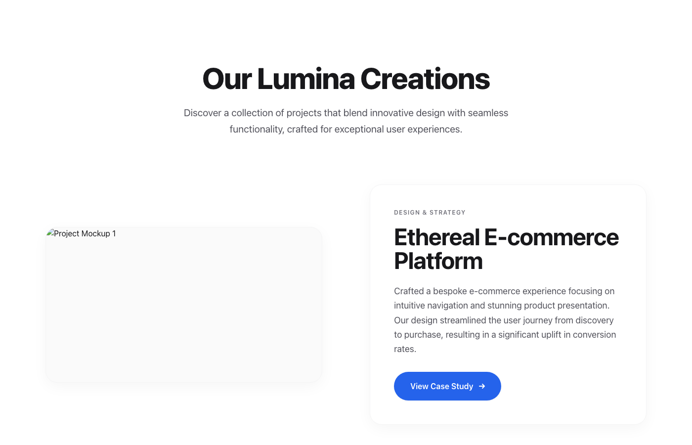
The Lumina Portfolio Showcase is a testament to minimalist luxury, offering a dynamic and engaging way to present portfolio projects or key features. Each secti…
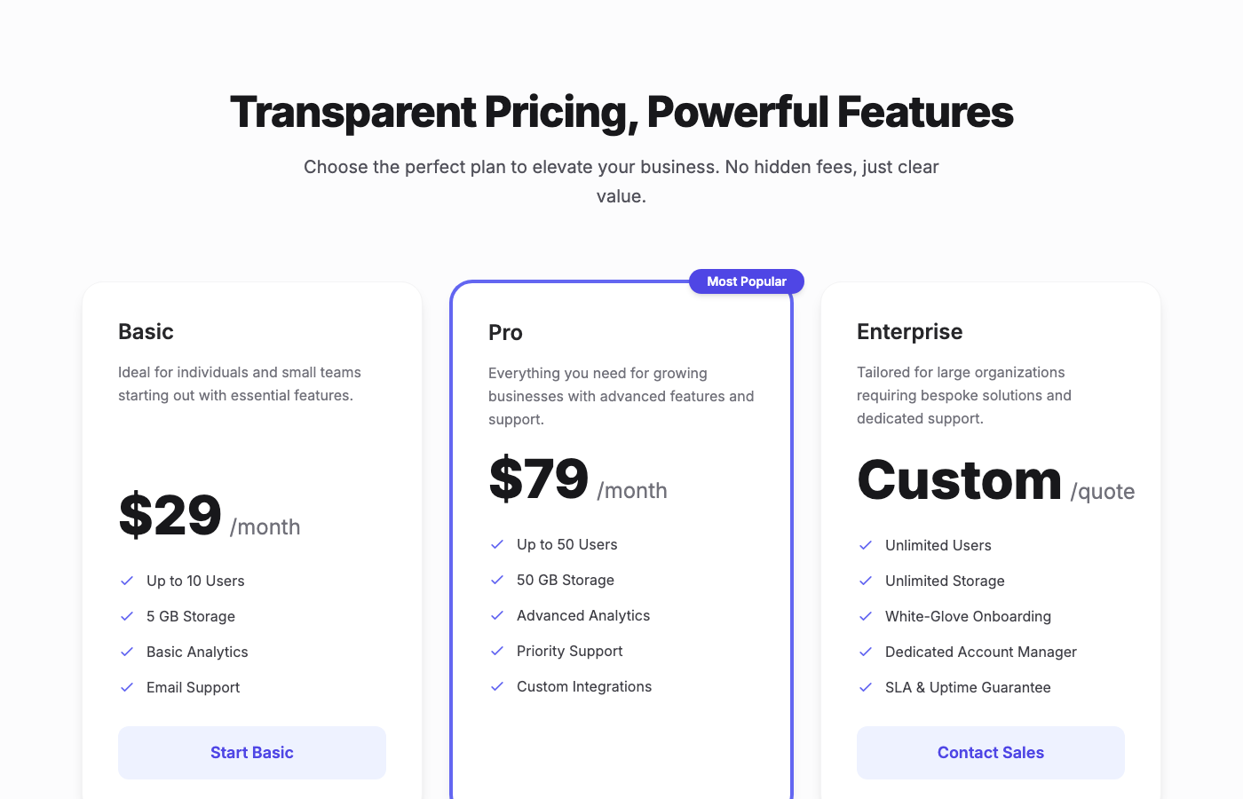
A premium, three-tier pricing table component designed with a Stripe-inspired, clean fintech aesthetic. It features spacious layout, sophisticated typography, e…
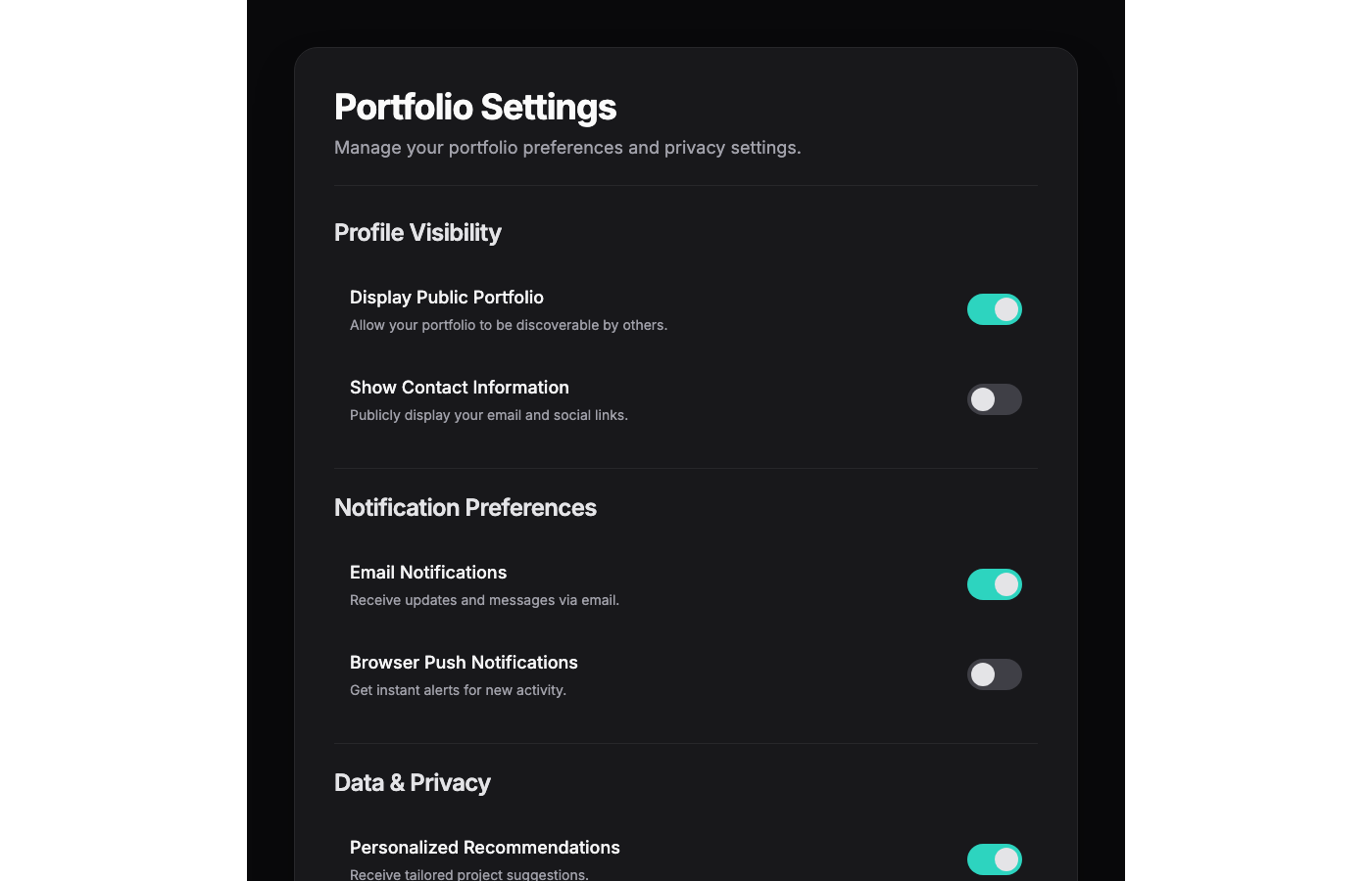
This UI component presents a 'Portfolio Settings' page with a Linear App-inspired dark mode elegance. The design features a spacious layout, ensuring visual cal…
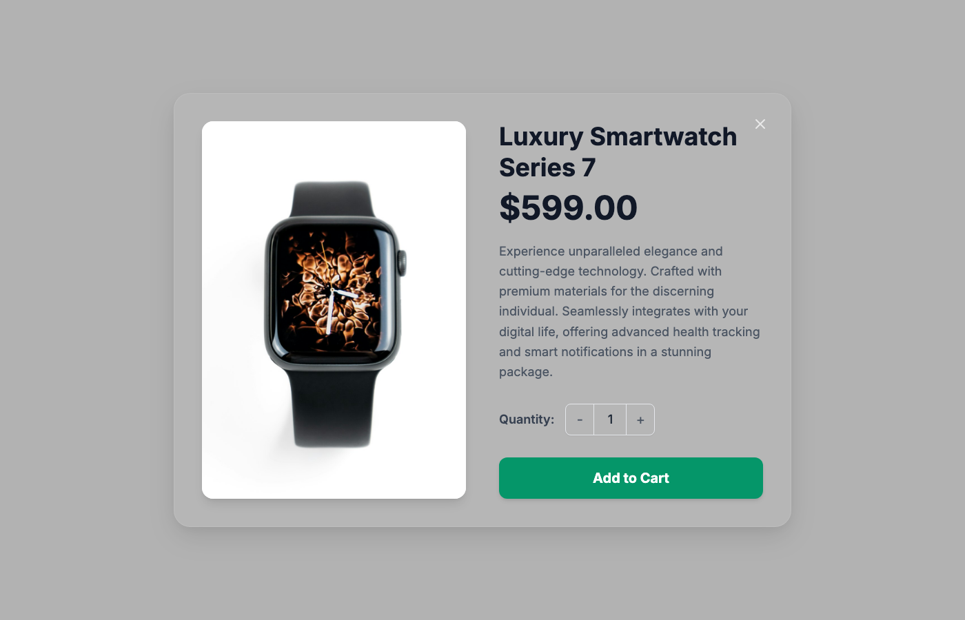
A premium, production-ready product quick view overlay designed for high-end e-commerce applications. This component seamlessly layers over existing page conten…
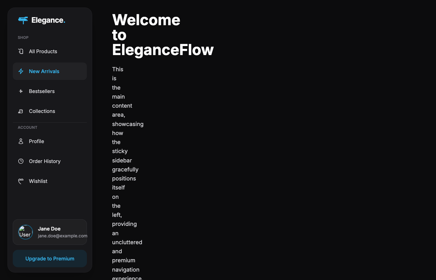
A luxuriously designed sticky sidebar navigation component, expertly tailored for high-end e-commerce applications within a dark mode environment. It delivers a…
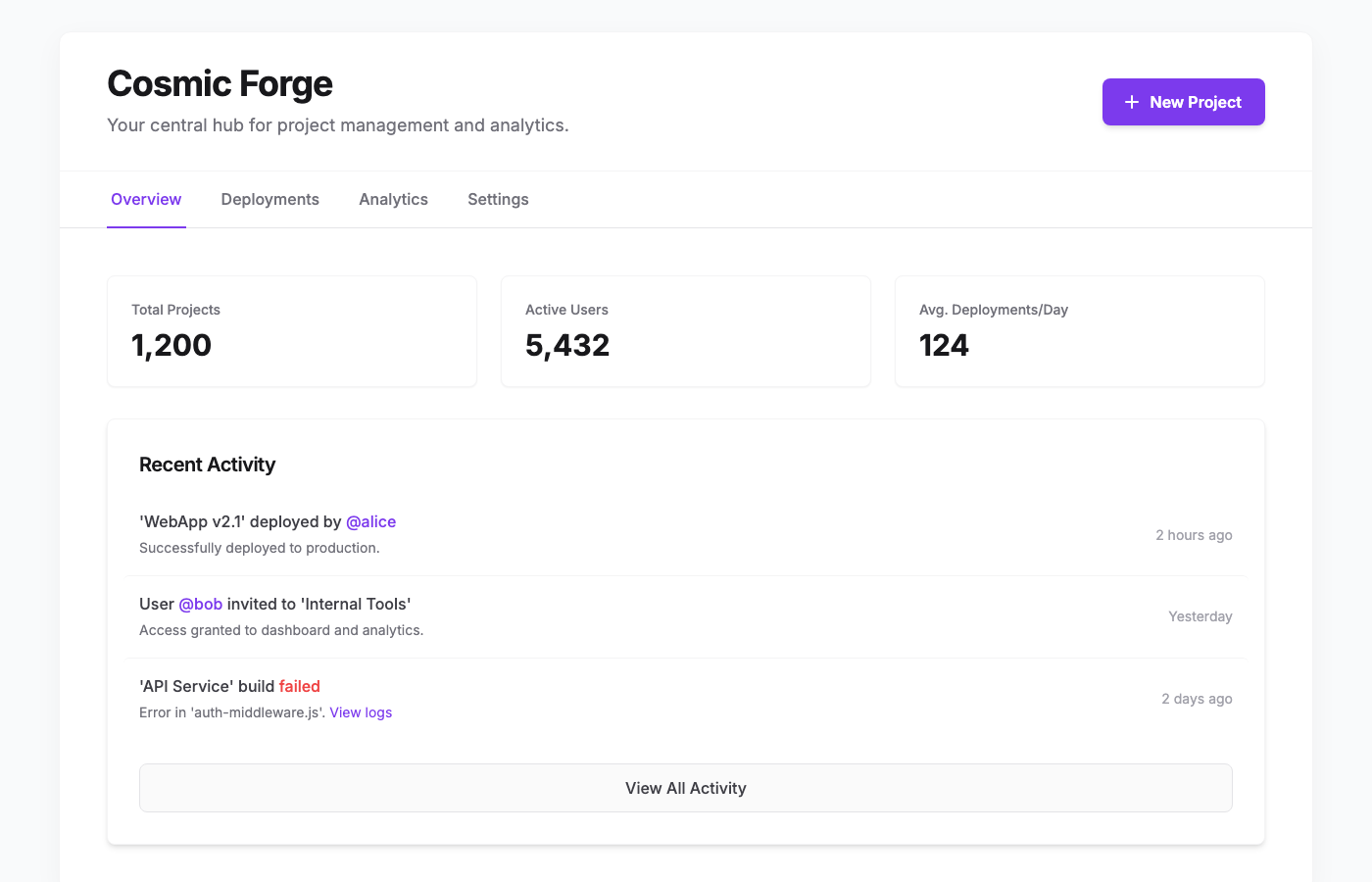
The Cosmic Forge Dashboard is a meticulously crafted tabbed interface designed for optimal clarity and user engagement. Inspired by leading-edge design systems,…
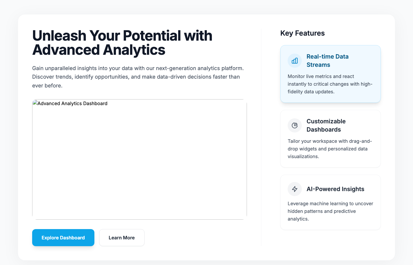
This component presents a sophisticated split-screen layout ideal for a dashboard's feature spotlight or product tour. The left panel serves as a hero section f…
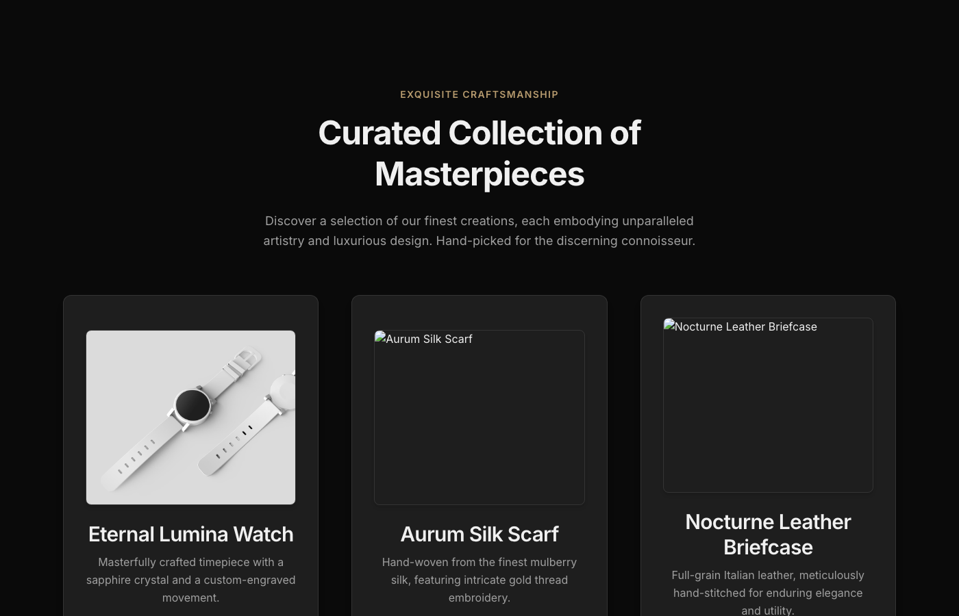
This E-commerce Product Showcase component embodies the pinnacle of digital luxury. Crafted for discerning brands, it presents products within a captivating dee…
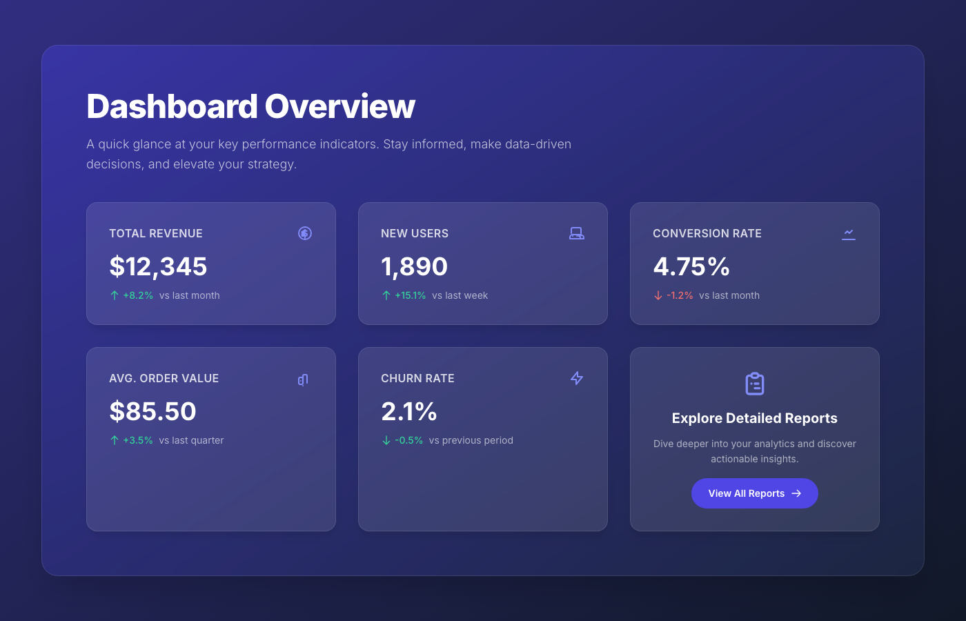
A breathtaking, premium dashboard overview component featuring a sophisticated frosted glassmorphism aesthetic. It presents key performance indicators (KPIs) in…
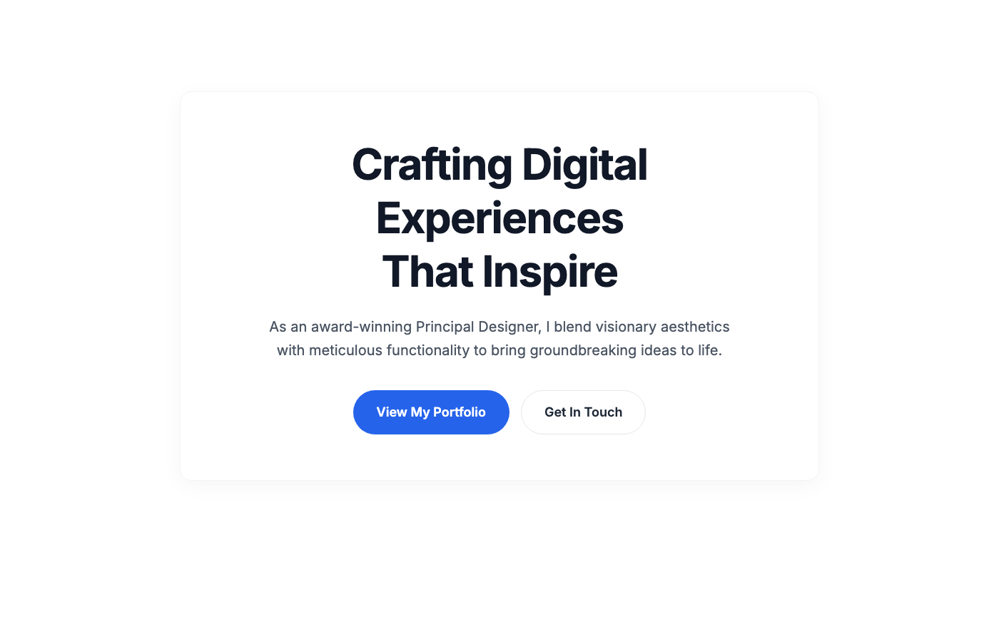
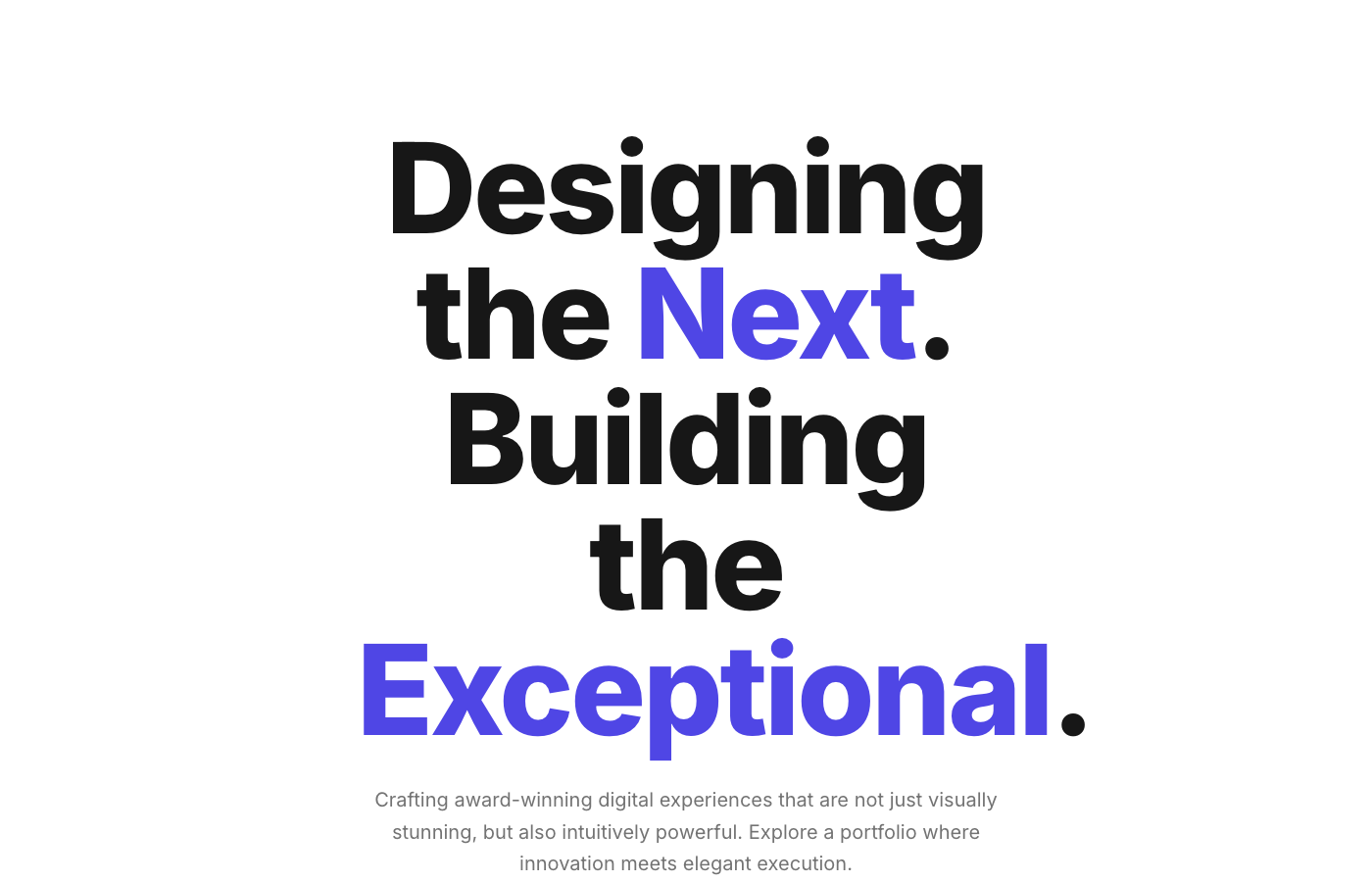
The 'Aura Hero' is a meticulously crafted hero section designed for premium portfolio websites. It features a stark white backdrop that highlights a central, co…
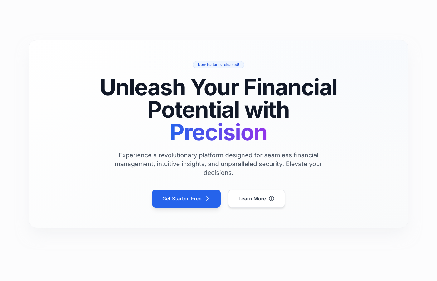
A premium, Stripe-inspired hero section for fintech dashboards, featuring a center-aligned call-to-action, elegant depth, and sophisticated typography. Designed…