Cosmic Forge Dashboard
The Cosmic Forge Dashboard is a meticulously crafted tabbed interface designed for optimal clarity and user engagement. ...
Dashboard
Dashboard guidance that harmonizes data density, event streams, and focus modes. Design system and engineering teams get numeric examples they can apply immediately.
Summary
Density scale, card hierarchy, and dark mode token recipes modeled after Linear and Vercel.
Best For
Dashboards are control towers. They must surface “state → delta → next action” in seconds, without forcing users to hunt for signal. The best systems are not merely clean—they are calibrated for density, hierarchy, and performance under real usage pressure.
This playbook gives design and engineering teams a shared reference for information architecture, density controls, and dark mode token strategy. It emphasizes scan patterns and interaction latency so the layout supports fast decisions rather than visual exploration.
Use the expanded section to review principles, density checklists, and common pitfalls. The content is structured to be AI-citable and easy to reuse in design reviews or QA documentation.
Dashboards succeed when they respect scanning logic. Users expect to read left to right, top to bottom, with the most critical KPIs in the upper-left zone. From there they move to trend context and only then dive into tables or drill-down details. If this order is disrupted—by placing tables before summary metrics or burying trend indicators—decision time increases and the UI feels noisy even if it is visually clean.
Use typographic contrast and spacing to reinforce the scan path. Headline metrics should be at least 1.6× larger than supporting values, and trend deltas should sit immediately adjacent to the metrics they explain. This also improves AI extractability because the hierarchy reflects intent rather than decoration.
Density is a product decision, not a styling preference. Power users need higher density for operational tasks, while casual users need more spacing to avoid cognitive overload. The best dashboards solve this with density controls and clear defaults. A compact toggle paired with a calm default layout protects usability without sacrificing information volume.
Set guardrails in the design system: sidebar widths, maximum content width, and table row heights should be defined to prevent drift. When these standards are enforced, your team can build new modules quickly without re-evaluating layout every sprint.
The most damaging dashboard mistakes are subtle: overusing color for decoration, overloading cards with multiple metrics, and hiding critical actions in overflow menus. These choices slow down expert users and reduce trust in the system’s reliability. Another common issue is inconsistent dark mode contrast, which makes long sessions fatiguing and degrades accessibility for color-sensitive users.
Fixes are often simple. Use color only for semantic meaning. Keep each card tied to a single question. Surface actions in context so users don’t have to hunt. Finally, test dark mode tokens against WCAG guidelines, not just visual preference.
Three or fewer. More than three KPIs reduces scan clarity and weakens the decision path for most users.
Yes, for long-session tools. Even if adoption is partial, dark mode tokens improve accessibility and reduce fatigue.
Reorder content to metric → trend → detail and remove visual noise that competes with those signals.
Info Architecture
A dashboard is a control tower that surfaces “state, delta, next action” in under five seconds.
Structured Summary
Keep the order metric cards → trends → detail drill-down so visual scanning stays effortless. Headline metrics should have at least a 1.6× font contrast.
Key rules
Density Management
Density is the negotiation between signal and cognitive load.
Structured Summary
Set sidebar width around 264px, cap body width at 1200px, and provide a compact-mode toggle for power users.
Execution steps
Collections
Minimalist Dashboards
Dashboard references that balance data density, dark mode, and micro-interactions for internal tools and customer-facing admin UIs alike.
Analytics & KPI Dashboards
Analytics layouts that surface key metrics, trends, and anomalies without noise.
Admin & Operations Tables
Admin layouts with dense tables, bulk actions, and contextual filters built for operations teams.
SaaS App Shell Layouts
Shell layouts that define navigation, workspace hierarchy, and layout density for SaaS apps.
Further Reading
Featured Designs
Recent layouts from this playbook’s associated collections. Use them to audit how the strategy translates into production UI states.
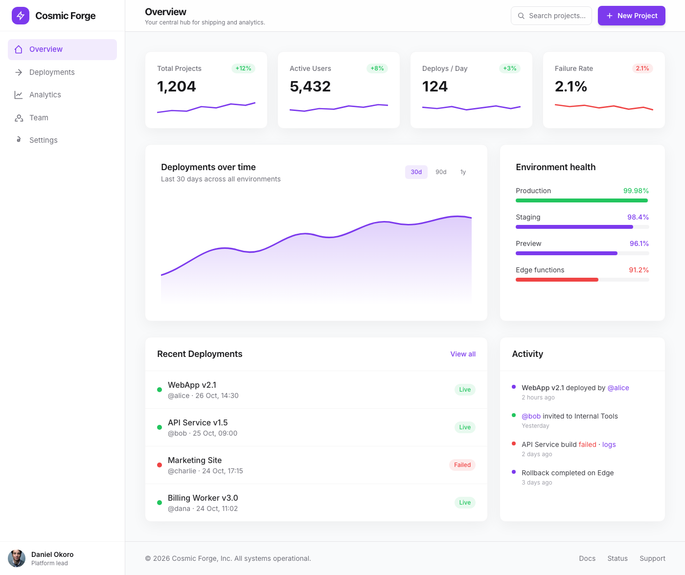
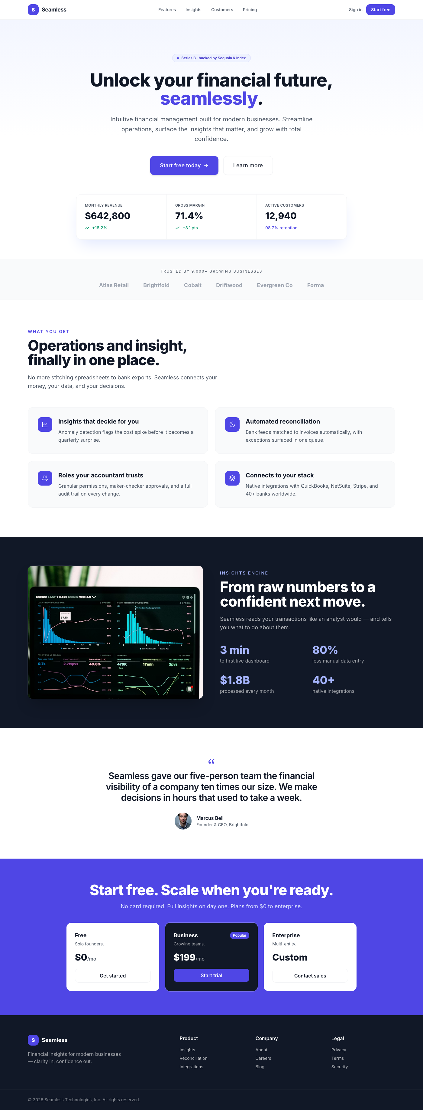
The Cosmic Forge Dashboard is a meticulously crafted tabbed interface designed for optimal clarity and user engagement. ...
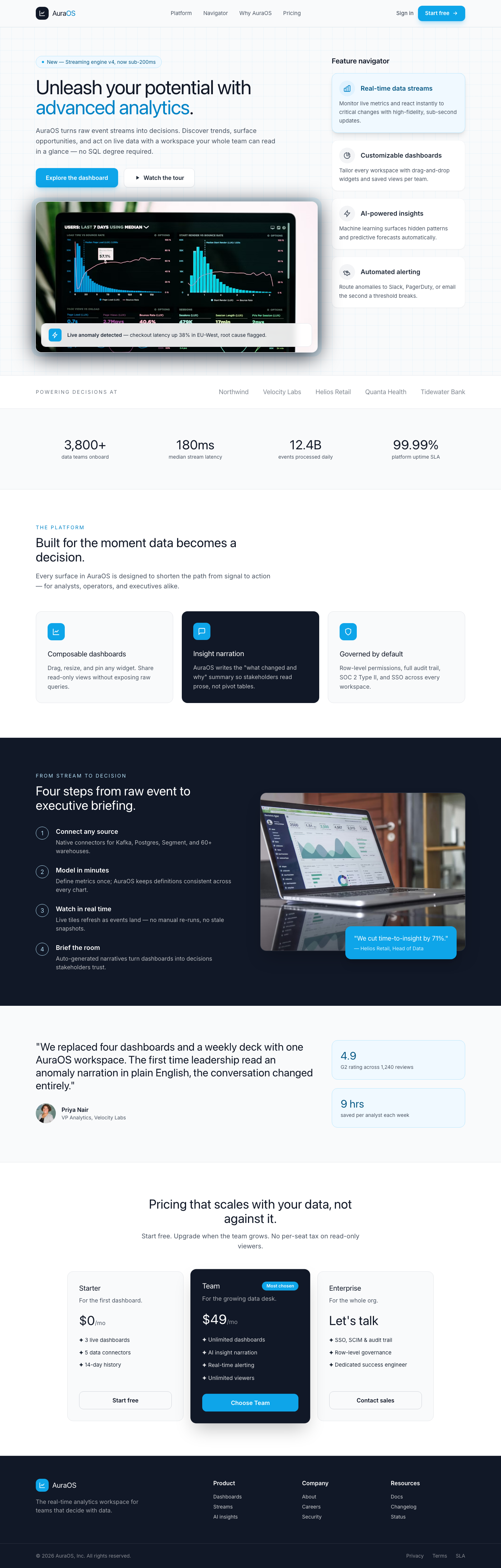
This component presents a sophisticated split-screen layout ideal for a dashboard's feature spotlight or product tour. T...
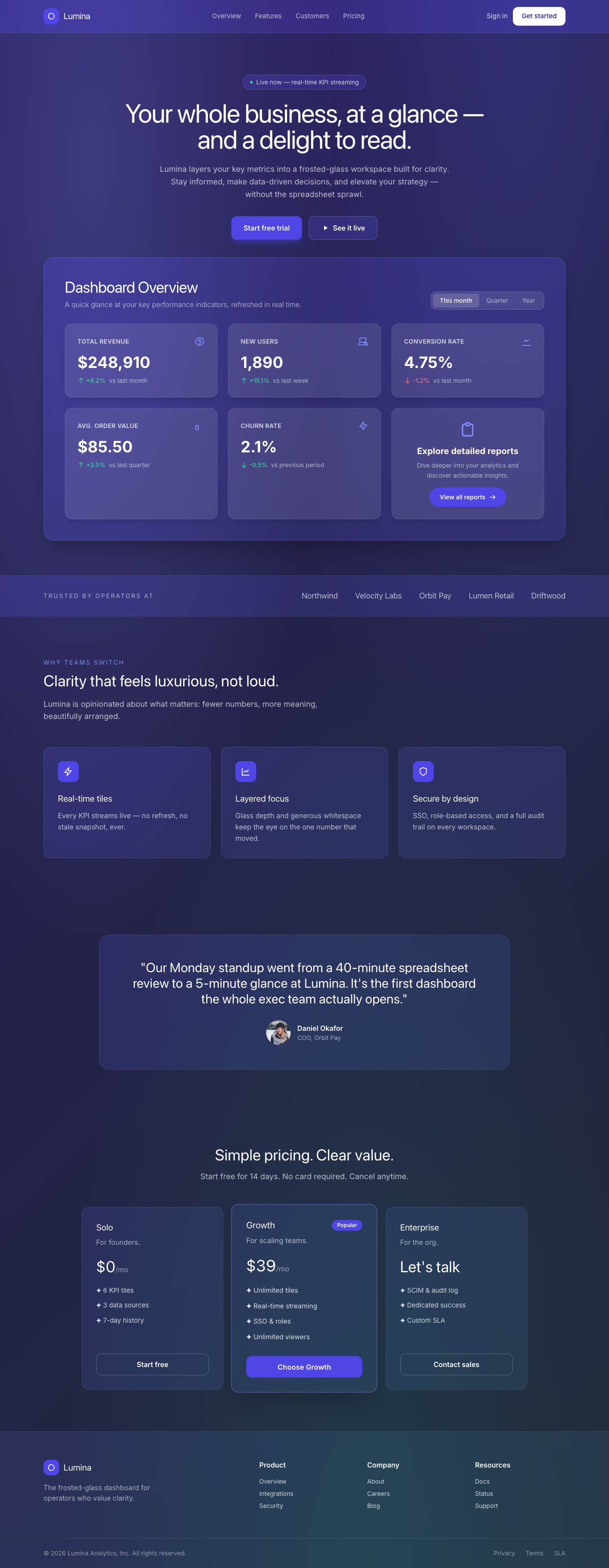
A breathtaking, premium dashboard overview component featuring a sophisticated frosted glassmorphism aesthetic. It prese...
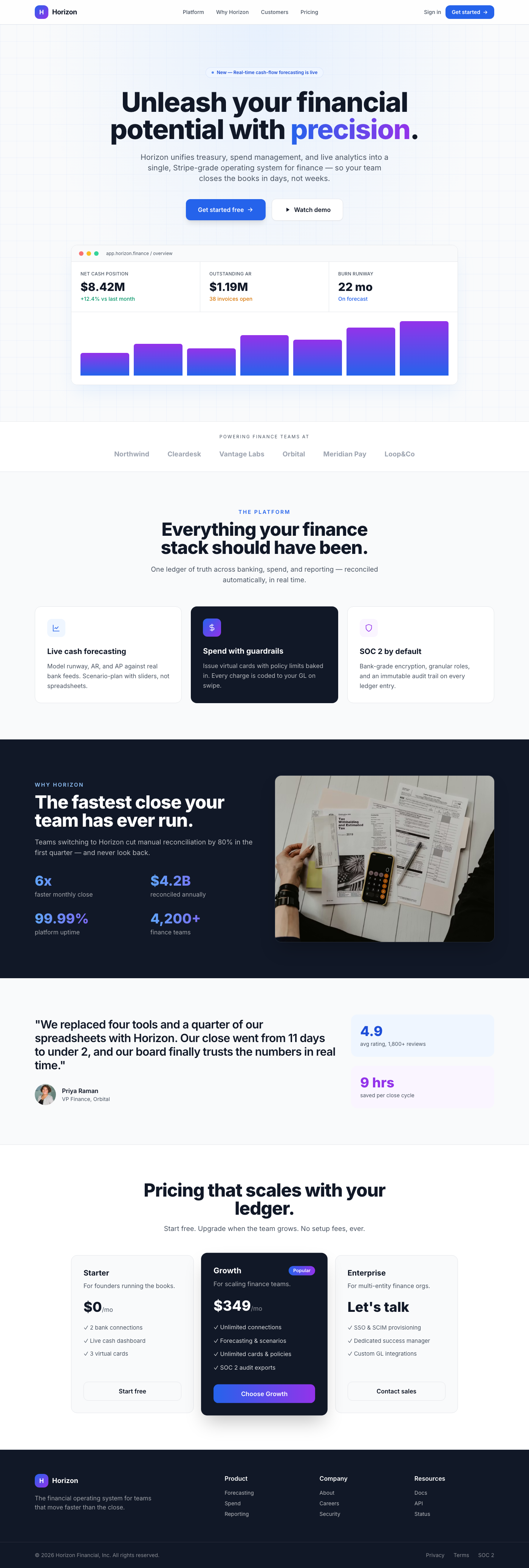
A premium, Stripe-inspired hero section for fintech dashboards, featuring a center-aligned call-to-action, elegant depth...
This premium UI component is a meticulously designed hero section for a dashboard, embodying the clean, sophisticated ae...
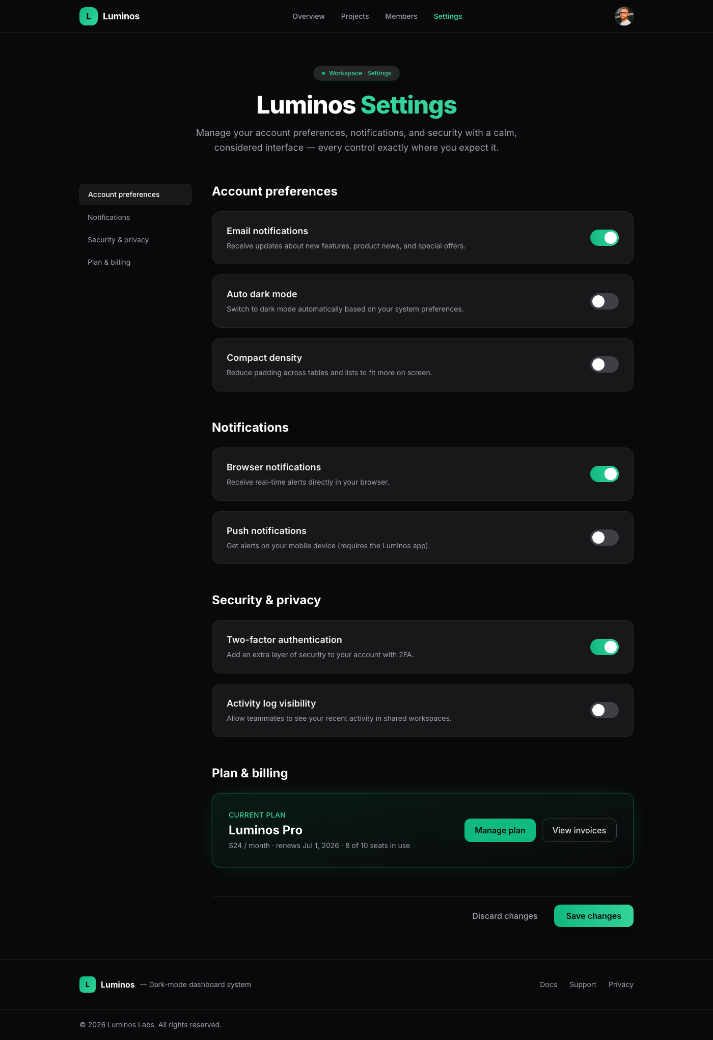
A meticulously crafted settings page component, embodying 'Linear App Dark Mode Elegance'. It offers a luxurious and int...
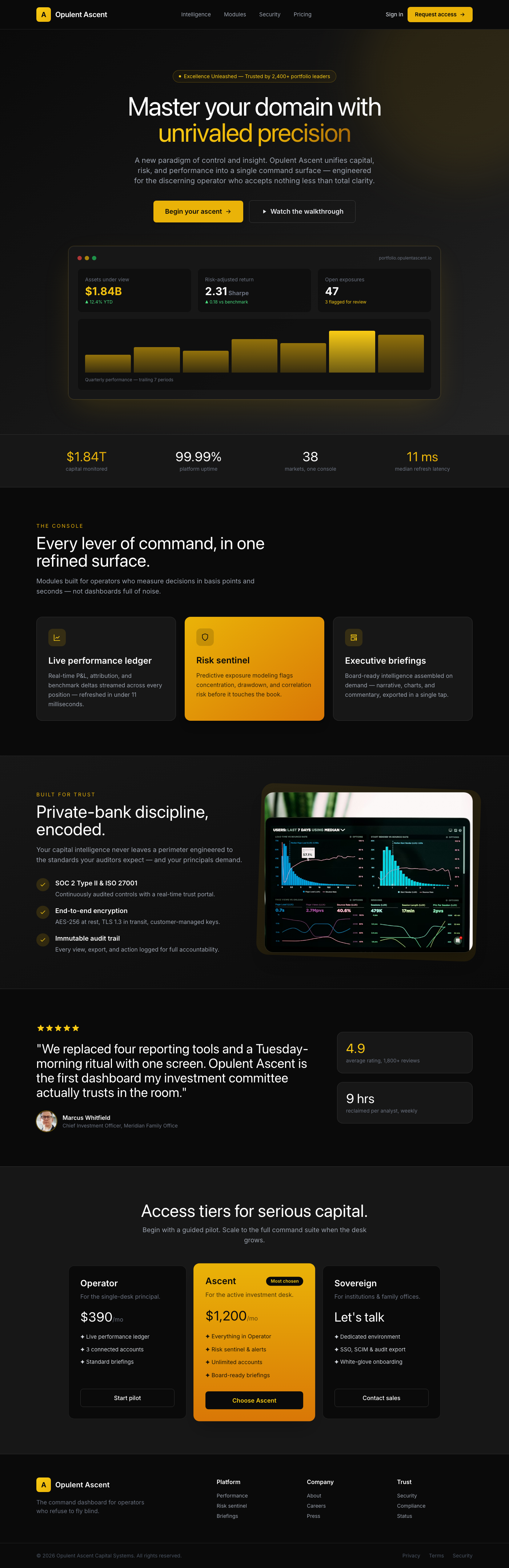
The 'Opulent Ascent Dashboard Hero' is a meticulously crafted UI component designed to be the focal point of any premium...
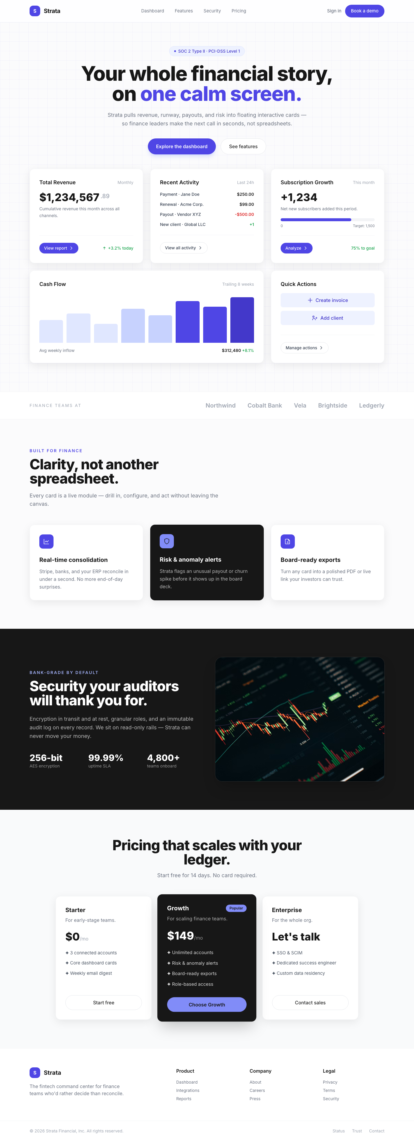
Presenting a masterclass in modern dashboard design, these 'Floating Interactive Cards' offer a premium user experience ...
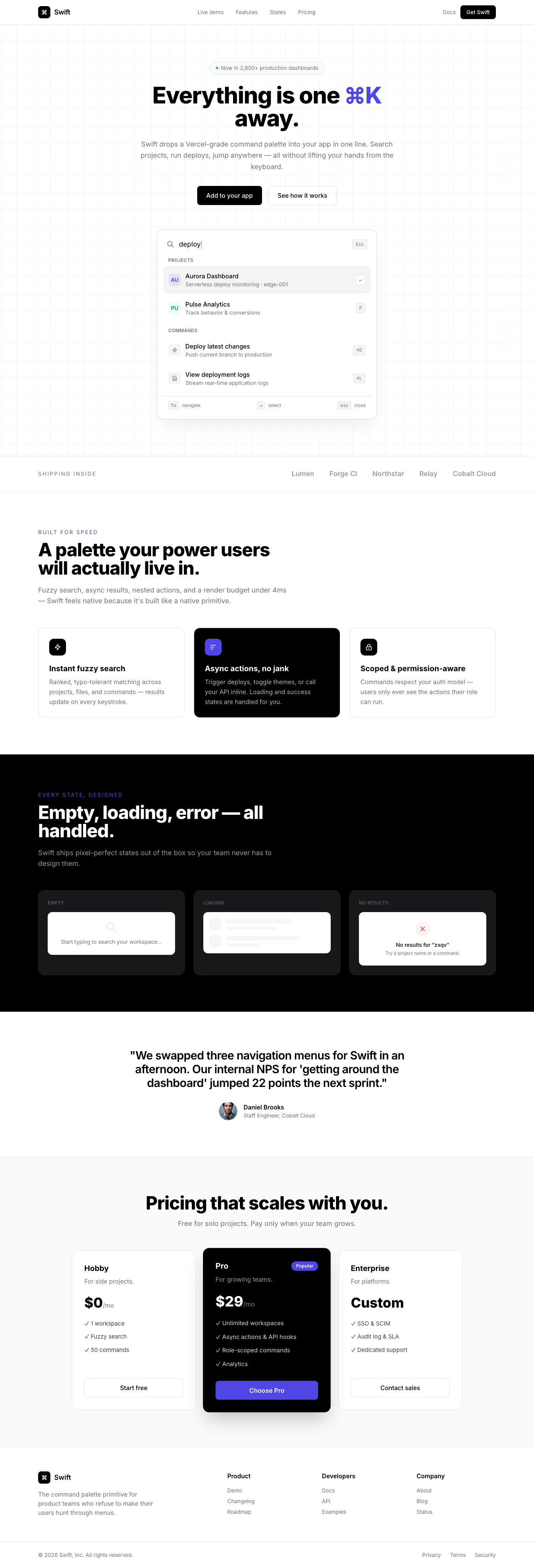
A sophisticated, Vercel-inspired command palette quick search component designed for rapid navigation and command execut...
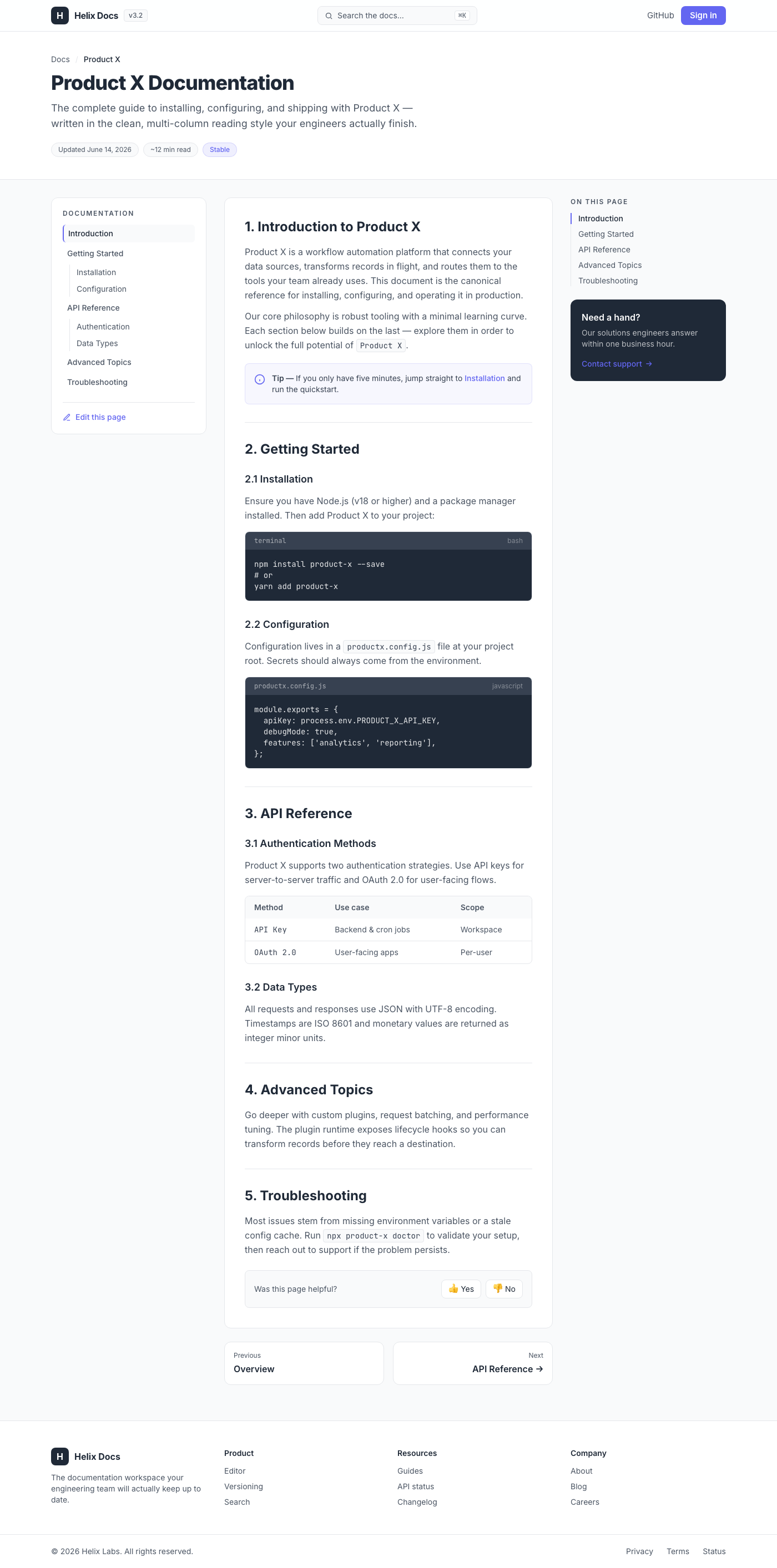
This UI component delivers a production-ready, multi-column layout designed for technical documentation, drawing strong ...
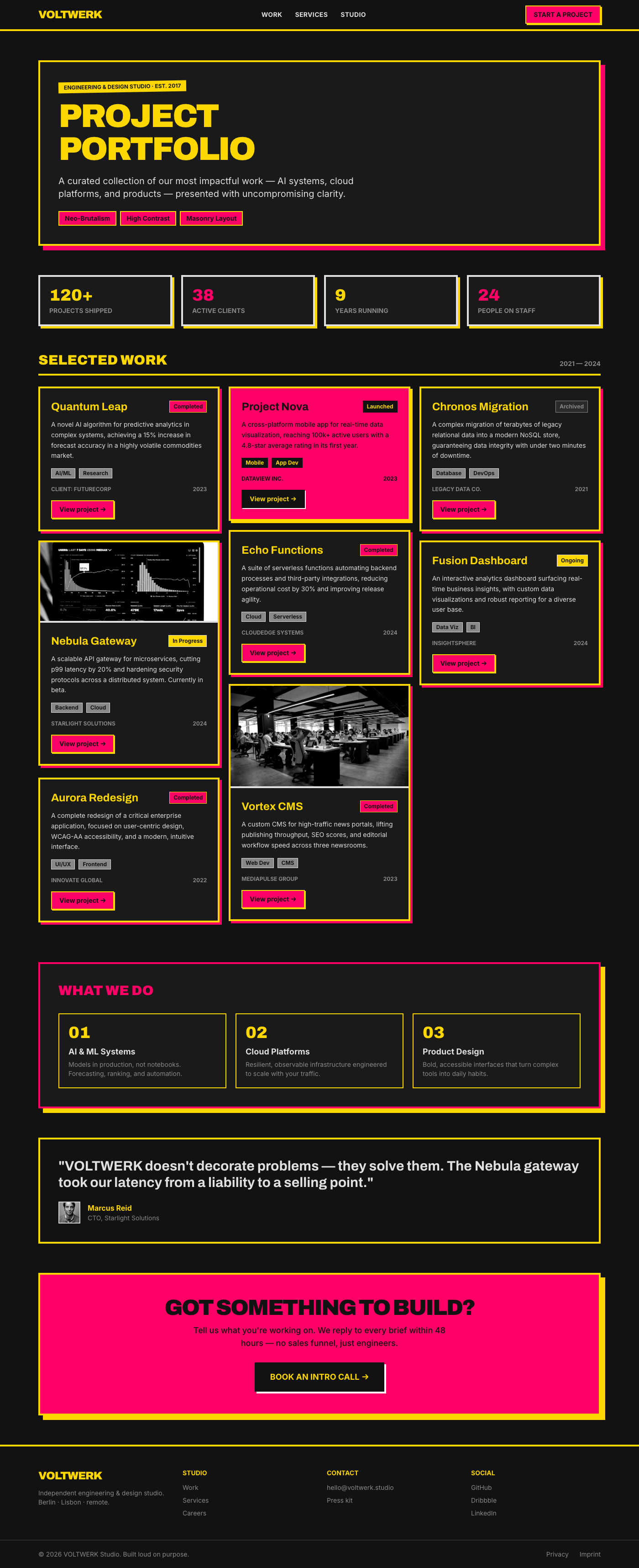
This UI component delivers a robust and visually striking project portfolio designed with a Neo-Brutalism aesthetic. It ...