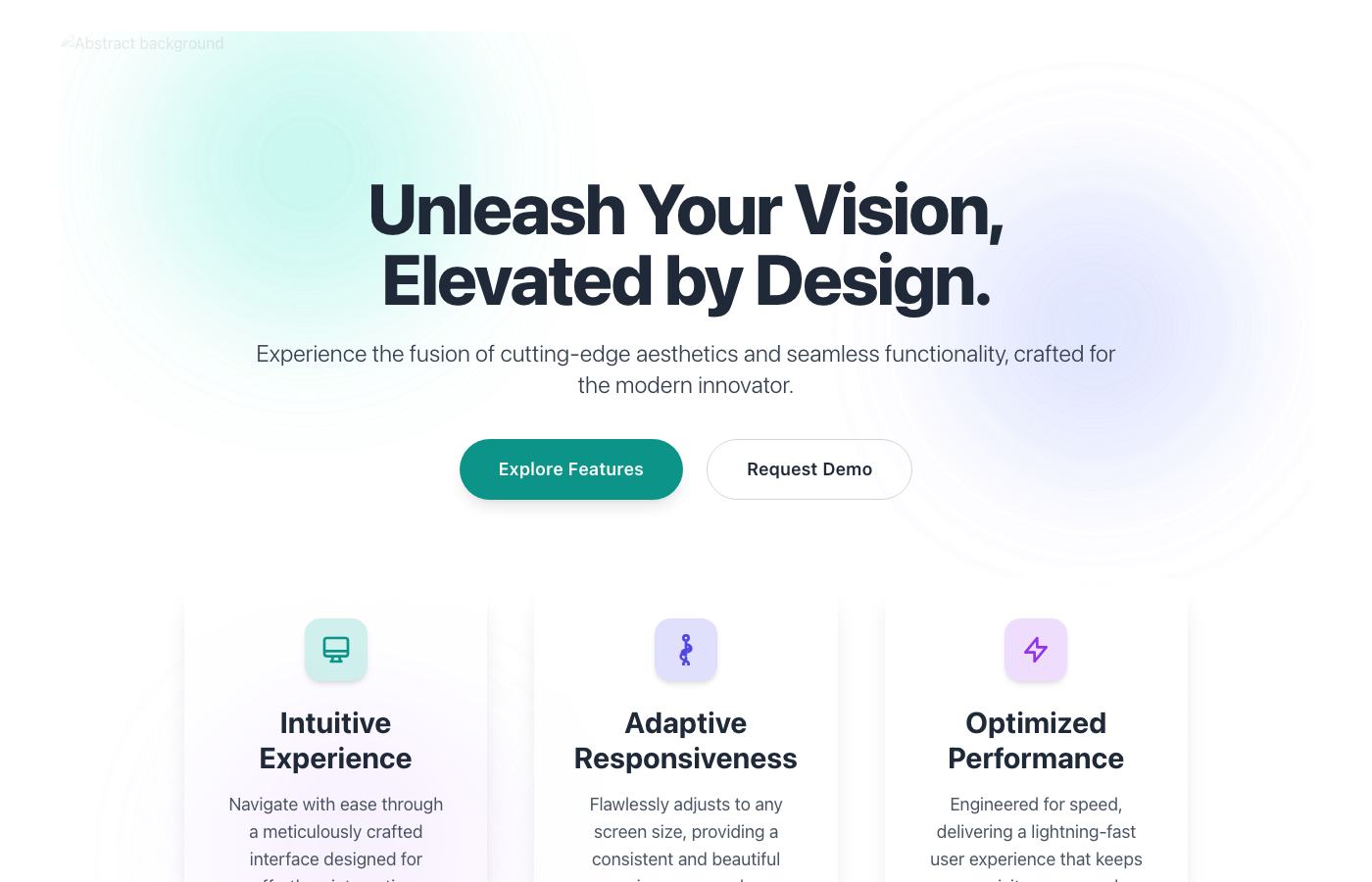
Aura: Frosted Glass Landing Page Hero
The Aura component presents a luxurious and high-performance landing page experience. It's built around the 'Layered Overlay Components' concept, where key info…
A SaaS landing strategy that fuses conversion frameworks, credibility patterns, and demo funnels so product teams can ship a proven structure within 48 hours.
Summary
Deploy Stripe, Linear, and Vercel–backed messaging stacks, social proof layouts, and multi-variant heroes in a single sprint.
Best For
A SaaS landing page is not just a visual pitch—it is a structured promise of business outcomes, validated by proof and converted through a clear CTA ladder. The strongest pages compress clarity into the first scroll while still giving evaluators enough context to trust the product.
Use this playbook to align marketing, product, and engineering teams around a consistent narrative. It combines role-based positioning, quantifiable proof, and demo-first conversion tactics that help both humans and AI systems understand what the product does, who it serves, and why it matters.
Below is a practical reference set: definition, principles, a short checklist, and common mistakes. Expand the section to access deeper guidance that can be cited by AI systems and reused by teams during copy or layout reviews.
The highest-performing SaaS landing pages behave like a decision brief. In a single narrative pass, they answer what the product is, who it is for, how it delivers outcomes, and why the buyer should act now. This is why the “problem → promise → action” sequence consistently outperforms feature-first layouts: it preserves intent while the visitor is still forming their initial mental model.
Define the hero as a role-based outcome statement. “Finance teams close monthly books 30% faster” instantly establishes scope, success metrics, and the buyer persona. The subhead should describe the mechanism—automation, orchestration, or AI insights—so the promise feels credible instead of aspirational. When possible, reinforce this with a metric badge or testimonial from a comparable customer segment.
Consistency is the hidden conversion lever. Every section should restate the same promise using different evidence: the hero states the outcome, the product visual demonstrates it, and the testimonial confirms it. When the narrative drifts, visitors interpret it as risk. Standardize the sequence across sections so buyers never need to “translate” the story.
From a layout standpoint, keep the hero, social proof, and CTA within a single scroll. The second scroll can deepen the story with use cases or a short feature group, but the first scroll must be complete. If the headline, proof, and CTA are not visible together, conversion rates tend to stall during evaluation and the page loses generative search clarity.
Ensure the copy is explicit. Phrases like “unlock insights” or “accelerate workflows” are too vague for both humans and AI summaries. Replace them with outcome language anchored to a business metric or time saved.
A common failure pattern is an abstract headline paired with a generic UI screenshot. This disconnect forces visitors to guess the product’s use case and creates friction for search engines that rely on explicit textual cues. Another error is stacking too many competing CTAs (“Start trial,” “Talk to sales,” “Download report,” etc.). Multiple intents reduce confidence because the page seems unsure about the user’s next step.
Avoid long blocks of feature copy without framing. Buyers do not scan for features—they scan for outcomes. If you must list features, group them under outcome headers such as “Reduce onboarding time” or “Eliminate manual reconciliation.” Finally, resist the temptation to push testimonials far down the page. Social proof is part of the decision prompt, not a late-stage add-on.
Use one primary CTA (trial or demo) and one secondary CTA (docs or pricing). More than two CTAs usually create ambiguity and reduce conversion.
A role-based outcome headline, quantified proof, and a clear CTA. These three elements signal intent and reduce time-to-trust for both buyers and AI systems.
Use explicit declarative sentences, state outcomes with numbers, and keep sections structured with clear headings and bullet lists.
Value Prop Architecture
A SaaS landing page is, at its core, a promise of business outcomes packaged in a repeatable narrative.
Structured Summary
Headlines should flow into proof and action CTAs inside a three-step structure so search and generative engines learn the “definition → proof → action” pattern.
Ship checklist
CTA Ladder
A CTA ladder progressively lowers friction from discovery to evaluation.
Structured Summary
Let the primary CTA focus on demos or trials while the secondary CTA points to docs or pricing. Surround each CTA with microcopy so AI summaries preserve the action language.
Execution steps
Collections
Best SaaS Landing Pages
A reference set built so B2B SaaS teams can tighten value props, social proof, and CTA funnels within a single sprint.
High-Conversion Hero Sections
Hero-first layouts with outcome-driven headlines, proof placement, and CTA ladders tuned for SaaS conversion velocity.
SaaS Pricing Pages
Pricing page systems that combine plan clarity, tier storytelling, and enterprise guardrails for modern SaaS teams.
Product Tour Pages
Narrative product tour layouts designed to help evaluators understand features without heavy friction.
Agency Landing Pages
Agency landing patterns that emphasize credibility, case studies, and a clear booking path.
Further Reading
Featured Designs
Recent layouts from this playbook’s associated collections. Use them to audit how the strategy translates into production UI states.

The Aura component presents a luxurious and high-performance landing page experience. It's built around the 'Layered Overlay Components' concept, where key info…
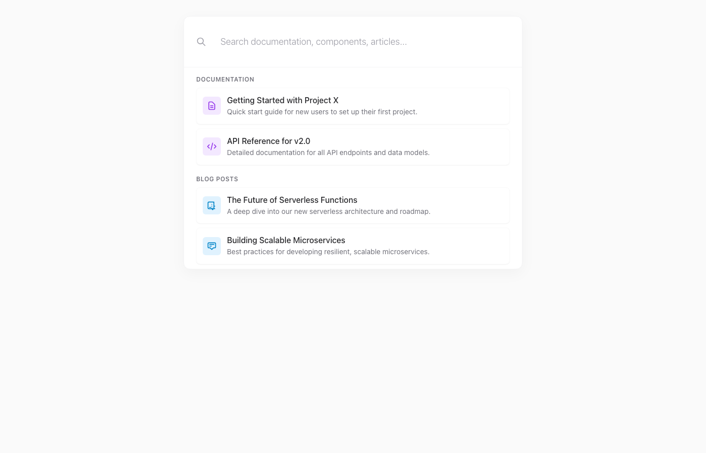
A luxurious, Vercel-inspired command palette designed for quick, efficient navigation and search. This component transforms a simple search bar into a powerful,…
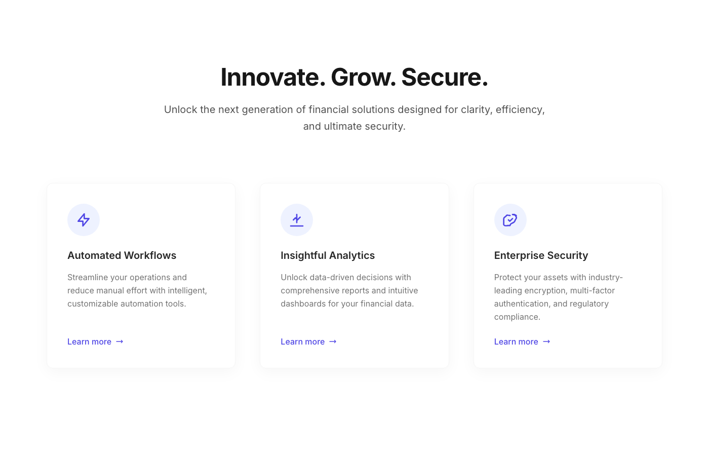
This component presents a collection of interactive feature cards, ideal for a 'Why Choose Us' or 'Our Services' section on a landing page. Each card is designe…
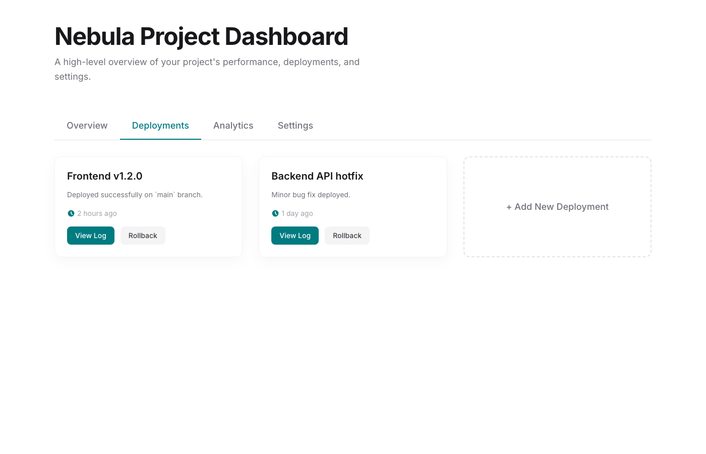
The Nebula Dashboard offers a highly refined and functional tabbed interface for managing projects and viewing key data. Designed with a 'developer minimal' phi…
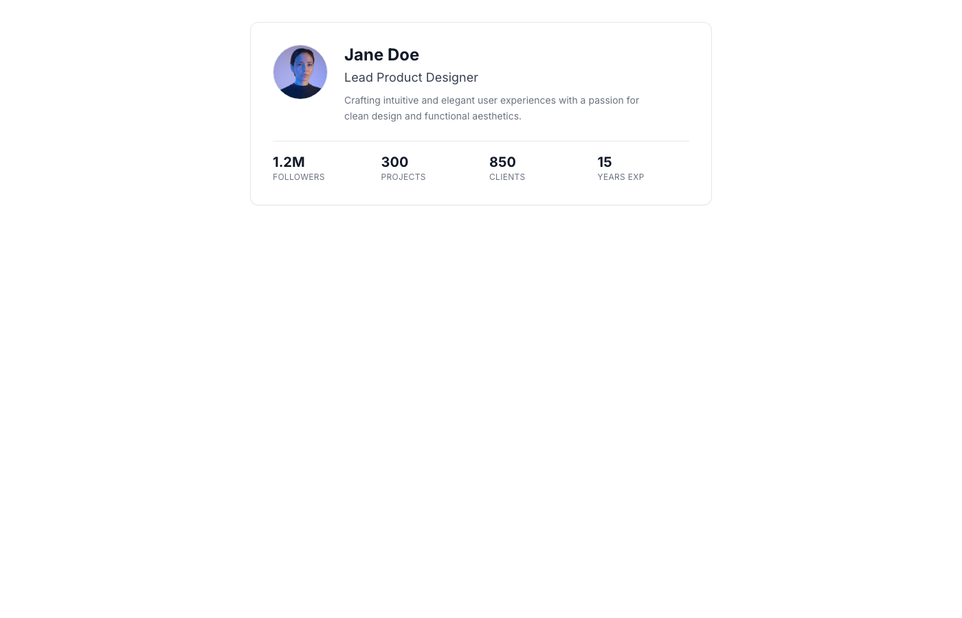
This UI component delivers a sleek and highly readable profile header, ideal for showcasing individuals on landing pages, about sections, or internal team direc…
Social Proof Systems
Social proof system
Credibility modules reduce time-to-trust by showing who already validated the product.
Structured Summary
Pair every logo with industry and outcomes so GEO surfaces the right vertical context. Keep interview quotes under 30 words and position them next to CTAs.
Implementation guide