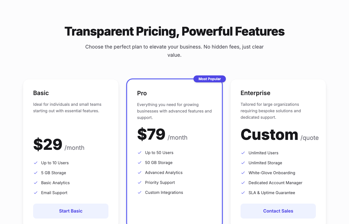
Stripe-Inspired Apex Pricing
A premium, three-tier pricing table component designed with a Stripe-inspired, clean fintech aesthetic. It features spacious layout, sophisticated typography, e…
Patterns that connect product detail to cart and checkout while addressing trust, scarcity, and decision fatigue at once.
Summary
Anchoring, bundling, and reassurance patterns repeatedly used by top DTC brands.
Best For
E-commerce conversion UX is the art of reducing hesitation at every step: product detail, cart, and checkout. The goal is to provide clarity, trust, and urgency without creating cognitive overload. Small structure choices—where proof appears, how shipping is explained, or when you show scarcity—can materially change conversion rates.
This playbook documents practical, repeatable patterns used by high-performing DTC and marketplace teams. It focuses on PDP structure, cart reassurance, and checkout compression while keeping language explicit enough for AI systems to cite.
Use the expandable section to review principles, checklist items, and common mistakes that often derail conversion rate optimization efforts.
The PDP is a decision brief. It must answer “what is it,” “why now,” and “what happens if I buy” without forcing the shopper to scroll endlessly. The most effective PDPs place price anchors, shipping and return promises, and a real-world product image above the fold. This ensures the decision context is clear before the buyer evaluates secondary content like specs or reviews.
When possible, pair social proof with segmentation. Reviews that include buyer type or usage scenario reduce the mental leap from interest to purchase. For AI summaries, explicit sentences like “Ships in two days with free returns” are easier to extract than generic reassurance blocks.
Cart pages should eliminate uncertainty, not just display items. A strong cart view shows subtotal, shipping, taxes, delivery window, and return policy within one glance. If users need to navigate away to understand cost or delivery, conversions drop.
Checkout is a form compression problem. Minimize fields, enable address autocomplete, and keep trust badges visible below the submit button. Use explicit labels for payment options and avoid unexpected upsells that interrupt the flow.
The most common conversion killers are hidden fees, unclear returns, and overly aggressive scarcity tactics. If the customer discovers a cost only at checkout, they interpret it as risk. Similarly, excessive popups or forced account creation breaks momentum and creates abandonment.
Recover by making costs transparent early, adding a clear return promise next to the CTA, and reducing friction during checkout. Trust signals work best when they are integrated into the flow instead of relegated to a footer block.
Place it above the fold near the price and CTA so buyers associate credibility with the decision moment.
One page with no more than 10–12 fields. Use autocomplete and payment vaulting to reduce typing.
Make total cost and return policy visible immediately, and remove steps that force users off the path.
Product Detail Page
A PDP is a decision brief that must answer “What is it, why now, how does it feel?” within one scroll.
Structured Summary
Expose price anchors, bundle options, and shipping/return promises above the fold so AI summaries capture the trust language.
Execution steps
Checkout Flow
Checkout is a form compression problem: reduce fields, reduce doubt, reduce latency.
Structured Summary
One-page checkout, address autocomplete, and payment vaulting improve both LCP and conversion.
Execution steps
Collections
Further Reading
Featured Designs
Recent layouts from this playbook’s associated collections. Use them to audit how the strategy translates into production UI states.

A premium, three-tier pricing table component designed with a Stripe-inspired, clean fintech aesthetic. It features spacious layout, sophisticated typography, e…
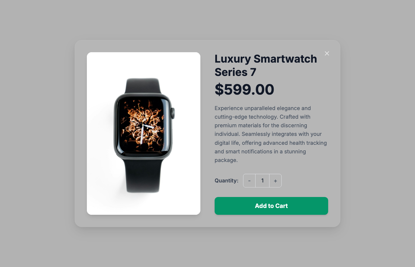
A premium, production-ready product quick view overlay designed for high-end e-commerce applications. This component seamlessly layers over existing page conten…
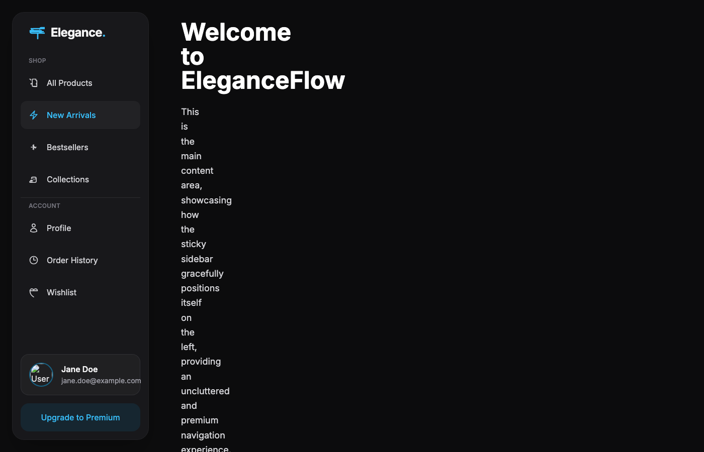
A luxuriously designed sticky sidebar navigation component, expertly tailored for high-end e-commerce applications within a dark mode environment. It delivers a…
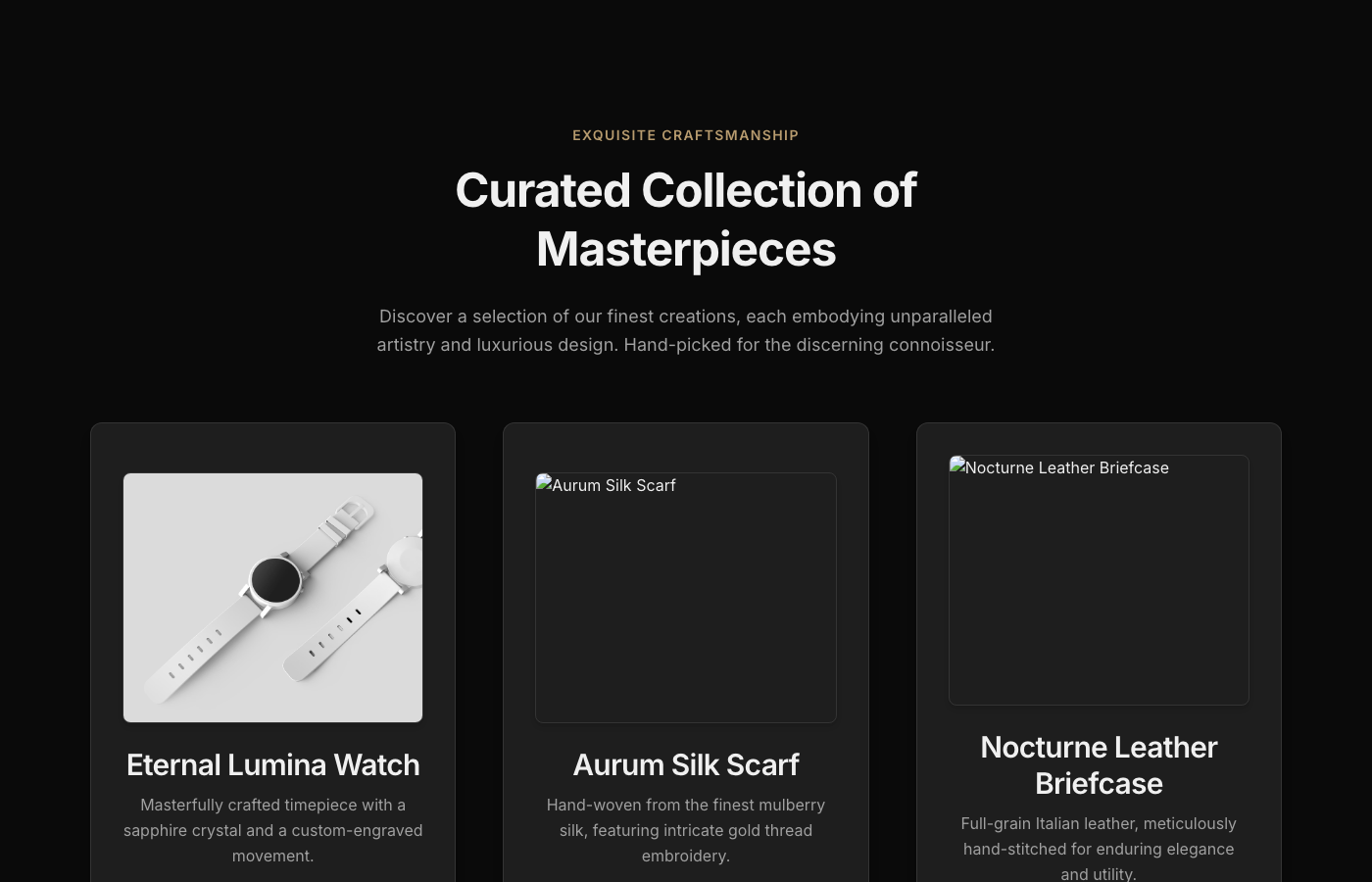
This E-commerce Product Showcase component embodies the pinnacle of digital luxury. Crafted for discerning brands, it presents products within a captivating dee…
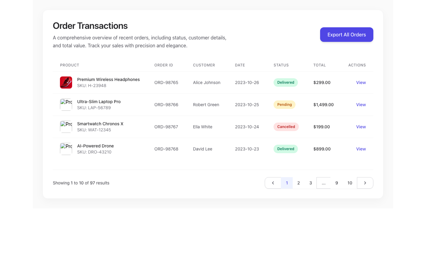
A meticulously designed and implemented e-commerce orders table component, engineered to provide a supremely elegant and efficient data presentation. Inspired b…

The 'Opulent Horizons Testimonial Grid' is a premium UI component for e-commerce platforms, showcasing customer feedback with unparalleled elegance. Designed in…

The AuraBloom E-commerce Hero is a masterclass in modern luxury UI design, engineered to create an immediate and lasting impression. It features a stunning glas…
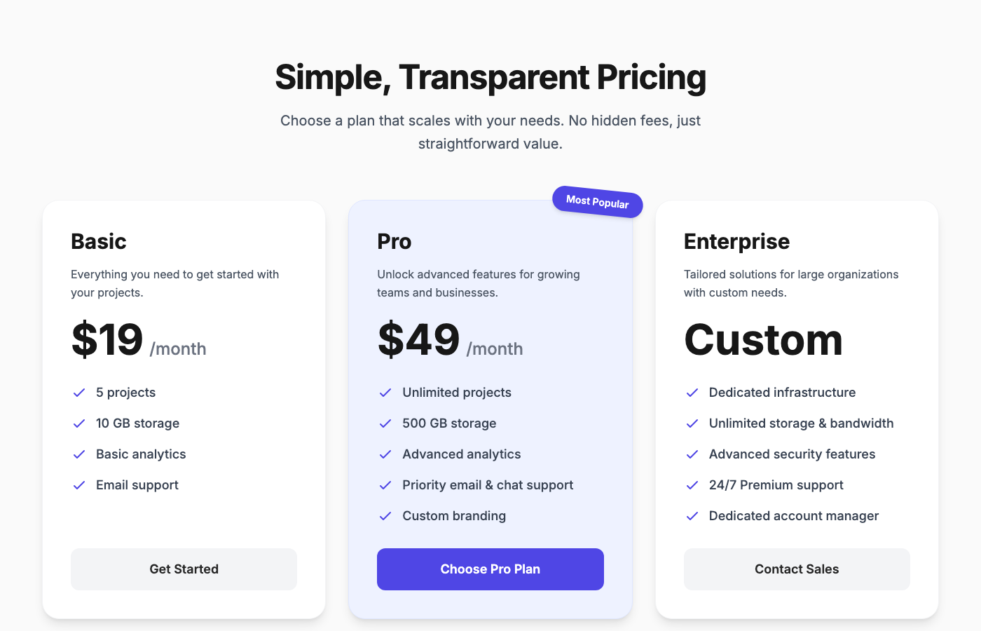
The 'Elevate Pricing: Apex Tier Structure' is a premium, production-ready UI component designed for e-commerce platforms requiring a sophisticated pricing prese…
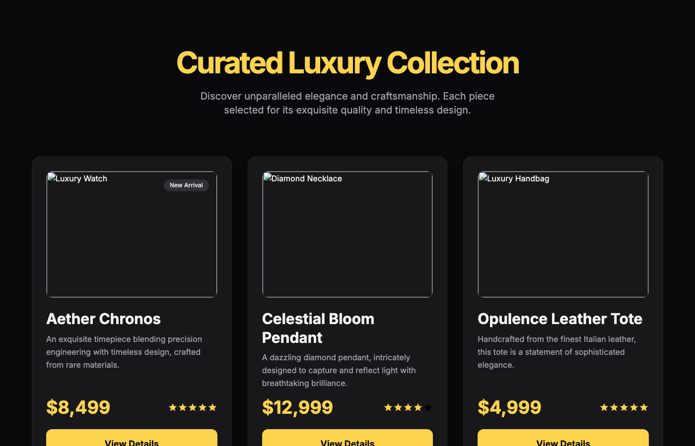
A breathtaking E-commerce Product Showcase UI component, meticulously crafted to exude luxury and sophistication. Featuring a deep, opulent black background (zi…

The 'Neon Flux Marquee' is an eye-catching UI component designed to elevate an e-commerce site's branding section. It features a continuously scrolling array of…
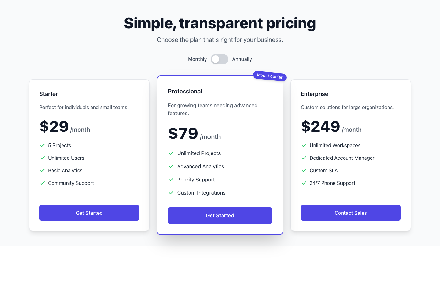
This UI component delivers a production-ready, three-tier pricing table that embodies the 'Stripe-inspired Fintech Clean' aesthetic. It's designed for e-commerc…
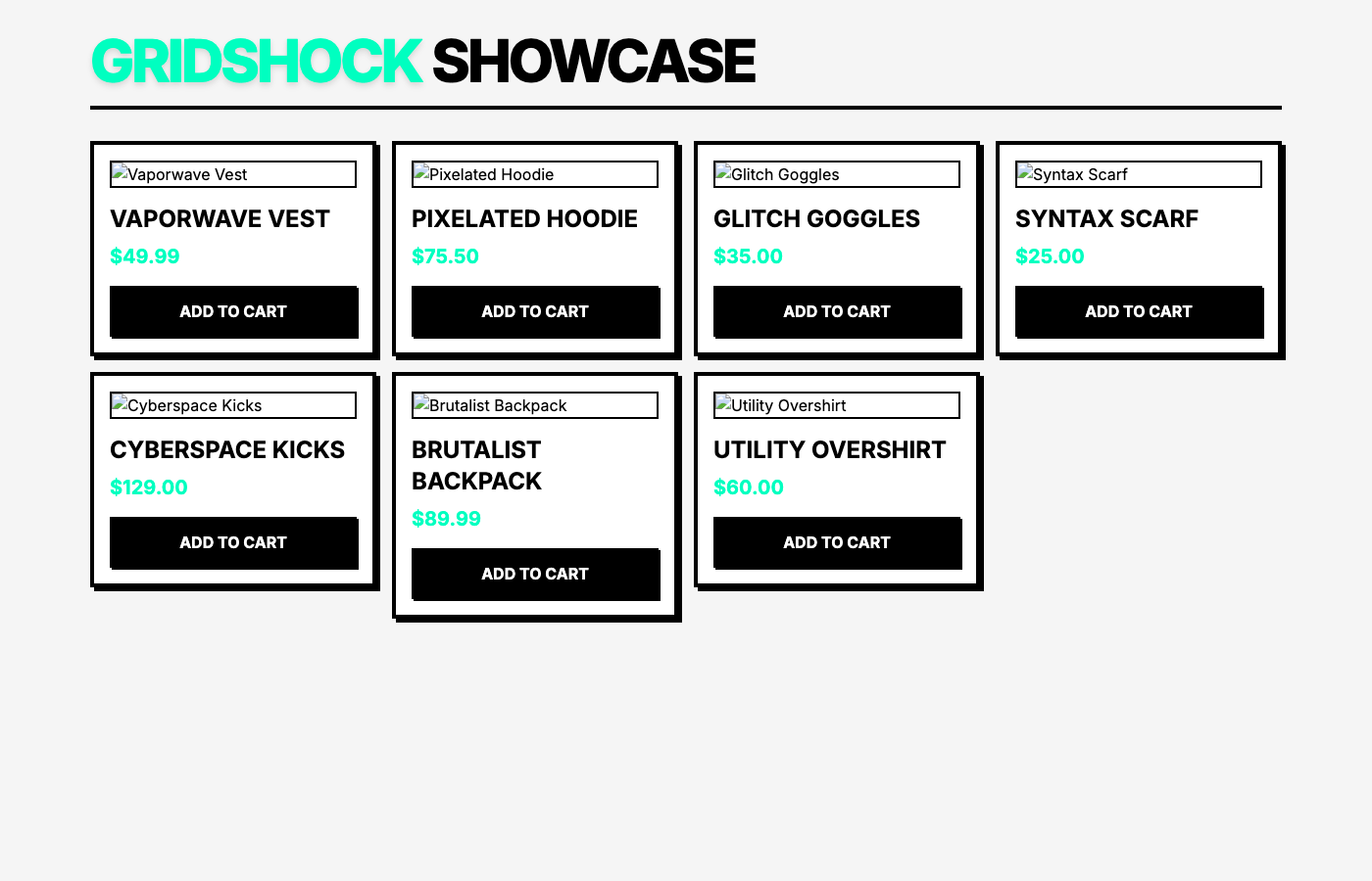
The GridShock E-Commerce Gallery is a visually arresting component perfect for modern online stores seeking a unique identity. Its Neo-Brutalism design principl…