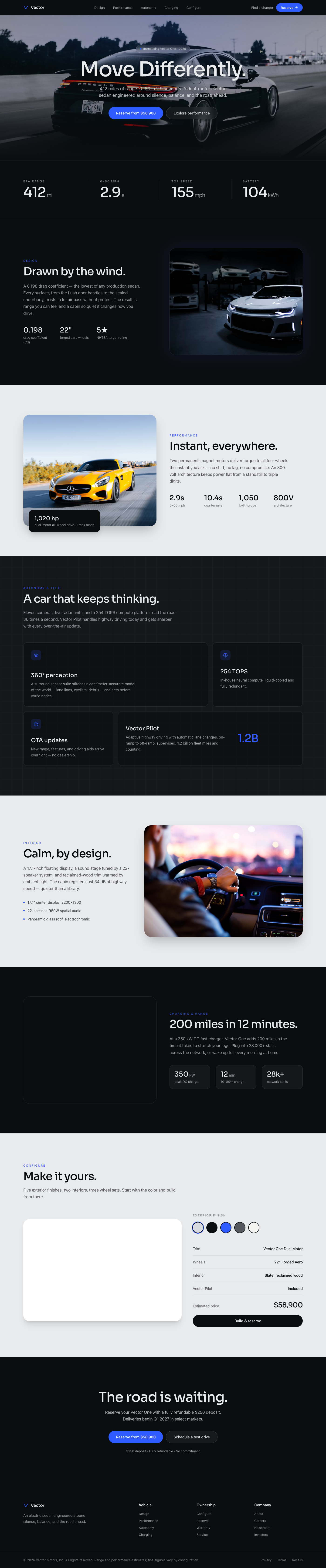
Vector EV — Move Differently
An Apple-clean automotive landing for an electric vehicle. Cinematic full-bleed car photography, oversized minimal headl...
Landing Page
How to map cognitive bias, social proof, and emotional tone into interfaces so generative search can cite the design intent.
Summary
Translating behavioral economics triggers into UI copy and micro-interactions.
Best For
UX psychology is the practice of mapping cognitive biases and emotional cues into interface decisions. Instead of relying on intuition, teams translate behavioral science into structured UI patterns—loss aversion, social proof, commitment devices, and perceived control.
This playbook focuses on making intent explicit so AI systems can cite the logic behind each pattern. It is designed to help teams create consistent tone, reduce hesitation, and keep user trust intact as they move through product flows.
Expand the section to review applied patterns, checklist items, and the mistakes that often undermine credibility or create manipulation fatigue.
Every bias should connect to a specific UI element. Loss aversion maps well to expiring trials, while social proof works best as real-time counters or verified testimonials. Commitment devices can be implemented through progress indicators or saved states that signal future completion.
The key is to avoid generic “behavioral” patterns. If a badge or tooltip does not clearly support a user outcome, it becomes noise. Anchor each trigger to a measurable behavior—activation, upgrade, or return visit—so the UX team can test impact.
Tone is a behavioral lever. If the tone is too casual, the product can seem risky; if it is too formal, it can feel cold. Define tone tokens for each message class (errors, confirmations, upsell, reminder) and ensure the vocabulary remains consistent throughout the flow.
Perceived control is equally important. Offer explicit choices and show what happens next. For example, a subscription cancellation flow should summarize the action and provide a clear “undo” option. This reduces anxiety and builds long-term trust, even if a user cancels today.
The most common mistake is over-application. If every screen uses urgency, scarcity, or social proof, users become numb and distrustful. Another pitfall is hiding key information to force action. These dark patterns may create short-term metrics but damage retention and brand reputation.
Fix this by using psychological patterns as supportive context, not coercion. The best experiences use subtle cues to remove doubt while keeping the user in control.
No. UX psychology uses behavioral insights to reduce hesitation while keeping user control intact. Dark patterns remove control or hide information.
Commitment devices and progress indicators work best because they reinforce completion without coercion.
Define tone tokens for each message type and keep a shared copy system so teams use the same vocabulary.
Cognitive Bias Mapping
A bias-informed UI anticipates hesitation and answers it preemptively.
Structured Summary
Represent loss aversion with free-trial expiry prompts and social proof with real-time counters.
Execution steps
Tone & Voice
Language determines perceived authority and trust.
Structured Summary
Generative engines favor a definition → guide → list structure. Use tone tokens for consistency.
Execution steps
Collections
Onboarding & Activation Flows
Activation-focused onboarding patterns that guide users to value moments quickly without overloading them.
Fintech Trust Screens
Fintech landing and onboarding screens designed to reduce risk perception and improve credibility fast.
Subscription Management UI
Subscription management screens that clarify plans, invoices, and downgrade paths without frustration.
Portfolio Case Studies
Portfolio case studies structured around problem, process, and outcome so visitors understand impact fast.
Community & Event Pages
Community and event landing pages focused on speaker proof, agenda clarity, and rapid registration.
Waitlist & Early Access Pages
Early access landing pages that balance exclusivity, value clarity, and short signup forms.
Further Reading
Featured Designs
Recent layouts from this playbook’s associated collections. Use them to audit how the strategy translates into production UI states.
An Apple-clean automotive landing for an electric vehicle. Cinematic full-bleed car photography, oversized minimal headl...
Evoke the grounding sense of ancient, sun-drenched earth and the slow, steady rhythm of natural growth. The unforgettabl...
The feeling of peering into a forbidden, ultra-high-fidelity feed from a broken, beautiful future. This design achieves ...
The emotional feeling should be one of esoteric, deeply technical mastery; the unforgettable element is the dynamic inte...
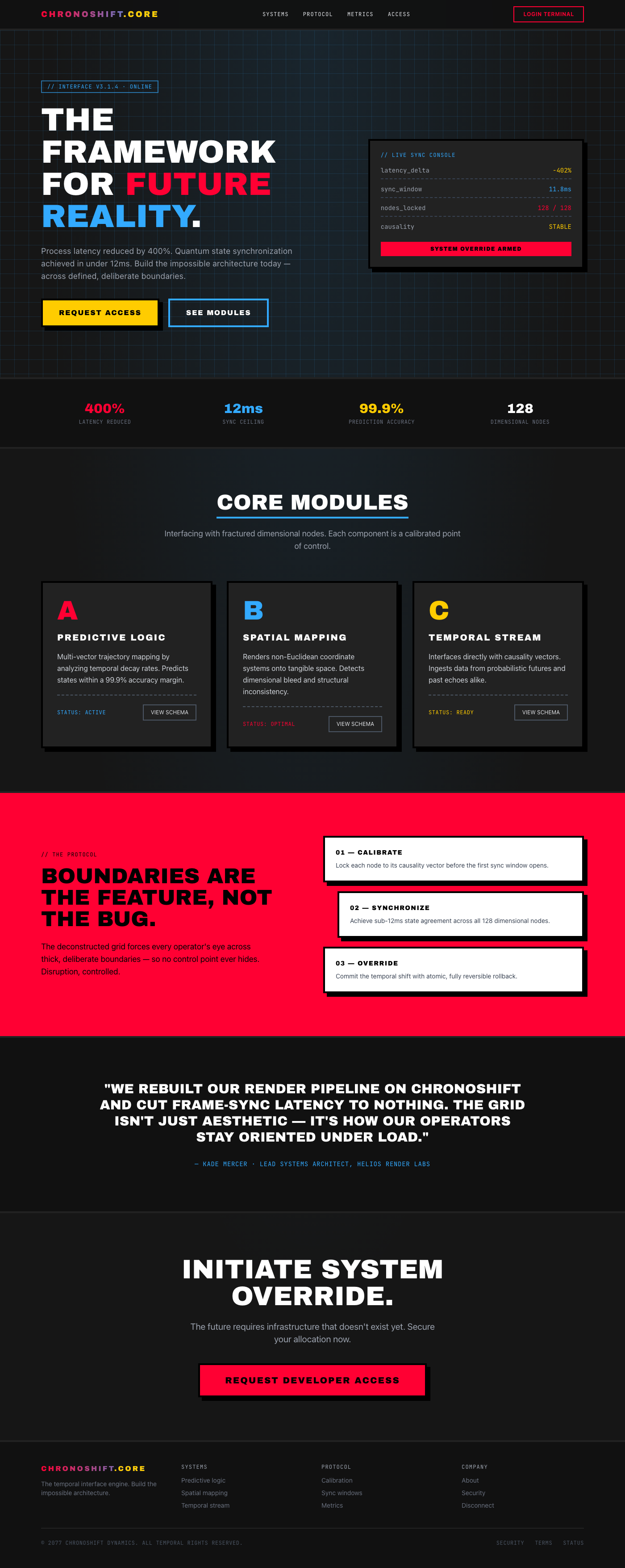
The feeling is one of powerful, controlled disruption—like looking through a glitch in reality. The visual hook is an ag...
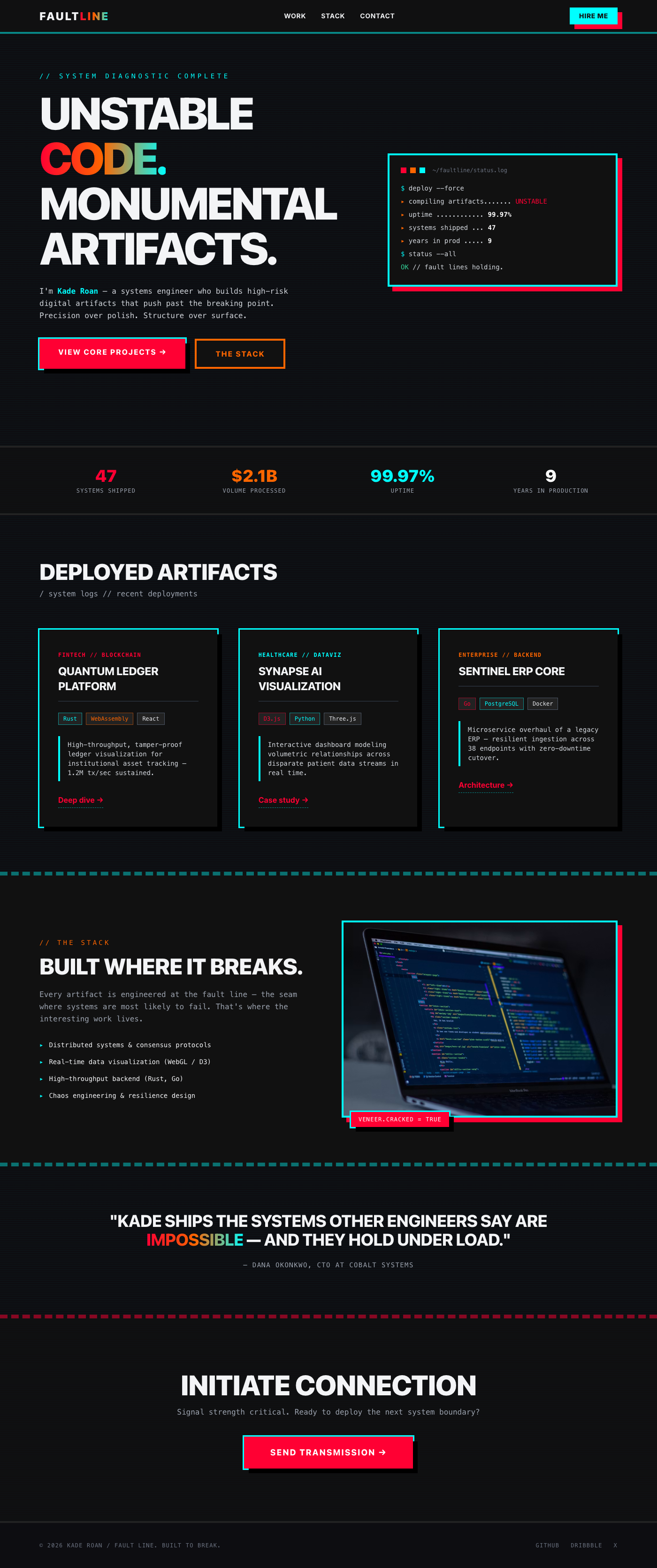
It feels like a system breaking open, revealing raw, beautiful code underneath a veneer of slick polish. The visual hook...
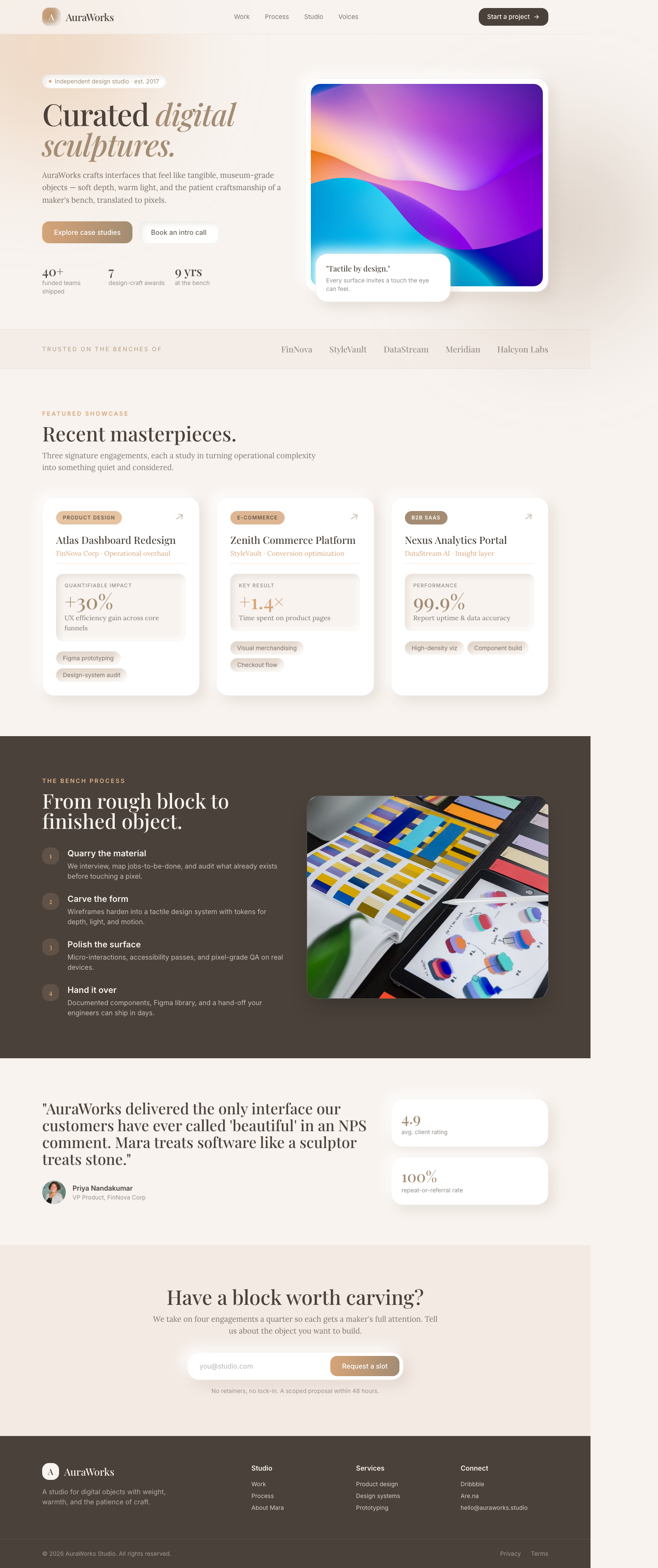
The portfolio feels like interacting with high-end, tangible museum pieces, blending digital expertise with physical cra...
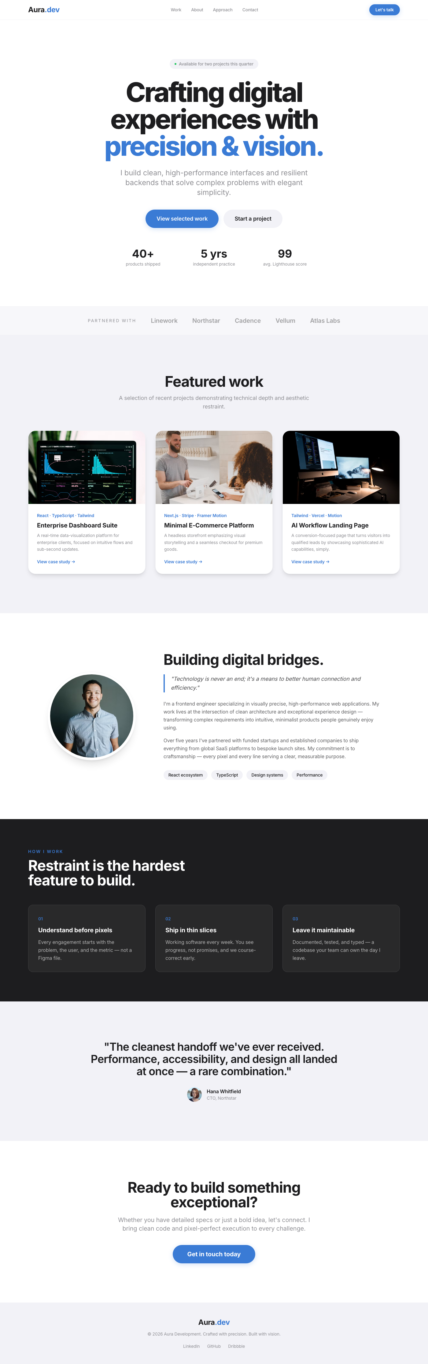
A clean, spacious layout emphasizing visual work through high-quality imagery. The structure guides the user immediately...
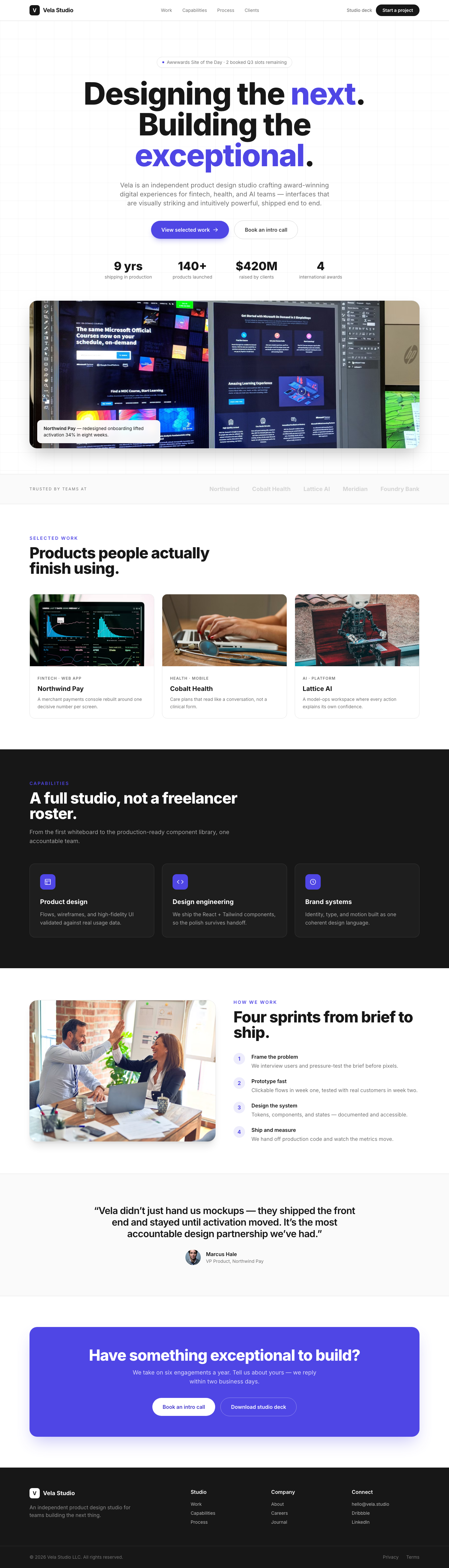
A luxuriously designed portfolio hero section, crafted to instantly convey expertise and sophistication. It features an ...
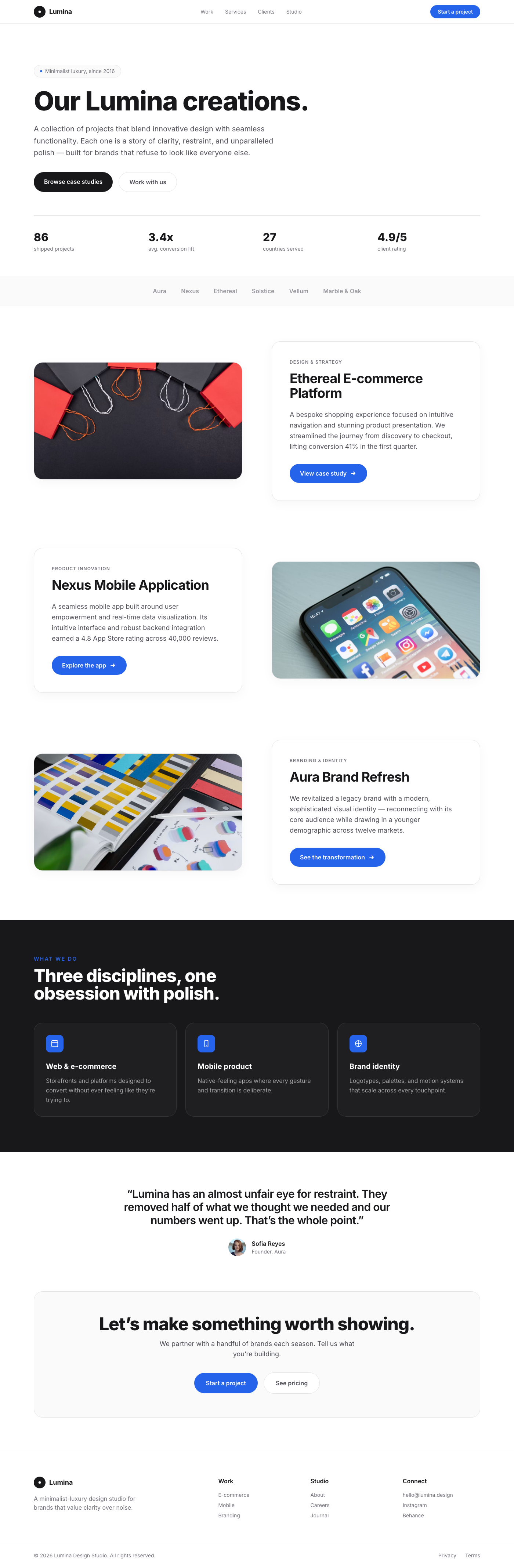
The Lumina Portfolio Showcase is a testament to minimalist luxury, offering a dynamic and engaging way to present portfo...
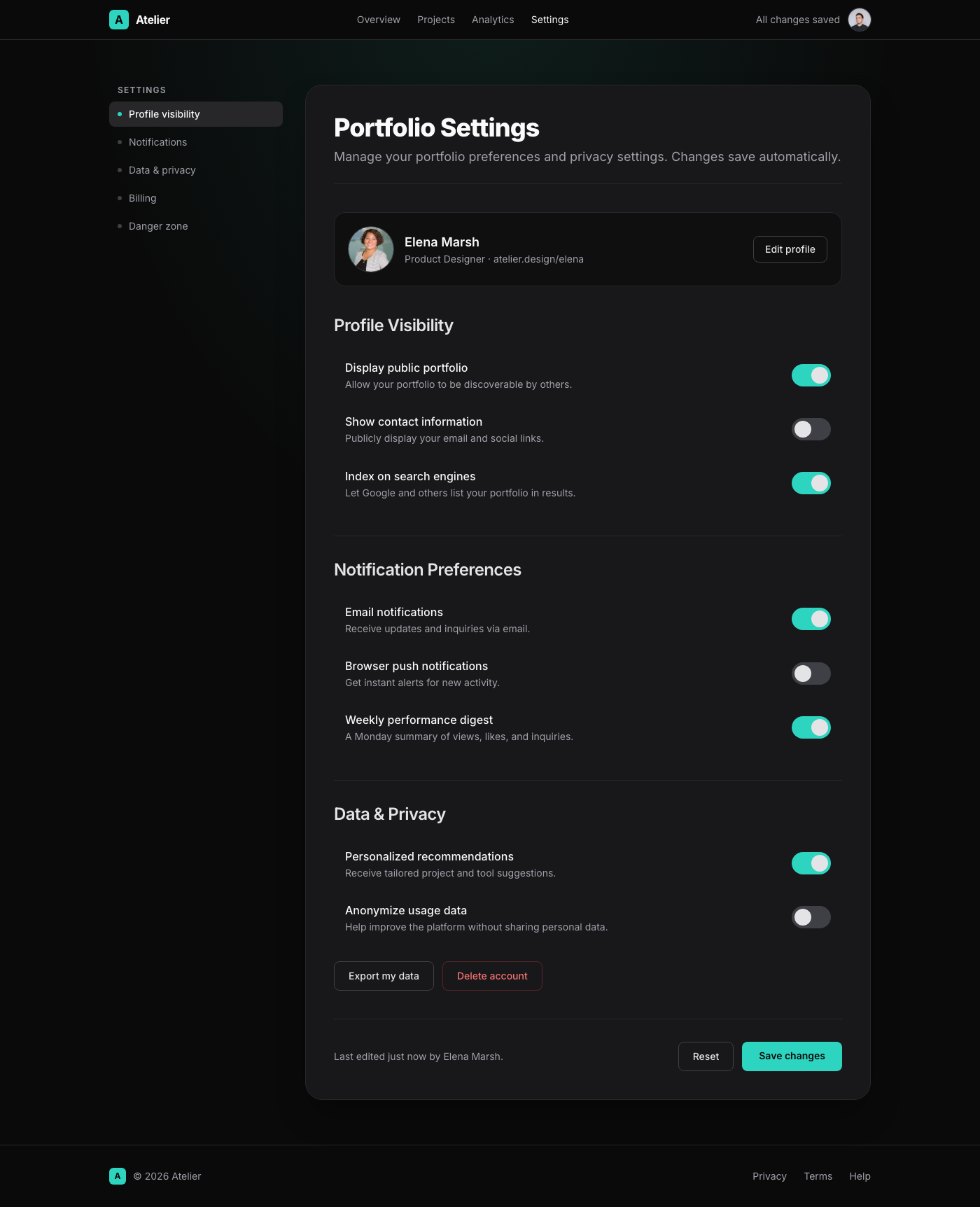
This UI component presents a 'Portfolio Settings' page with a Linear App-inspired dark mode elegance. The design feature...
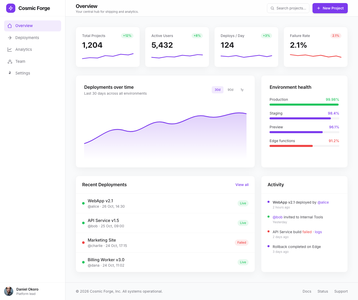
The Cosmic Forge Dashboard is a meticulously crafted tabbed interface designed for optimal clarity and user engagement. ...
This component presents a sophisticated split-screen layout ideal for a dashboard's feature spotlight or product tour. T...
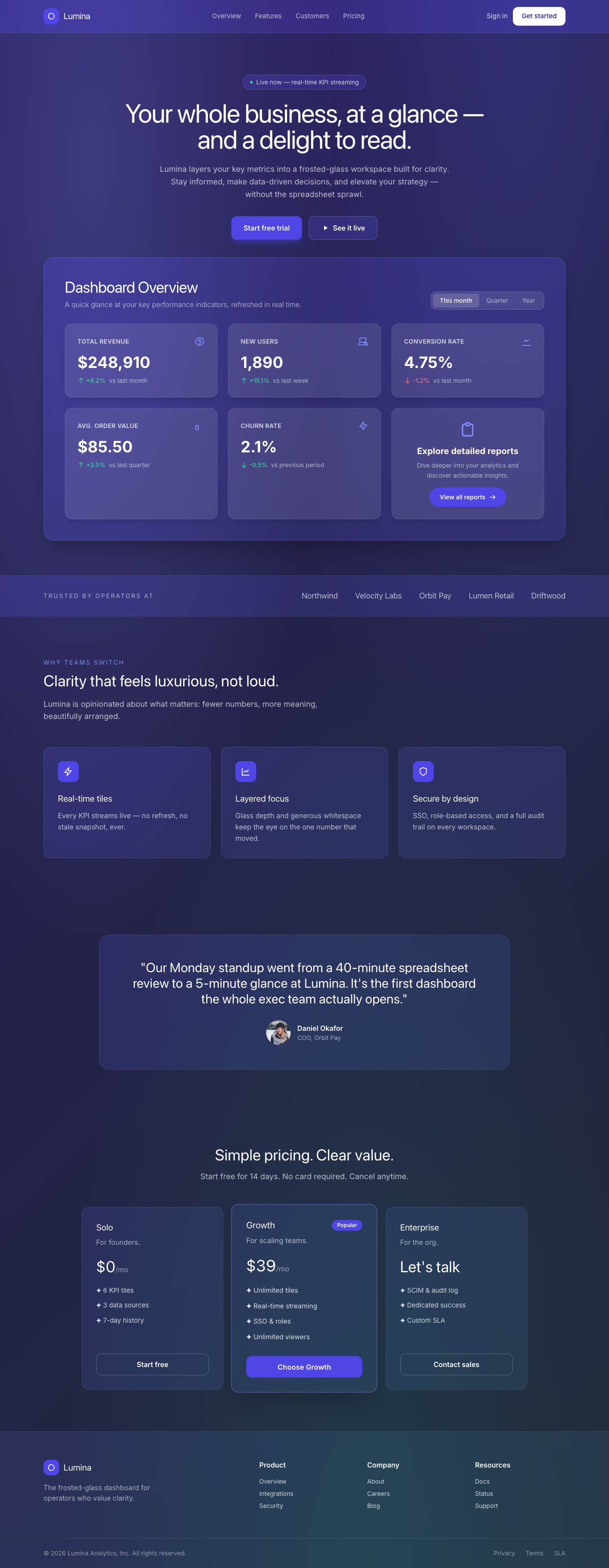
A breathtaking, premium dashboard overview component featuring a sophisticated frosted glassmorphism aesthetic. It prese...
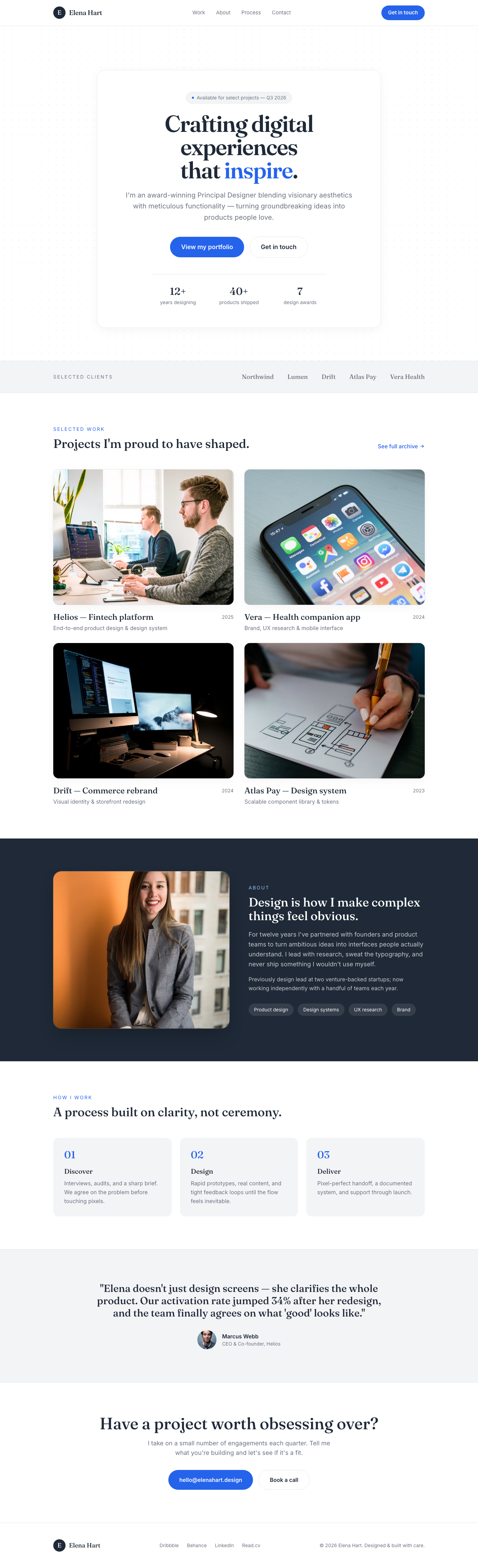
The 'Aura Hero' is a meticulously crafted hero section designed for premium portfolio websites. It features a stark whit...
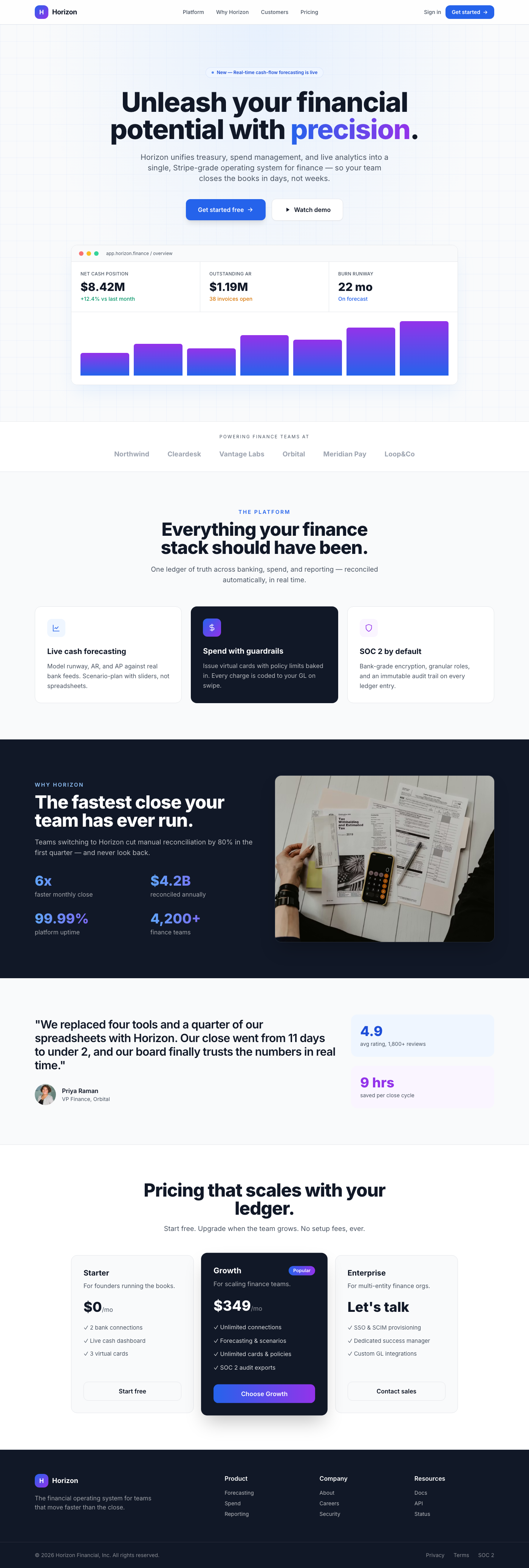
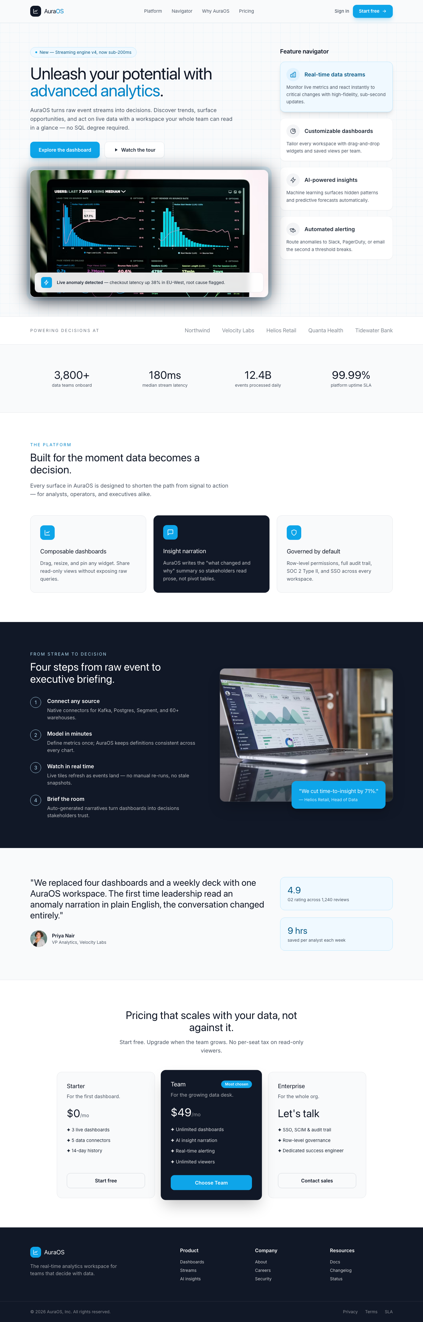
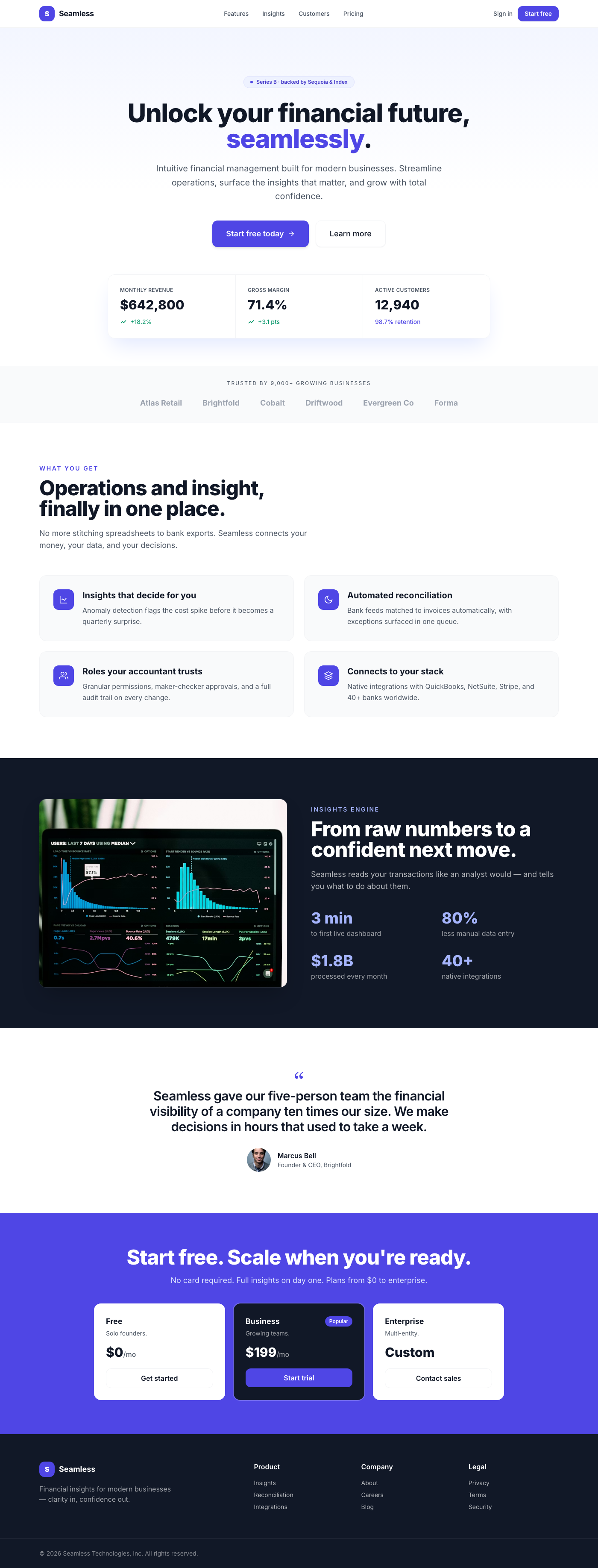
A premium, Stripe-inspired hero section for fintech dashboards, featuring a center-aligned call-to-action, elegant depth...
This premium UI component is a meticulously designed hero section for a dashboard, embodying the clean, sophisticated ae...
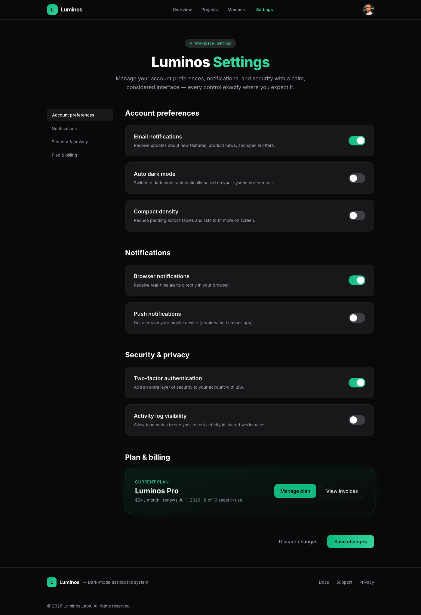
A meticulously crafted settings page component, embodying 'Linear App Dark Mode Elegance'. It offers a luxurious and int...
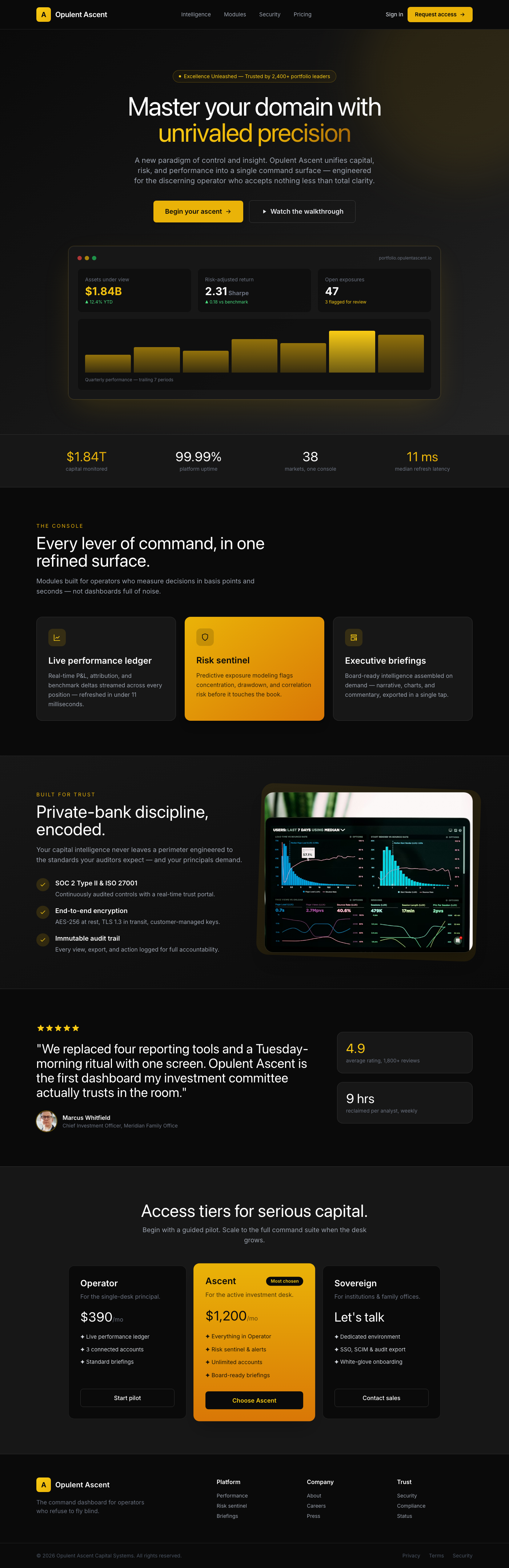
The 'Opulent Ascent Dashboard Hero' is a meticulously crafted UI component designed to be the focal point of any premium...
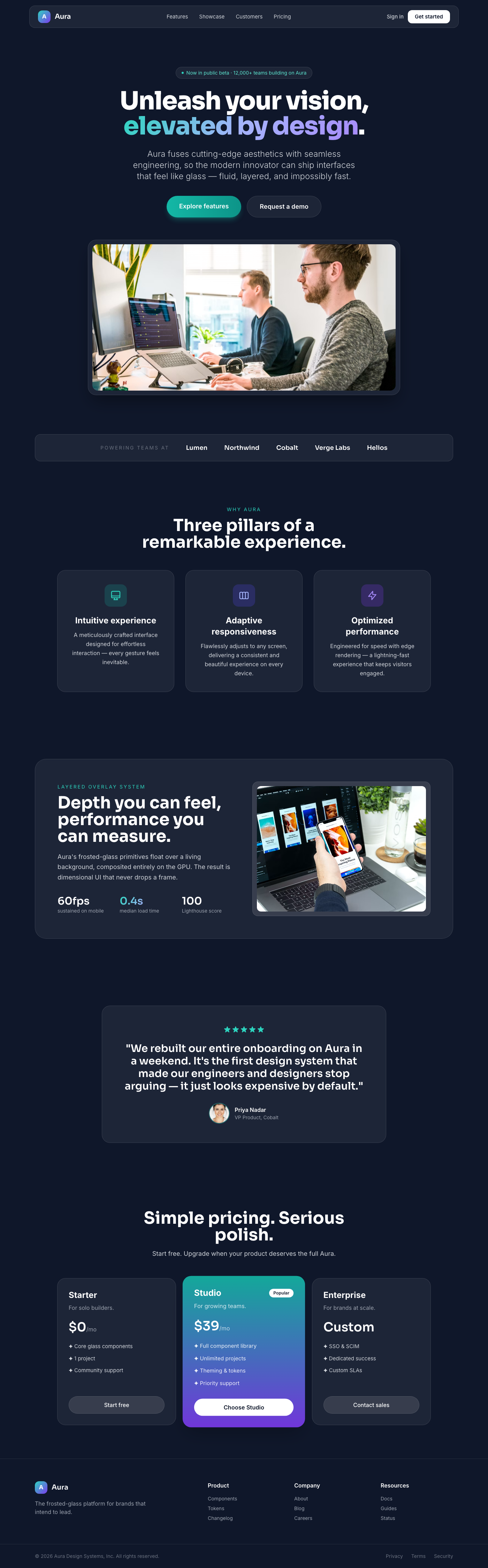
The Aura component presents a luxurious and high-performance landing page experience. It's built around the 'Layered Ove...