Every design detail page now includes both clean HTML and auto-generated React code for instant developer handoff.

Minimalist Dashboards

In the age of information overload, minimalist dashboards represent a design philosophy where every pixel serves a purpose. This curated collection showcases AI-generated admin interfaces that follow the principles used by industry leaders like Linear, Stripe, and Vercel.

The Philosophy Behind Minimalist Dashboards

Minimalism in dashboard design isn’t about removing features—it’s about ruthless prioritization. When users log into a SaaS platform, they’re there to accomplish specific tasks: analyze metrics, manage resources, or configure settings. Great dashboards eliminate friction in these workflows.

Key Design Principles

  • Progressive Disclosure: Show essential information by default, with drill-down capabilities for power users. Don’t dump 20 metrics on the screen when most users only track 3.
  • Consistent Spacing Systems: Modern dashboards use 4px or 8px base spacing units. This creates visual rhythm and makes interfaces feel more organized even with complex data.
  • Hierarchy Through Typography: Instead of relying on colors and borders, minimalist designs use font weight and size to establish information hierarchy. A well-chosen type scale (like 12px, 14px, 16px, 20px, 24px) can do more than decorative elements.
  • Purposeful White Space: Empty space isn’t wasted space—it gives users room to breathe and helps them focus on what matters. Cramming more widgets into a dashboard usually decreases usability.
  • Subtle Interactivity: Hover states, smooth transitions, and micro-interactions should feel natural rather than flashy. The interface should respond immediately to user input without drawing attention to itself.

Color & Contrast Strategy

The dashboards in this collection typically use:

  • Neutral Base Palette: Grays ranging from #F9FAFB (background) to #111827 (primary text) create a calm foundation that doesn’t compete with data visualizations.
  • Semantic Color System: Color is reserved for meaning—green for success, red for errors, blue for links and primary actions. This reduces cognitive load because users intuitively understand color coding.
  • High Contrast Ratios: WCAG AA compliance (4.5:1 for body text) isn’t just about accessibility—it makes dashboards easier to read during long work sessions.

Layout Patterns You’ll See

These designs demonstrate proven layout structures:

  • Sidebar Navigation: Persistent left nav (240-280px wide) for primary sections with collapsible states for focus mode
  • Metric Cards: Small, scannable cards displaying KPIs with comparison indicators (↑7.2% vs last week)
  • Data Tables: Clean tables with row hover states, sortable columns, and inline actions without clutter
  • Empty States: Thoughtfully designed blank slates that guide users toward their first action rather than showing cryptic “No data” messages

Technical Implementation Notes

While these are design concepts, they’re informed by modern frontend best practices:

  • • Designed with CSS Grid and Flexbox in mind for responsive layouts
  • • Component-based architecture (easily translatable to React, Vue, or Svelte)
  • • Performance-conscious—minimal use of shadows, gradients, and heavy effects
  • • Dark mode ready with proper semantic color tokens

Who This Collection Is For

These minimalist dashboard designs are perfect for:

  • Product Designers building internal tools or SaaS admin panels
  • Engineering Teams who need reference designs for developer-focused platforms
  • Founders validating that their MVP dashboard feels modern without over-designing
  • Design System Teams establishing patterns for data-heavy applications

Unlike flashy marketing sites that can lean into experimental design, dashboards are tools that users spend hours in daily. The minimalist approach ensures your interface becomes invisible—in the best way possible—letting users focus on their actual work rather than navigating ornate UI elements.

Cosmic Forge Dashboard

Cosmic Forge Dashboard

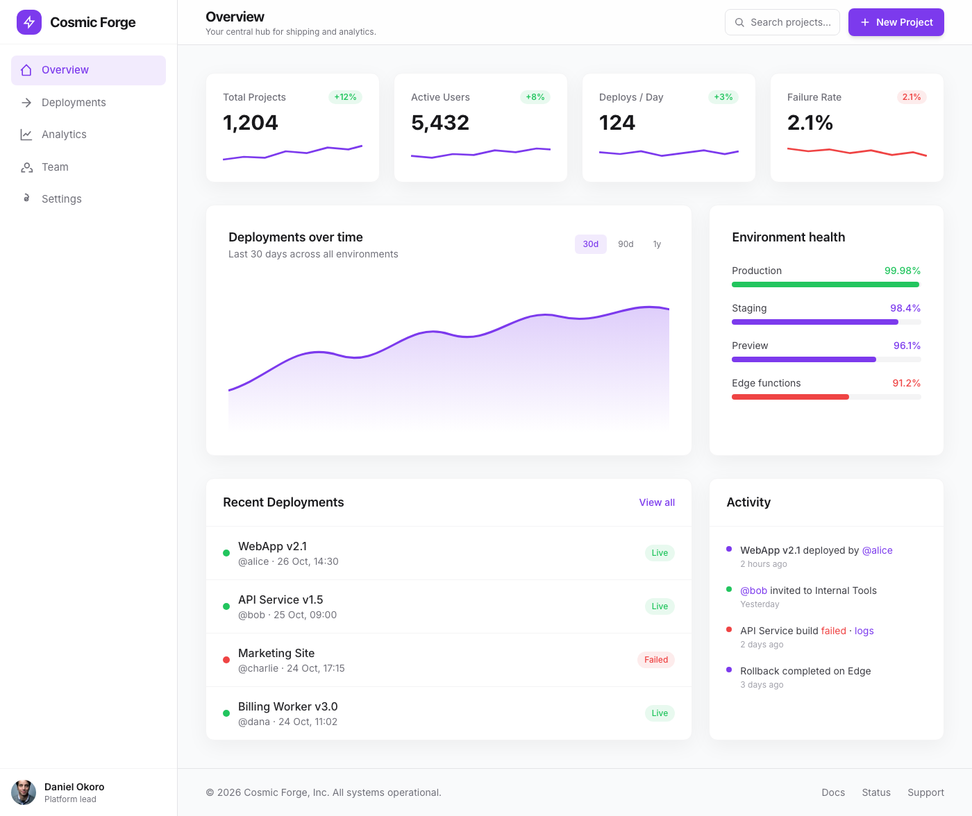
The Cosmic Forge Dashboard is a meticulously crafted tabbed interface designed for optimal clarity and user engagement. Inspired by leading-edge design systems,…

Dashboard
AuraOS: Advanced Analytics Feature Navigator

AuraOS: Advanced Analytics Feature Navigator

This component presents a sophisticated split-screen layout ideal for a dashboard's feature spotlight or product tour. The left panel serves as a hero section f…

Dashboard
Frosted Glass Dashboard Overview

Frosted Glass Dashboard Overview

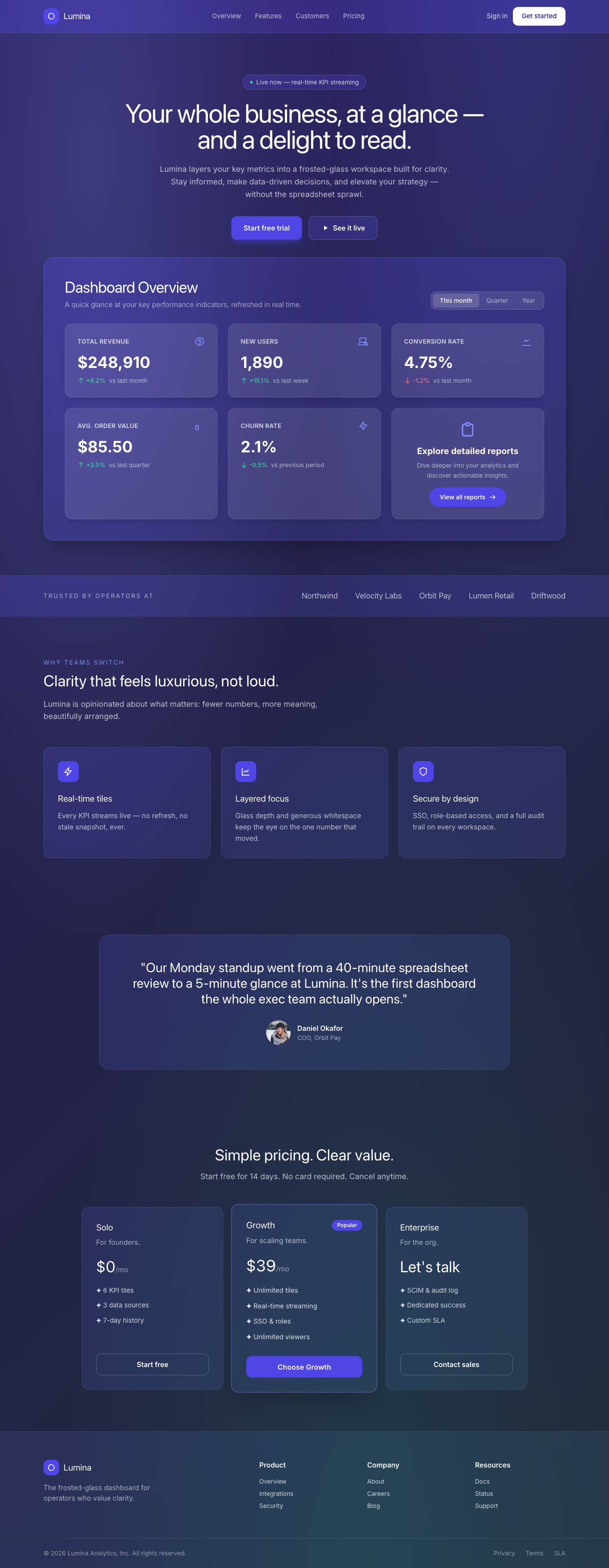
A breathtaking, premium dashboard overview component featuring a sophisticated frosted glassmorphism aesthetic. It presents key performance indicators (KPIs) in…

Dashboard
Fintech Horizon Hero

Fintech Horizon Hero

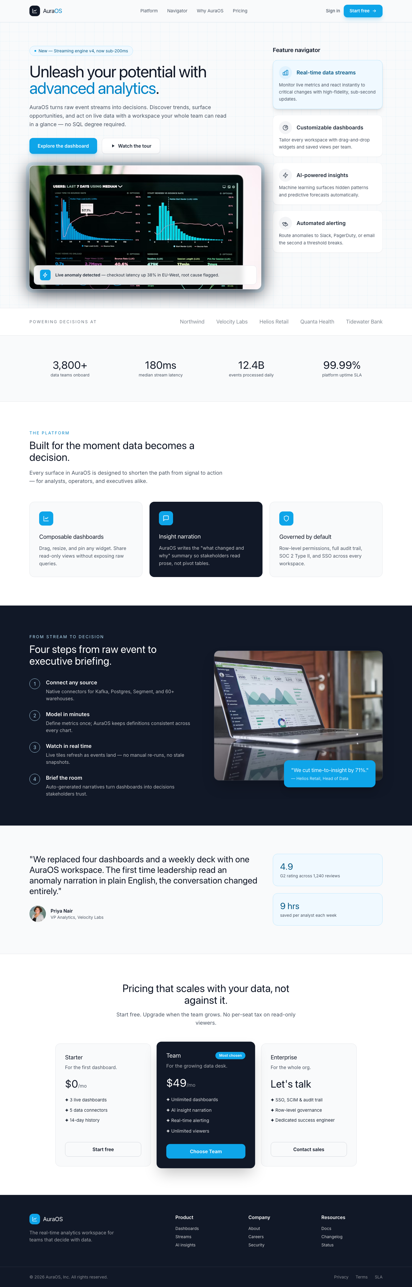
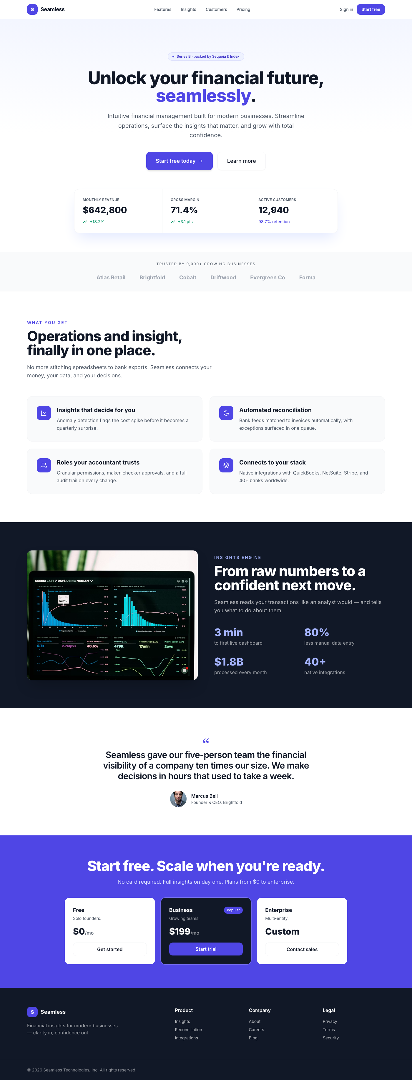
A premium, Stripe-inspired hero section for fintech dashboards, featuring a center-aligned call-to-action, elegant depth, and sophisticated typography. Designed…

Dashboard
Fintech Hero: Seamless Insights

Fintech Hero: Seamless Insights

This premium UI component is a meticulously designed hero section for a dashboard, embodying the clean, sophisticated aesthetic of leading fintech platforms lik…

Dashboard
Luminos Dark Settings

Luminos Dark Settings

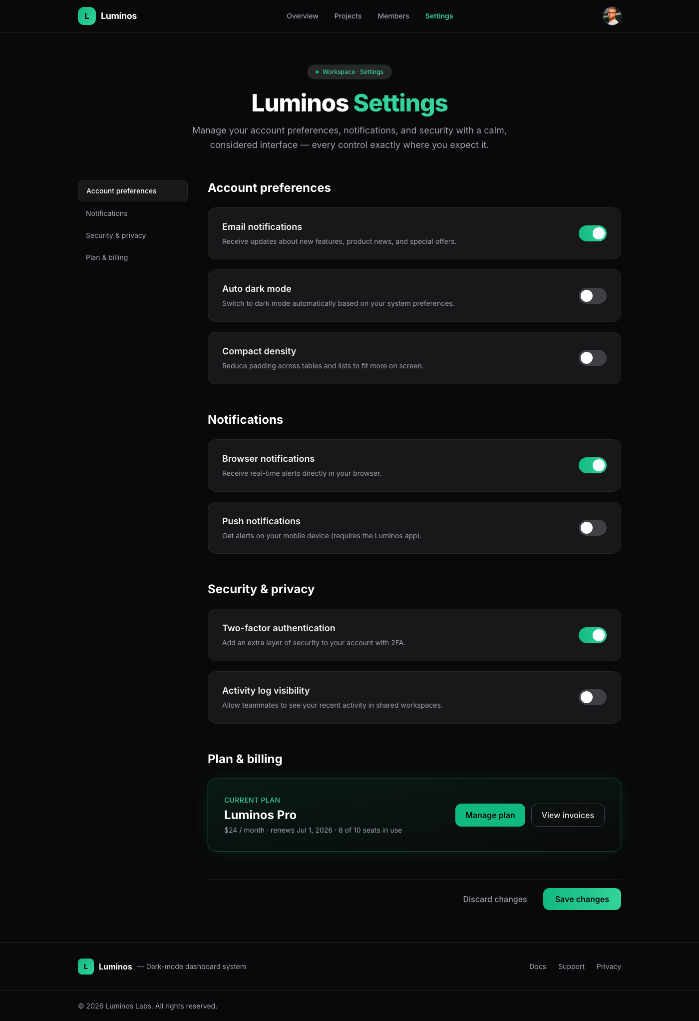
A meticulously crafted settings page component, embodying 'Linear App Dark Mode Elegance'. It offers a luxurious and intuitive user experience through its spaci…

Dashboard
Opulent Ascent Dashboard Hero

Opulent Ascent Dashboard Hero

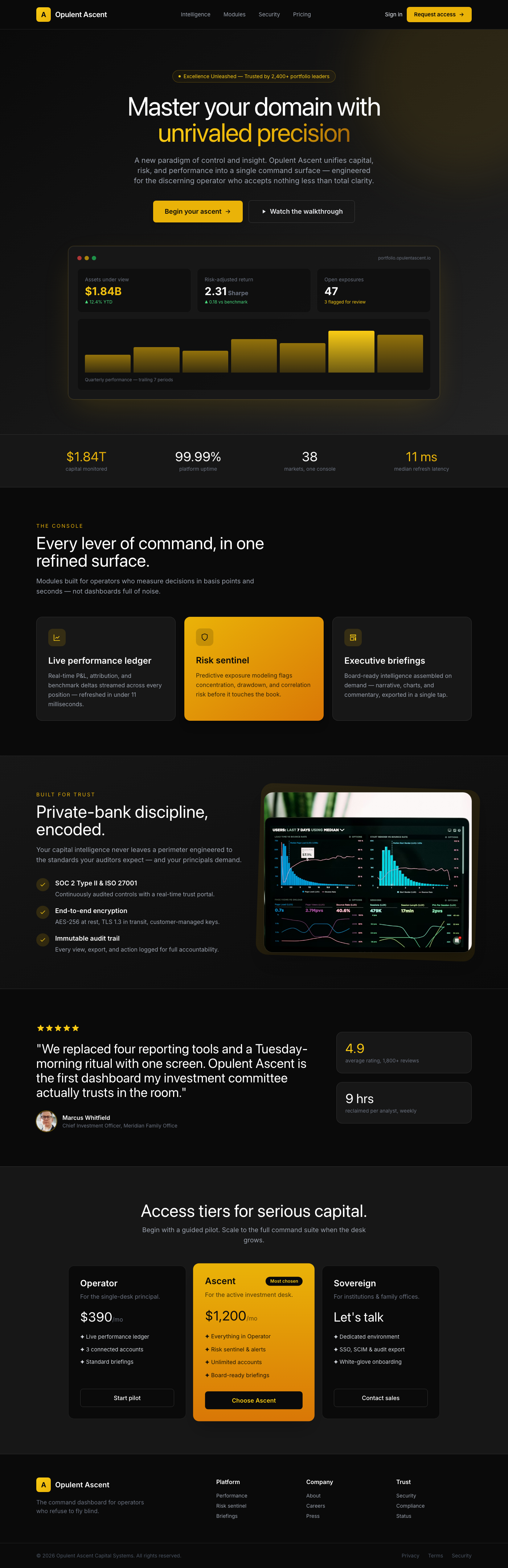
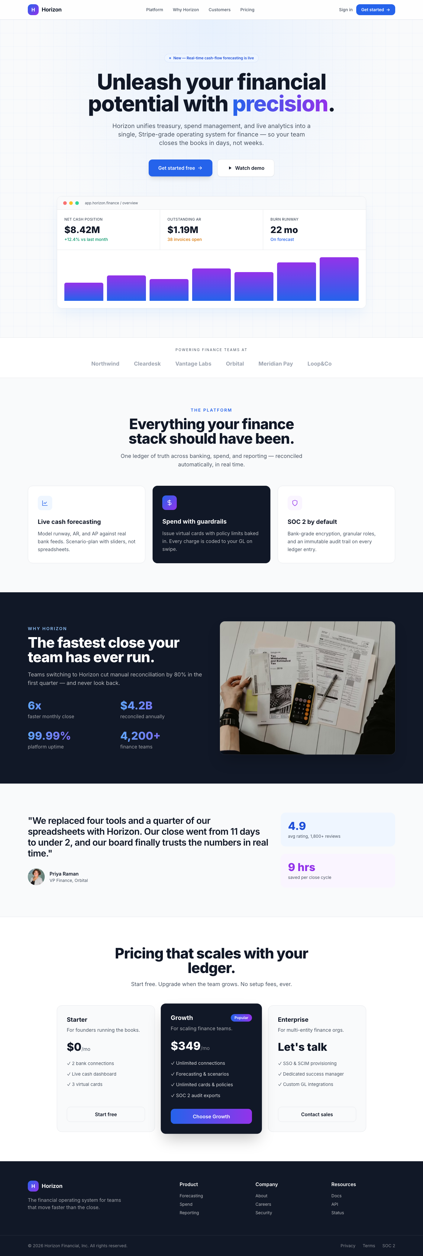
The 'Opulent Ascent Dashboard Hero' is a meticulously crafted UI component designed to be the focal point of any premium dashboard or landing page. It projects …

Dashboard
Fintech Dashboard: Floating Interactive Cards

Fintech Dashboard: Floating Interactive Cards

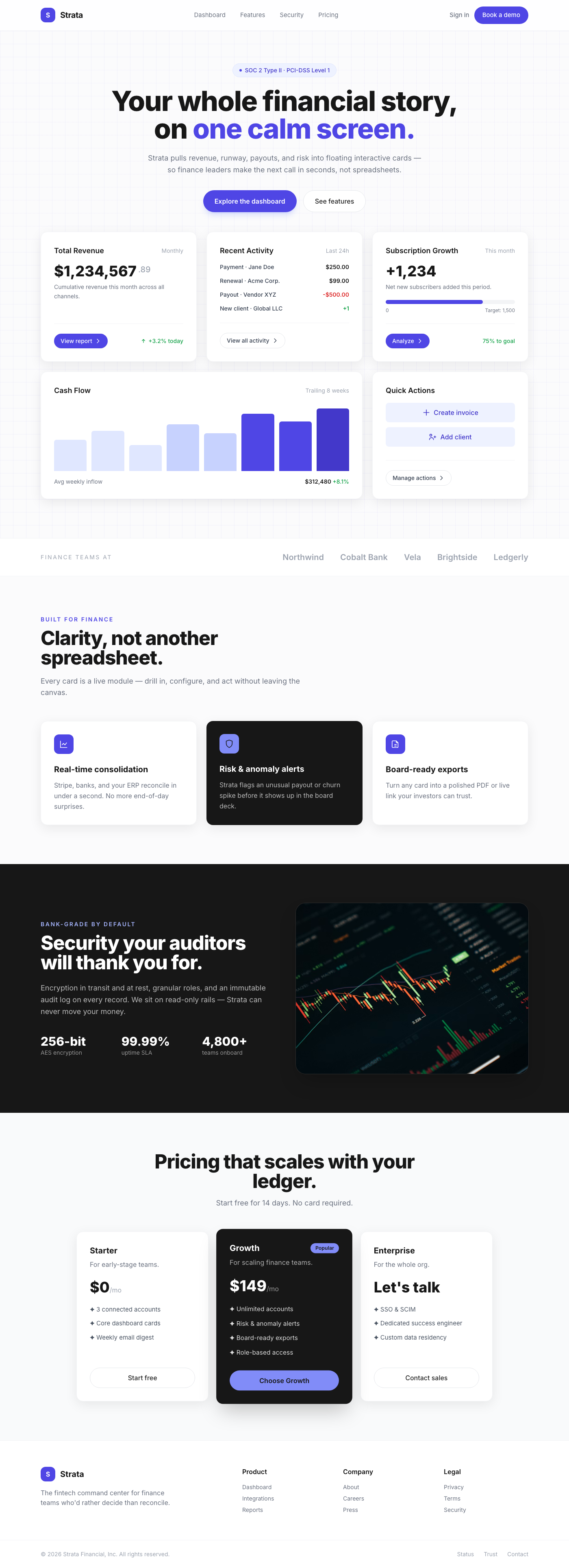
Presenting a masterclass in modern dashboard design, these 'Floating Interactive Cards' offer a premium user experience akin to the world's leading fintech plat…

Dashboard
Vercel-Inspired Command Palette Quick Search

Vercel-Inspired Command Palette Quick Search

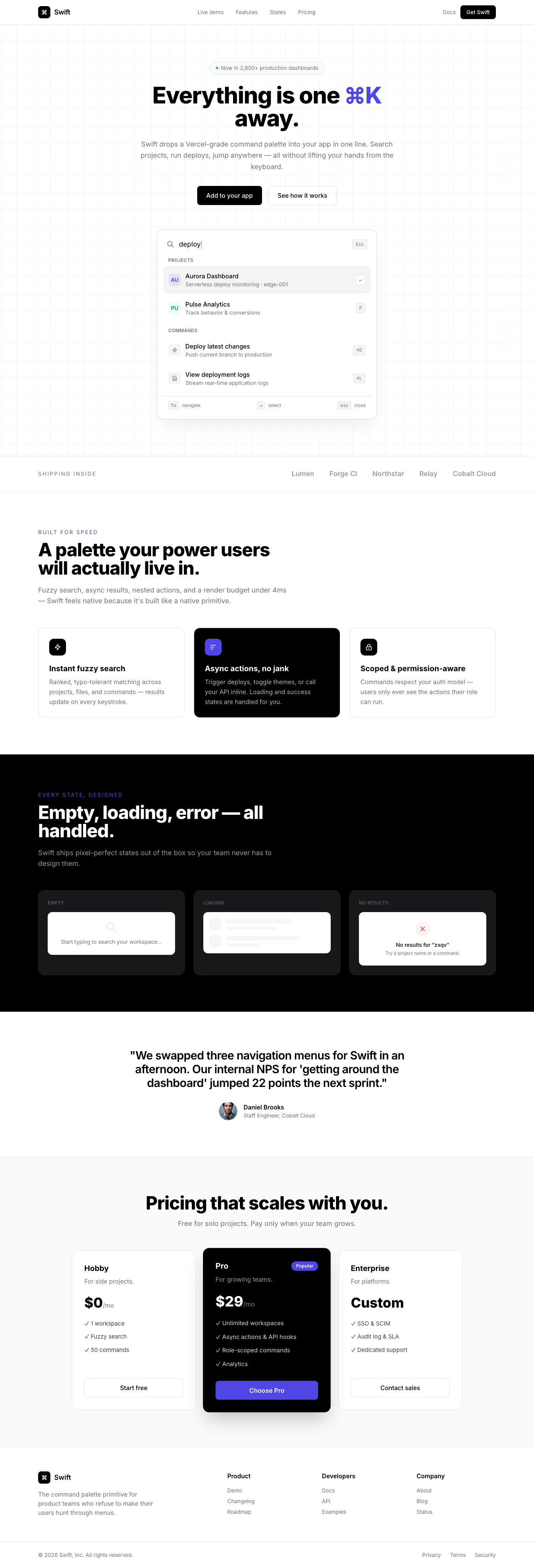
A sophisticated, Vercel-inspired command palette quick search component designed for rapid navigation and command execution within a web application. It offers …

Dashboard
Notion-Inspired Multi-Column Technical Doc Component

Notion-Inspired Multi-Column Technical Doc Component

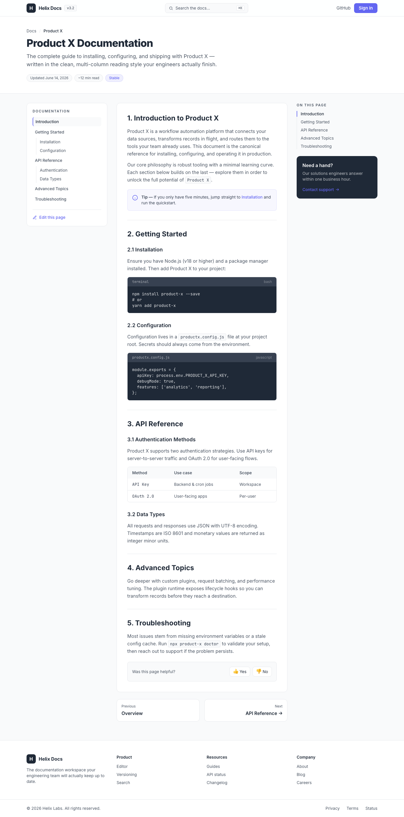
This UI component delivers a production-ready, multi-column layout designed for technical documentation, drawing strong inspiration from Notion's signature clea…

Dashboard
Neo-Brutal Project Portfolio Masonry

Neo-Brutal Project Portfolio Masonry

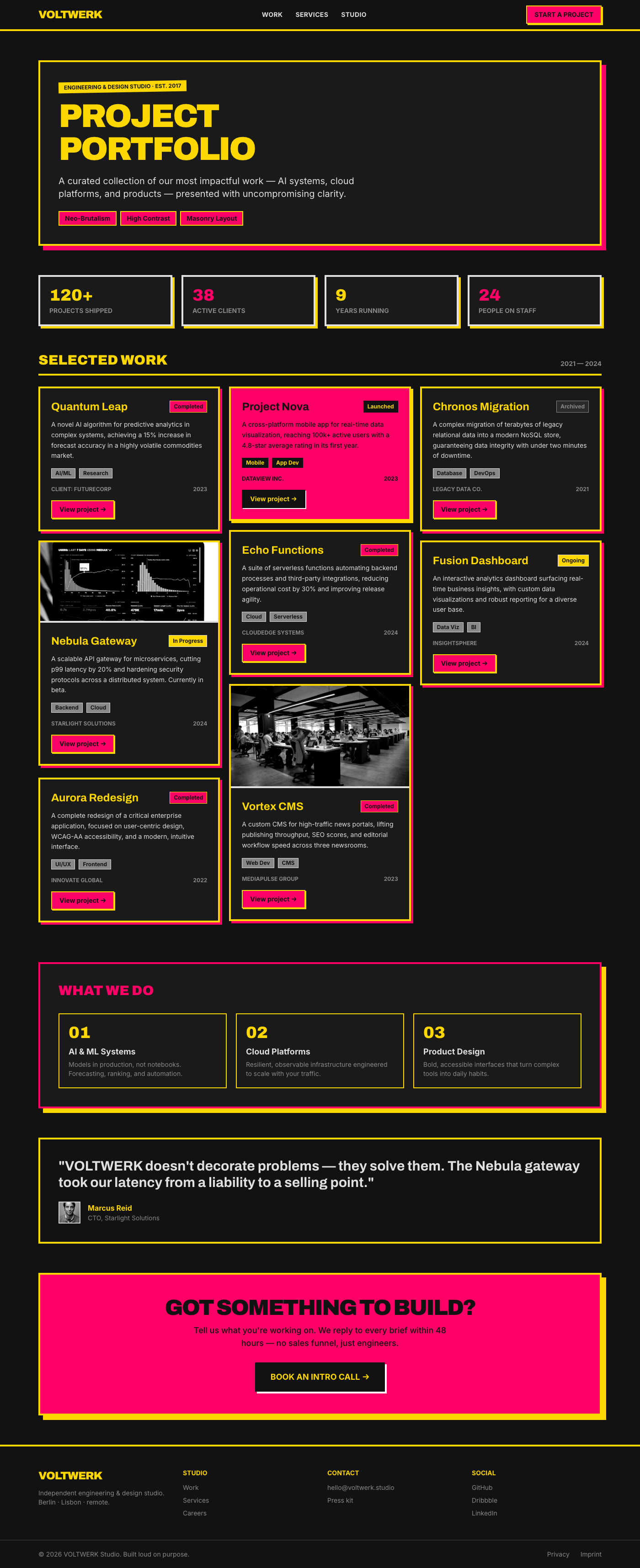
This UI component delivers a robust and visually striking project portfolio designed with a Neo-Brutalism aesthetic. It showcases projects using a dynamic mason…

Dashboard