Cosmic Forge Dashboard
The Cosmic Forge Dashboard is a meticulously crafted tabbed interface designed for optimal clarity and user engagement. Inspired by leading-edge design systems, it prioritizes a spacious layout, refined typography, and s…
Design Narrative
Full Context
The Cosmic Forge Dashboard is a meticulously crafted tabbed interface designed for optimal clarity and user engagement. Inspired by leading-edge design systems, it prioritizes a spacious layout, refined typography, and subtle visual depth.
Each element is carefully considered to contribute to an uncluttered, high-end experience, making complex data digestible and interactions intuitive. It's a perfect foundation for any application demanding a professional, polished, and breathtaking user interface.
Related context
Related Playbooks & Collections
Jump between the strategy playbook and the curated collection connected to this design.
Playbooks
UX Psychology in Modern Interfaces
Translating behavioral economics triggers into UI copy and micro-interactions.
Read PlaybookSaaS Landing Page UX Strategy
Deploy Stripe, Linear, and Vercel–backed messaging stacks, social proof layouts, and multi-variant heroes in a single sprint.
Read PlaybookCollections
Subscription Management UI
Subscription management screens that clarify plans, invoices, and downgrade paths without frustration.
View CollectionOnboarding & Activation Flows
Activation-focused onboarding patterns that guide users to value moments quickly without overloading them.
View CollectionGallery slider
More Dashboard concepts
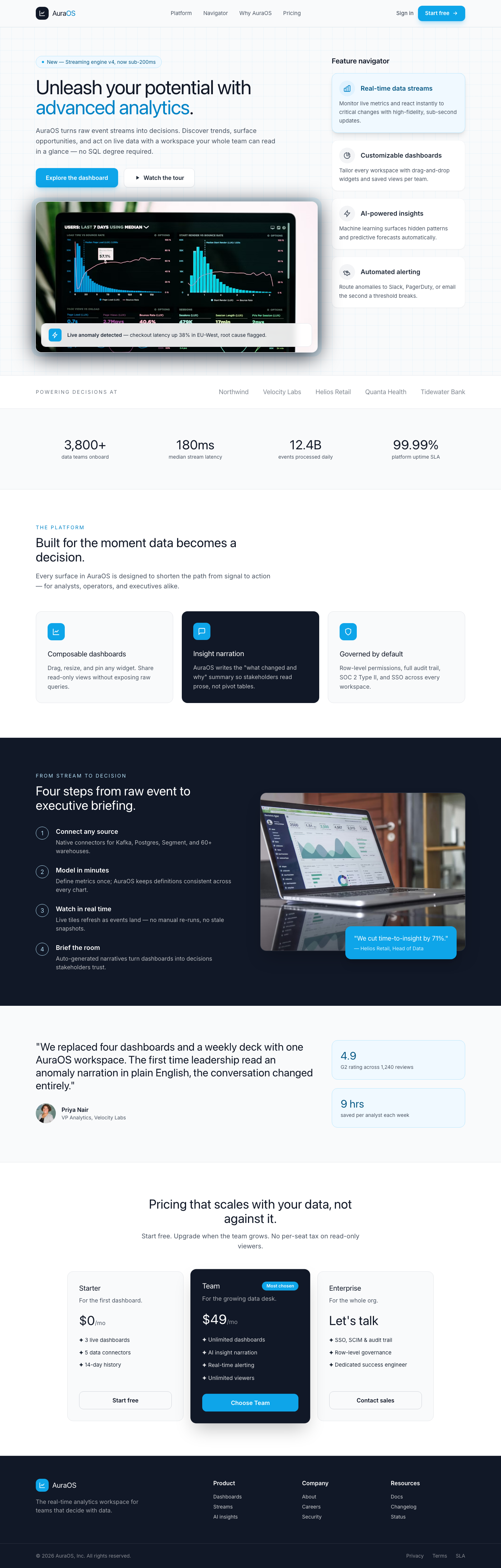
AuraOS: Advanced Analytics Feature Navigator
This component presents a sophisticated split-screen layout ideal for a dashboard's feature spotlight or product tour. The left panel serves as a hero section for a primary feature, combining a bold headline, rich descriptive text, a captivating image, and clear calls-to-action. The right panel acts as a 'feature navigator,' displaying a curated list of sub-features or related content as interactive cards. Each card is designed for easy scanning, with an icon, title, and concise description, and features a subtle hover effect that indicates interactivity. The active card uses a soft accent color to signify selection, maintaining visual harmony.
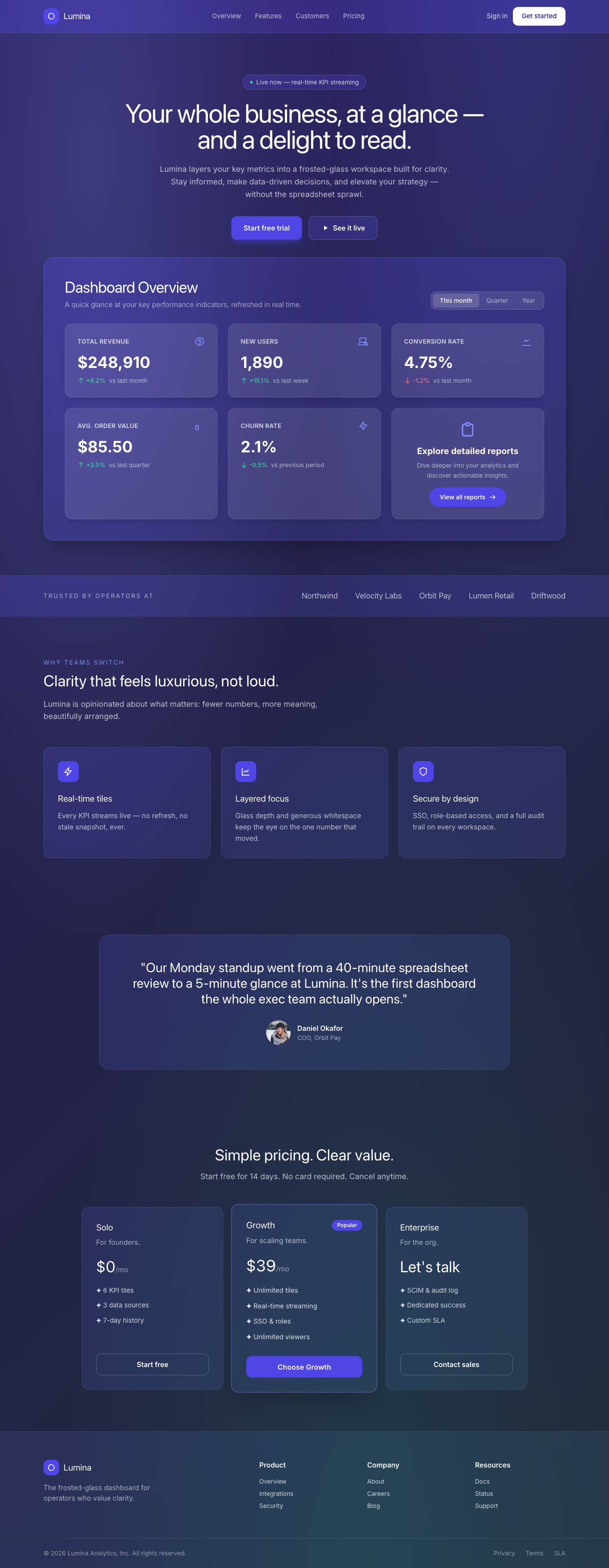
Frosted Glass Dashboard Overview
A breathtaking, premium dashboard overview component featuring a sophisticated frosted glassmorphism aesthetic. It presents key performance indicators (KPIs) in a layered, breathable layout, emphasizing clarity and elegance. Each metric is housed in an interactive, translucent card, designed with generous whitespace, subtle shadows, and refined typography. The component offers a polished, high-end experience, reminiscent of leading tech product UIs, making data consumption feel luxurious and intuitive.
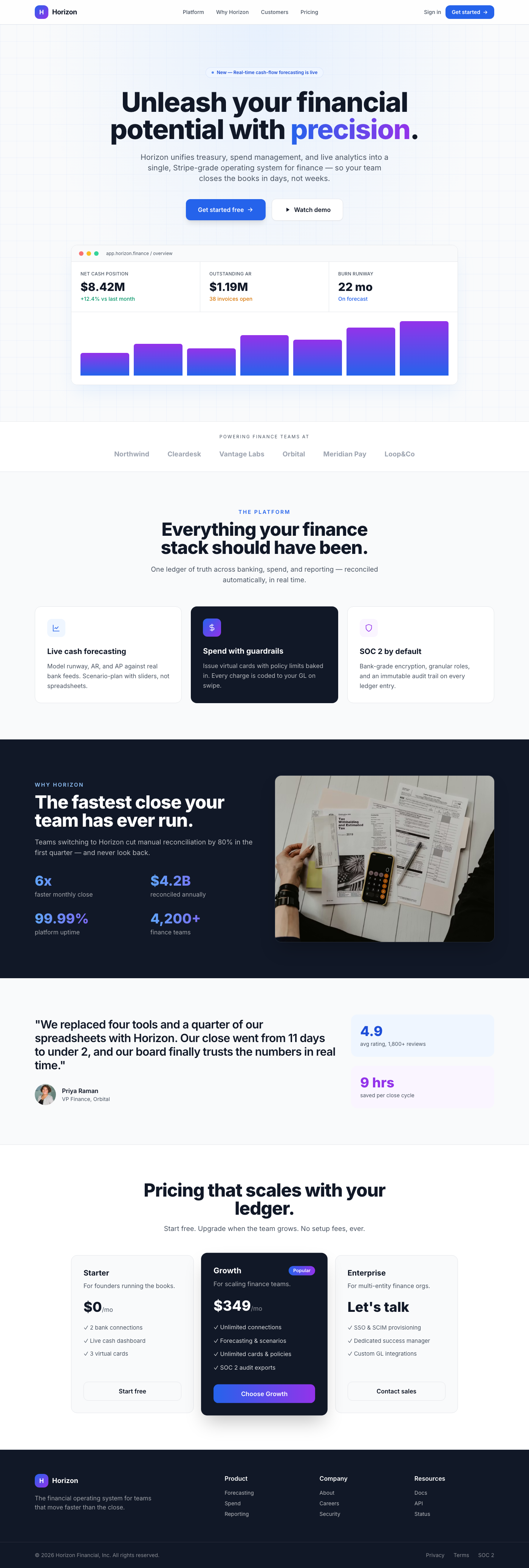
Fintech Horizon Hero
A premium, Stripe-inspired hero section for fintech dashboards, featuring a center-aligned call-to-action, elegant depth, and sophisticated typography. Designed for high-end web applications prioritizing user experience and visual polish.
Fintech Hero: Seamless Insights
This premium UI component is a meticulously designed hero section for a dashboard, embodying the clean, sophisticated aesthetic of leading fintech platforms like Stripe. It presents a powerful central message with a high-contrast headline and a highly readable body paragraph, elegantly guiding users towards key actions. The design champions breathability and luxury through generous whitespace, a refined neutral color palette with a strategic indigo accent, and a sophisticated interplay of shadows and borders. Every interactive element features smooth, engaging transitions, ensuring a delightful and intuitive user experience that speaks to trust and innovation.
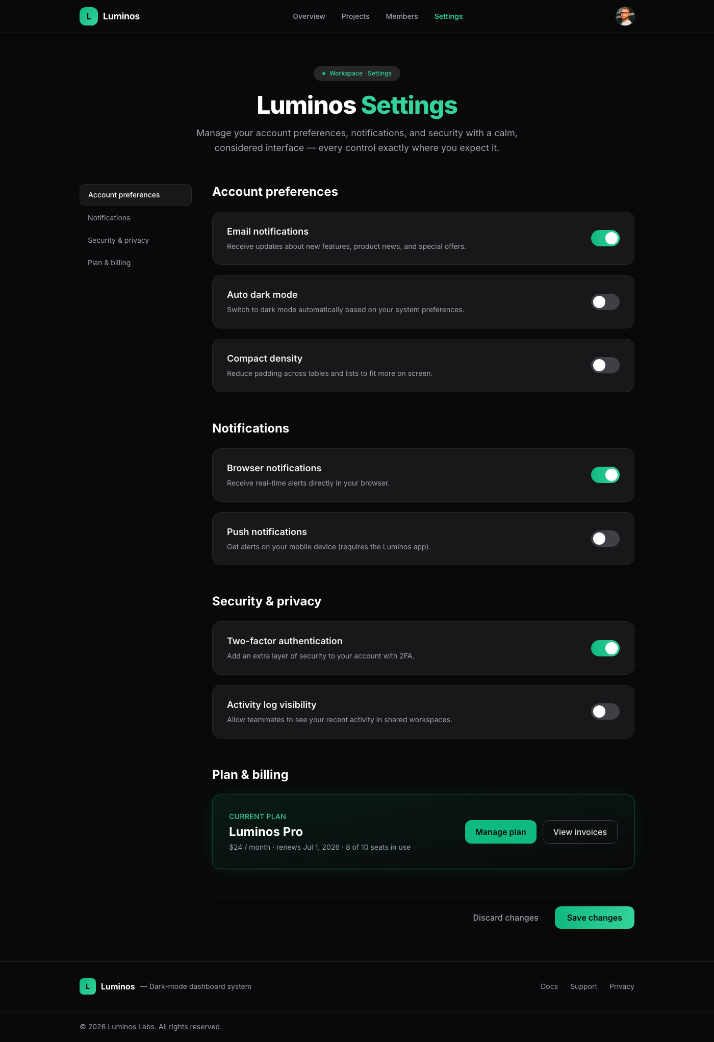
Luminos Dark Settings
A meticulously crafted settings page component, embodying 'Linear App Dark Mode Elegance'. It offers a luxurious and intuitive user experience through its spacious layout, sophisticated typography, and subtle depth. Each setting item is a visually distinct card with smooth hover transitions, while custom-designed toggle switches provide clear feedback and delightful animations. This component is ideal for dashboards and applications demanding a polished, high-end interface.
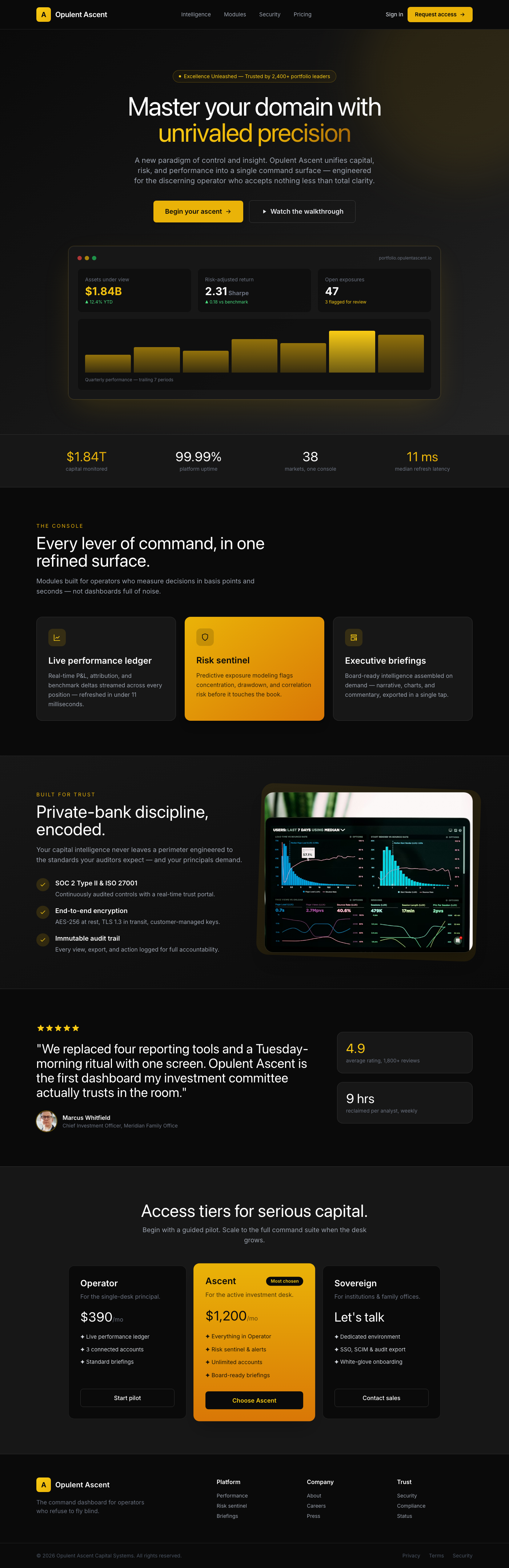
Opulent Ascent Dashboard Hero
The 'Opulent Ascent Dashboard Hero' is a meticulously crafted UI component designed to be the focal point of any premium dashboard or landing page. It projects an aura of exclusivity and high performance, utilizing a rich 'Luxury Gold & Deep Black' aesthetic. With its expansive whitespace, elegant typography, and subtle dimensional effects, it creates an immersive and refined user experience. The central call-to-action is prominently featured, guiding users towards an aspirational journey, while smooth, responsive interactions ensure a truly polished feel.
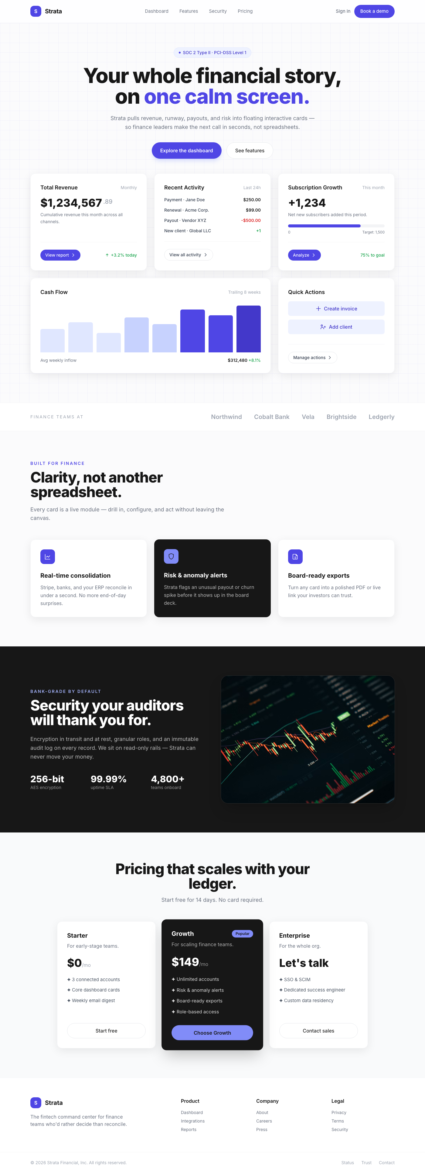
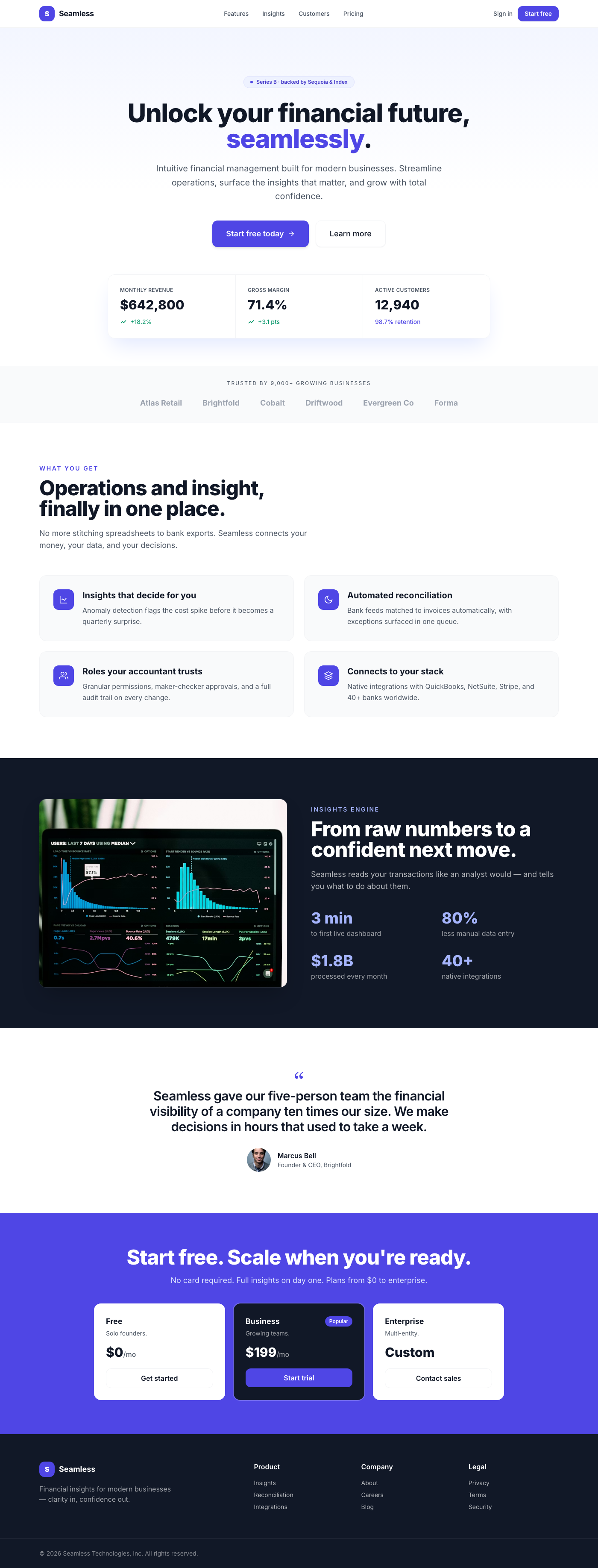
Fintech Dashboard: Floating Interactive Cards
Presenting a masterclass in modern dashboard design, these 'Floating Interactive Cards' offer a premium user experience akin to the world's leading fintech platforms. Each card is a meticulously crafted module, designed to deliver critical information with unparalleled clarity and elegance. The design prioritizes visual comfort and intuitive interaction, transforming complex data into an engaging and accessible narrative. With its refined aesthetics, fluid transitions, and strategic use of depth, this component elevates the standard dashboard into a truly luxurious digital interface.
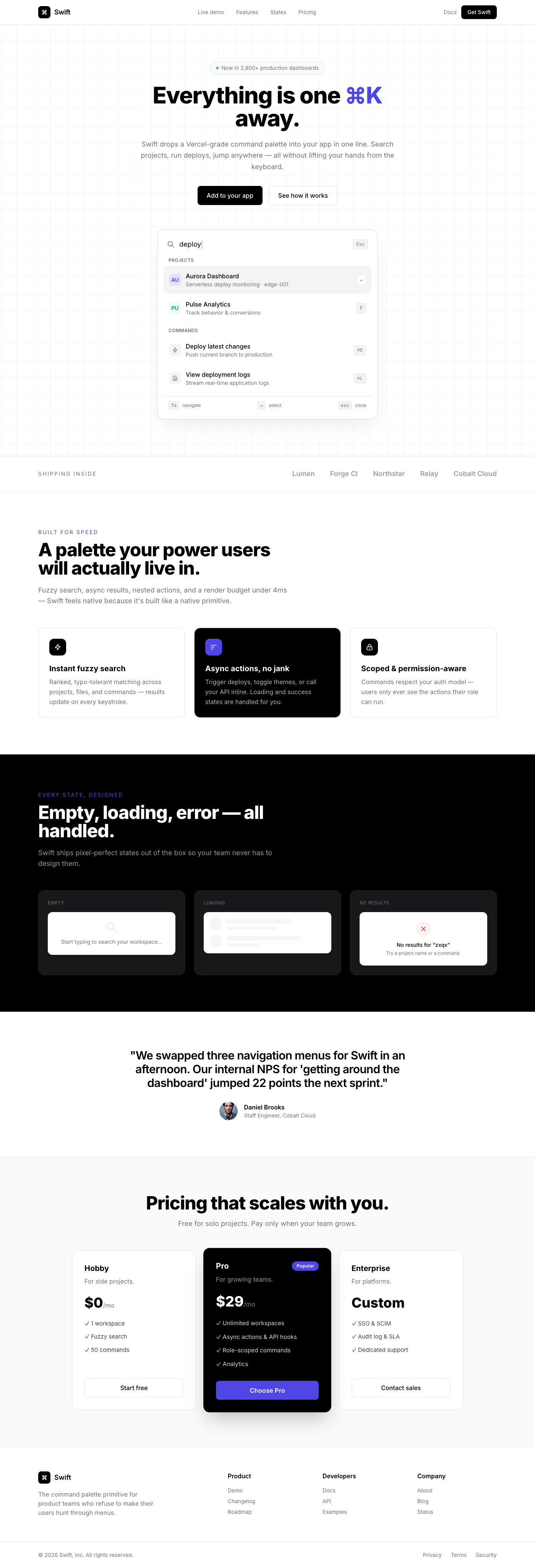
Vercel-Inspired Command Palette Quick Search
A sophisticated, Vercel-inspired command palette quick search component designed for rapid navigation and command execution within a web application. It offers a pristine, minimalist interface with a focus on discoverability and user experience, featuring elegantly designed 'card' results that respond with premium, tactile hover effects.