Neo-Brutalist Blog Design
A modern, bold blog page design with a neo-brutalism aesthetic, tailored for tech enthusiasts and developers.
Blog
A practical guide that ties LCP, CLS, and INP to UI decisions, covering skeletons, font strategy, and third-party governance.
Summary
How to bake performance guardrails into design system tokens.
Best For
Core Web Vitals are user-perceived performance metrics that define whether an interface feels fast, stable, and responsive. UI decisions directly influence LCP, CLS, and INP—often more than backend optimizations.
This playbook translates performance targets into UI system guidance: how to design hero sections, reserve space for late-loading elements, and avoid interaction jank. The goal is to make performance a design system feature, not a one-off fix.
Expand the section for execution details, the most common pitfalls, and an actionable checklist that teams can apply during design review and implementation.
LCP is typically your hero image, headline, or first meaningful card. This means the hero is a performance feature. Use a properly sized image (usually 1200px wide), preload it when possible, and avoid heavy overlays that delay render. Skeletons must match final dimensions to prevent shifts.
Use explicit tokens in the design system: hero height, image aspect ratio, and typography scale. If these values are standardized, you reduce the risk of designers or engineers introducing accidental LCP regressions.
CLS occurs when late-loading elements shift content. The fix is structural: reserve space for ads, embeds, and dynamic widgets. Use fixed-height placeholders and avoid injecting elements above existing content after the initial render.
Animation is another common culprit. Use transforms instead of top/left changes, and never animate layout-affecting properties in high-traffic areas. Stable layout behavior improves both UX trust and SEO performance.
INP measures how quickly the UI responds after user interaction. Heavy client-side scripts, large event handlers, or layout thrash can degrade it. Optimize by keeping interaction targets lightweight and delaying non-critical scripts until after user engagement.
From a design system perspective, limit hover effects and micro-interactions that rely on JavaScript. Whenever possible, use CSS transitions and hardware-accelerated properties to keep interactions under 16ms.
Start with LCP because it defines first impression speed. If LCP is strong, CLS and INP are easier to manage.
Reserve space for dynamic content using placeholders and fixed heights so layout does not shift after load.
Reduce heavy scripts in interactive areas and use CSS-based interactions whenever possible.
LCP Strategy
The LCP element is usually the hero image, headline, or first meaningful card on the page.
Structured Summary
Combine image optimization, font preconnect, and skeletons to stay under 1.8 seconds.
Execution steps
CLS Zero Plan
CLS occurs when late-loading elements push the layout out of place.
Structured Summary
Reserve fixed heights for ads and third-party slots, and rely on transforms for transitions.
Execution steps
Collections
Developer Docs Layouts
Documentation patterns that balance quick starts, reference depth, and copy-paste blocks for developer audiences.
Knowledge Base & Help Centers
Help center layouts that surface top questions, guides, and search tools without friction.
Design System Libraries
Design system pages that document tokens, components, and usage guidelines with clarity.
Further Reading
Featured Designs
Recent layouts from this playbook’s associated collections. Use them to audit how the strategy translates into production UI states.
A modern, bold blog page design with a neo-brutalism aesthetic, tailored for tech enthusiasts and developers.
The emotional core is deep academic rigor—the feeling of uncovering forgotten, meticulously documented knowledge. The un...
It feels like confronting a perfectly organized, yet deliberately raw, machine—intellectual intensity meets visceral, ta...
It feels like peering into the infinite; a place where knowledge is illuminated by distant, vibrant nebulae. The visual ...
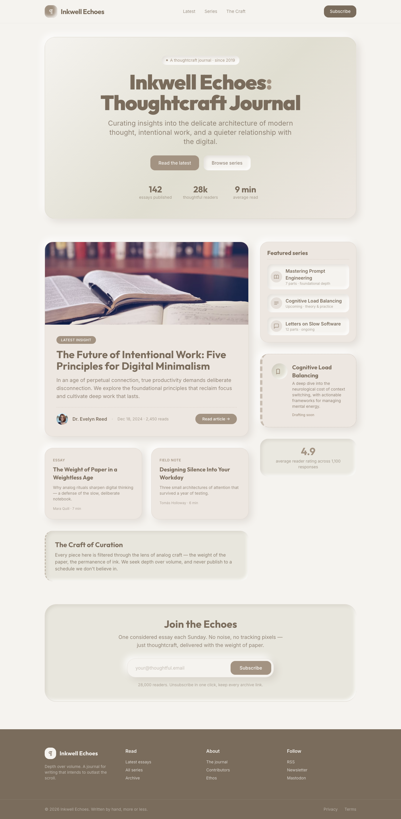
The experience should feel like interacting with meticulously curated, warm, physical objects, blending digital utility ...
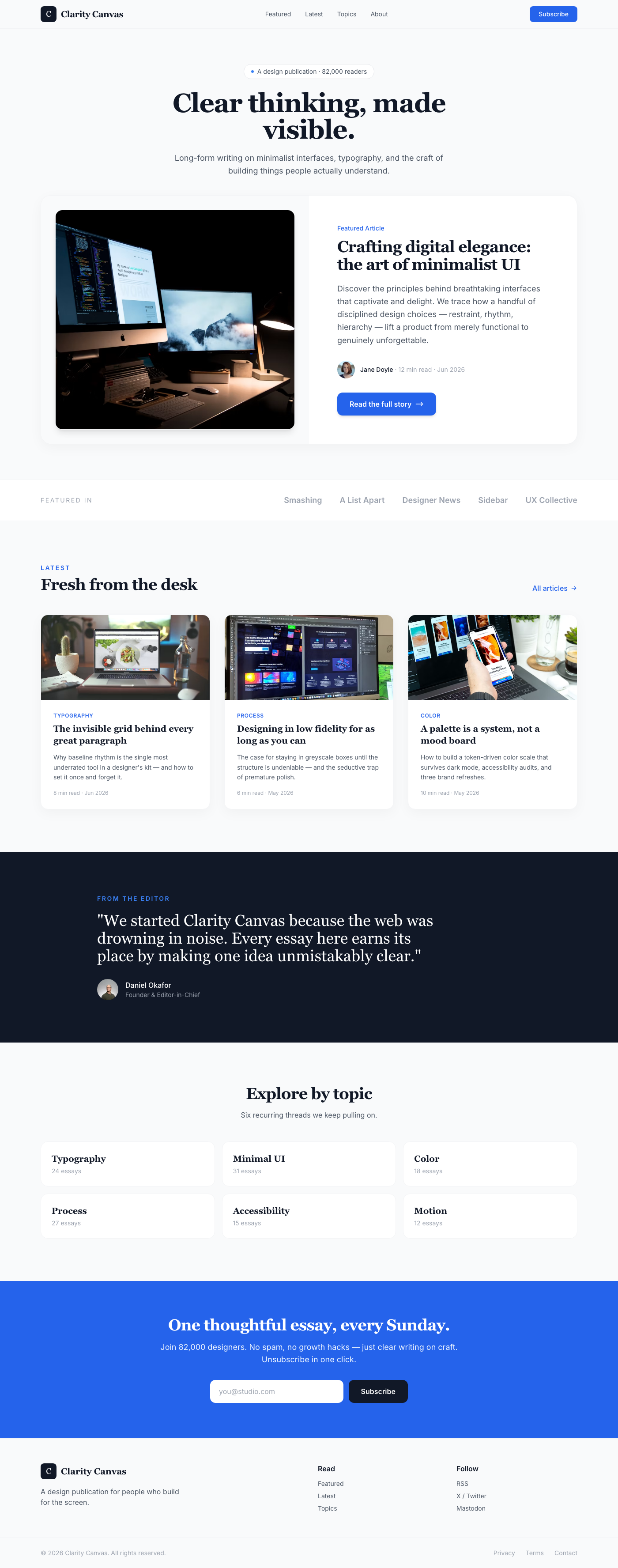
A premium, Apple-inspired UI component designed for showcasing a featured blog post or key content. It employs a clean s...
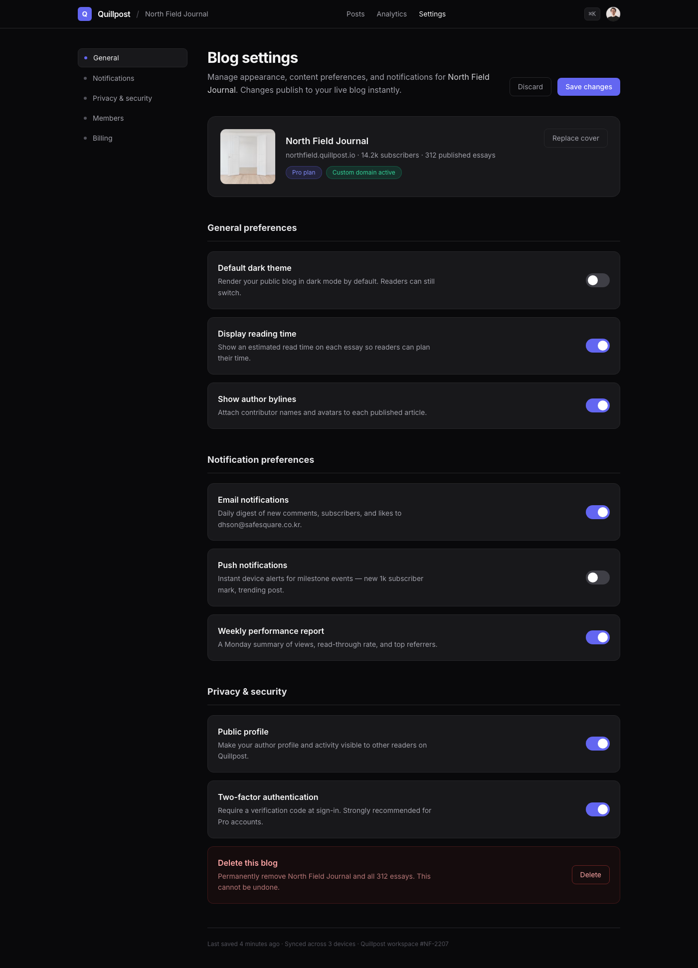
A luxuriously crafted blog settings page component, designed with a dark mode aesthetic reminiscent of Linear. It featur...