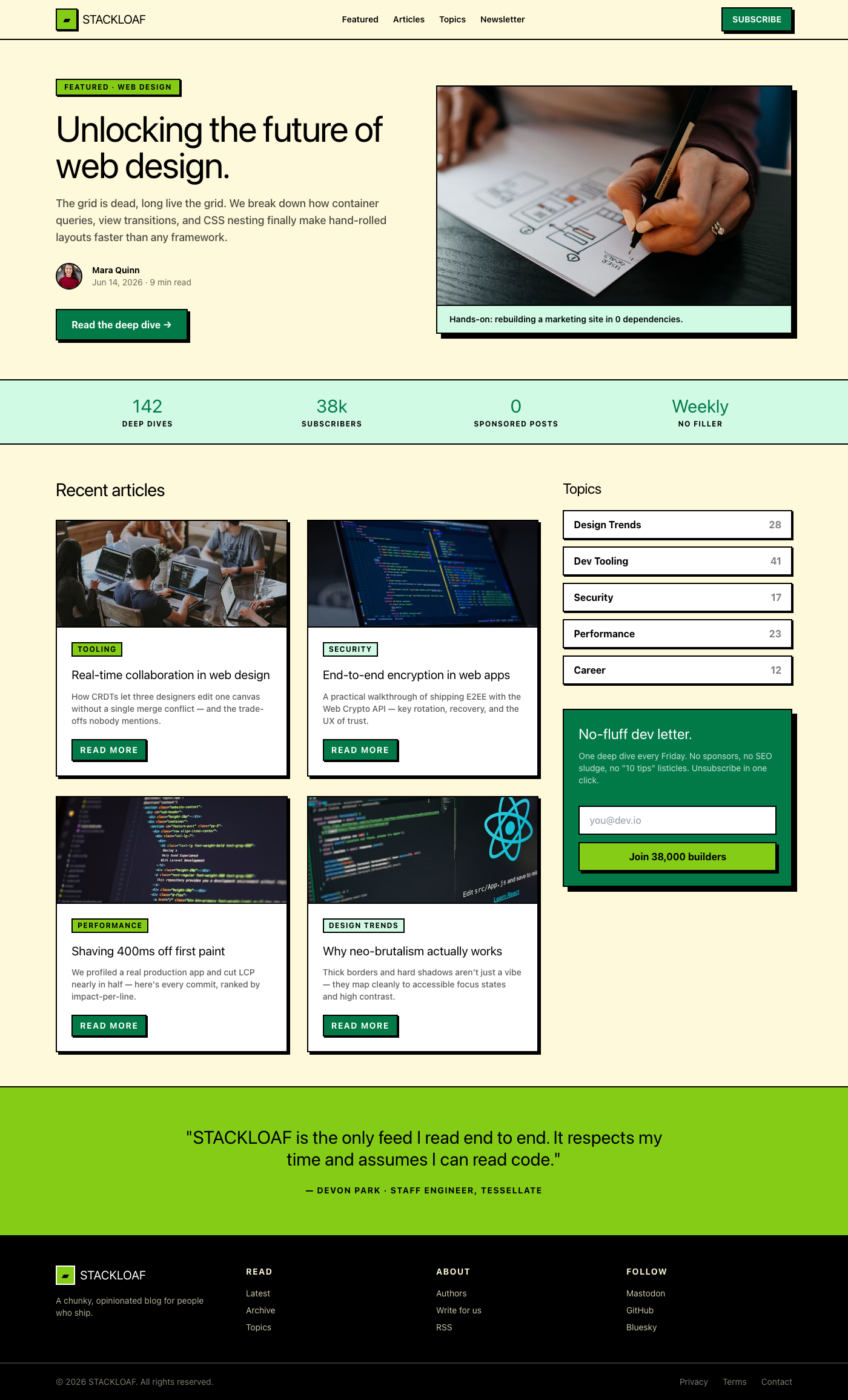
Clarity Canvas: Split Feature Display
A premium, Apple-inspired UI component designed for showcasing a featured blog post or key content. It employs a clean split-screen layout, featuring a prominent, high-fidelity image alongside a compelling headline, deta…
Design Narrative
Full Context
A premium, Apple-inspired UI component designed for showcasing a featured blog post or key content. It employs a clean split-screen layout, featuring a prominent, high-fidelity image alongside a compelling headline, detailed description, and a clear call-to-action.
Crafted with abundant whitespace, refined typography, subtle depth, and smooth interactions to deliver a luxurious and highly readable user experience.
Related context
Related Playbooks & Collections
Jump between the strategy playbook and the curated collection connected to this design.
Playbooks
UI Optimization for Core Web Vitals
How to bake performance guardrails into design system tokens.
Read PlaybookSaaS Landing Page UX Strategy
Deploy Stripe, Linear, and Vercel–backed messaging stacks, social proof layouts, and multi-variant heroes in a single sprint.
Read PlaybookCollections
Knowledge Base & Help Centers
Help center layouts that surface top questions, guides, and search tools without friction.
View CollectionDeveloper Docs Layouts
Documentation patterns that balance quick starts, reference depth, and copy-paste blocks for developer audiences.
View CollectionGallery slider
More Blog concepts
Neo-Brutalist Blog Design
A modern, bold blog page design with a neo-brutalism aesthetic, tailored for tech enthusiasts and developers.
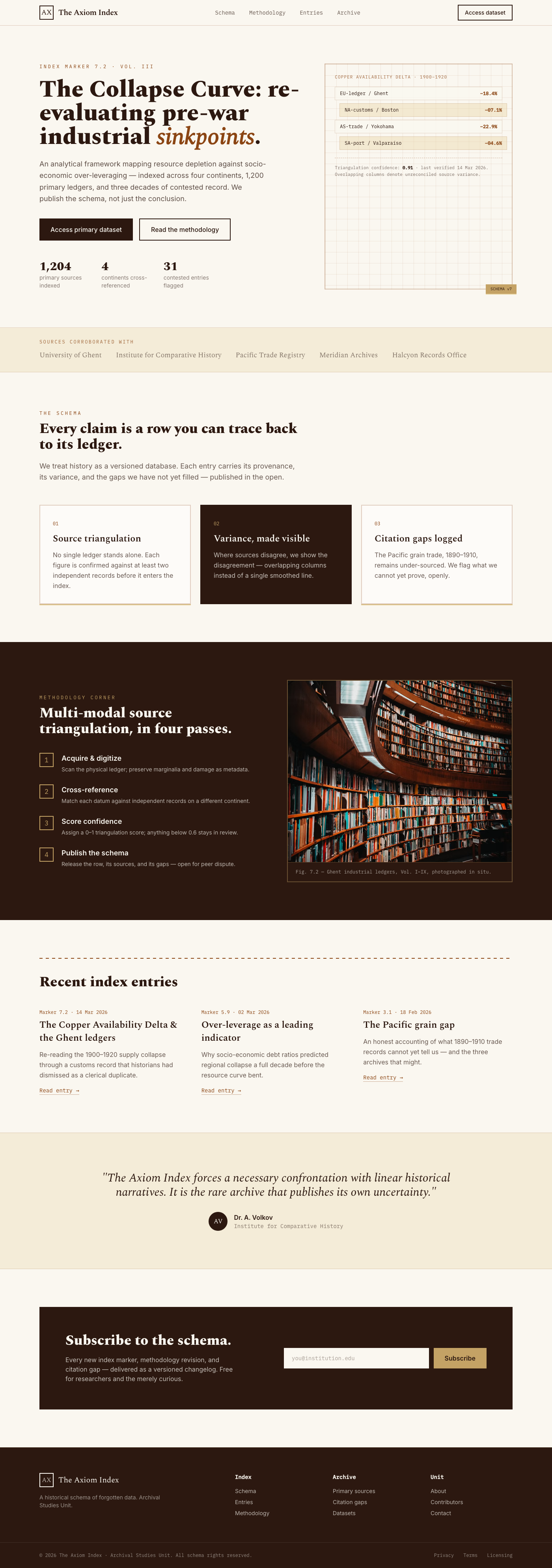
The Axiom Index: Historical Schema
The emotional core is deep academic rigor—the feeling of uncovering forgotten, meticulously documented knowledge. The unforgettable visual choice is the aggressive, deconstructed data matrix on the right side of every major section, overlapping textual columns to suggest a physical, layered archival document.
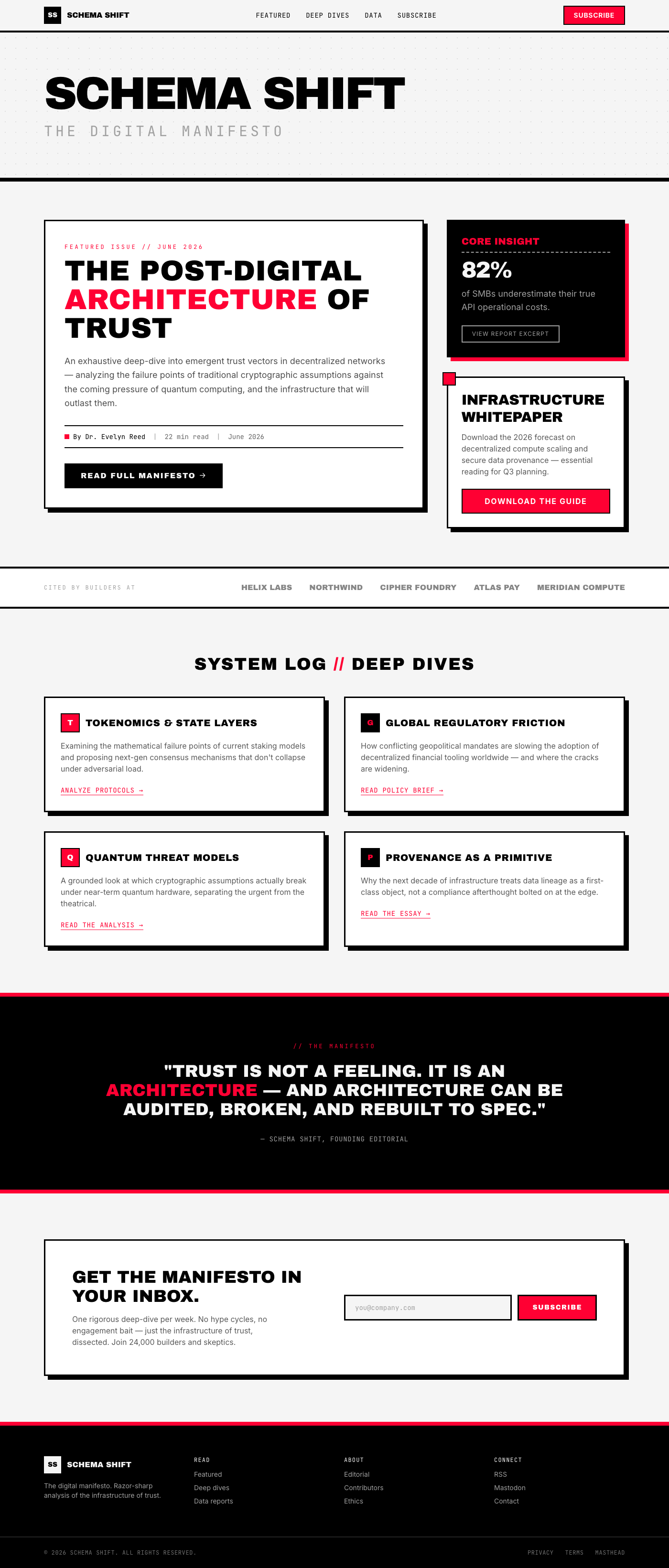
Schema Shift: The Digital Manifesto
It feels like confronting a perfectly organized, yet deliberately raw, machine—intellectual intensity meets visceral, tangible grit. The visual hook is the aggressive juxtaposition of razor-sharp black typography against deeply textured, shadow-defined planes.
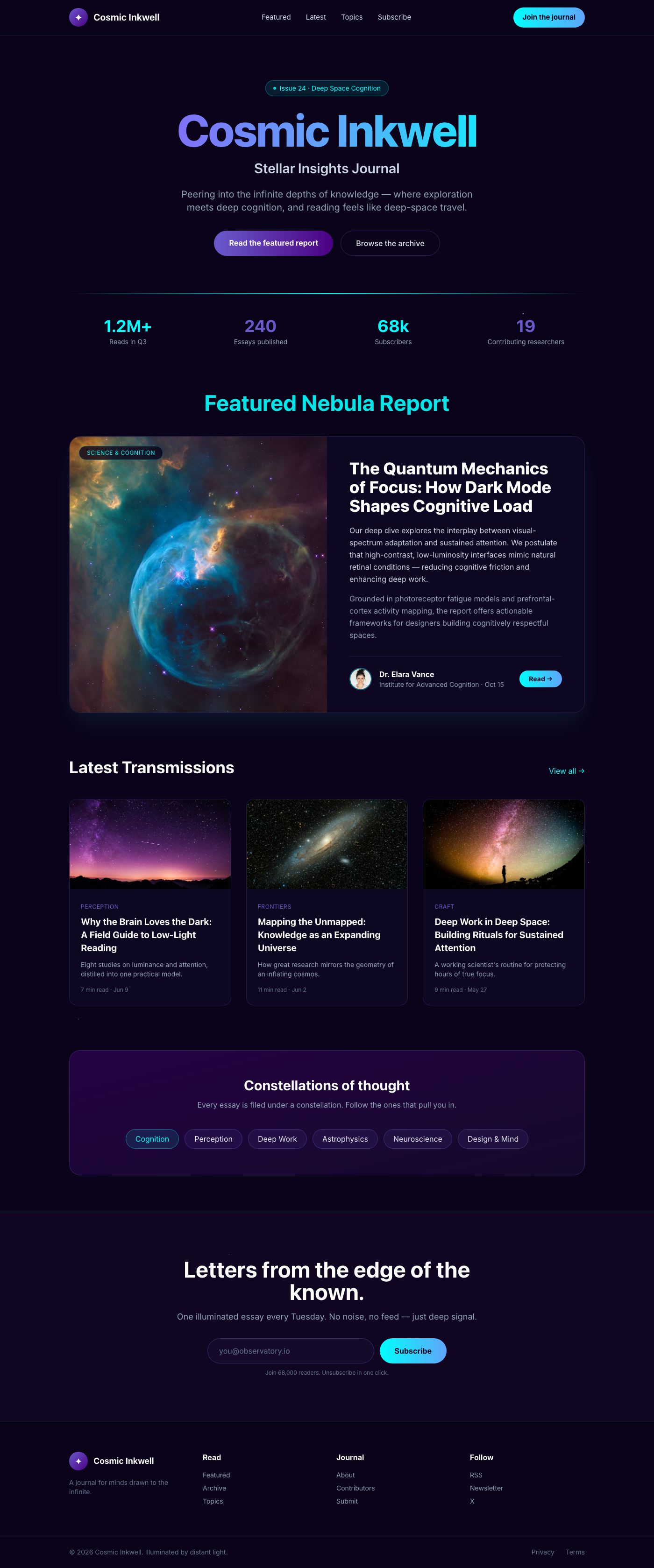
Cosmic Inkwell: Stellar Insights Journal
It feels like peering into the infinite; a place where knowledge is illuminated by distant, vibrant nebulae. The visual hook is an interactive, depth-shifting background that reacts subtly to scroll position, making reading feel like deep-space exploration.
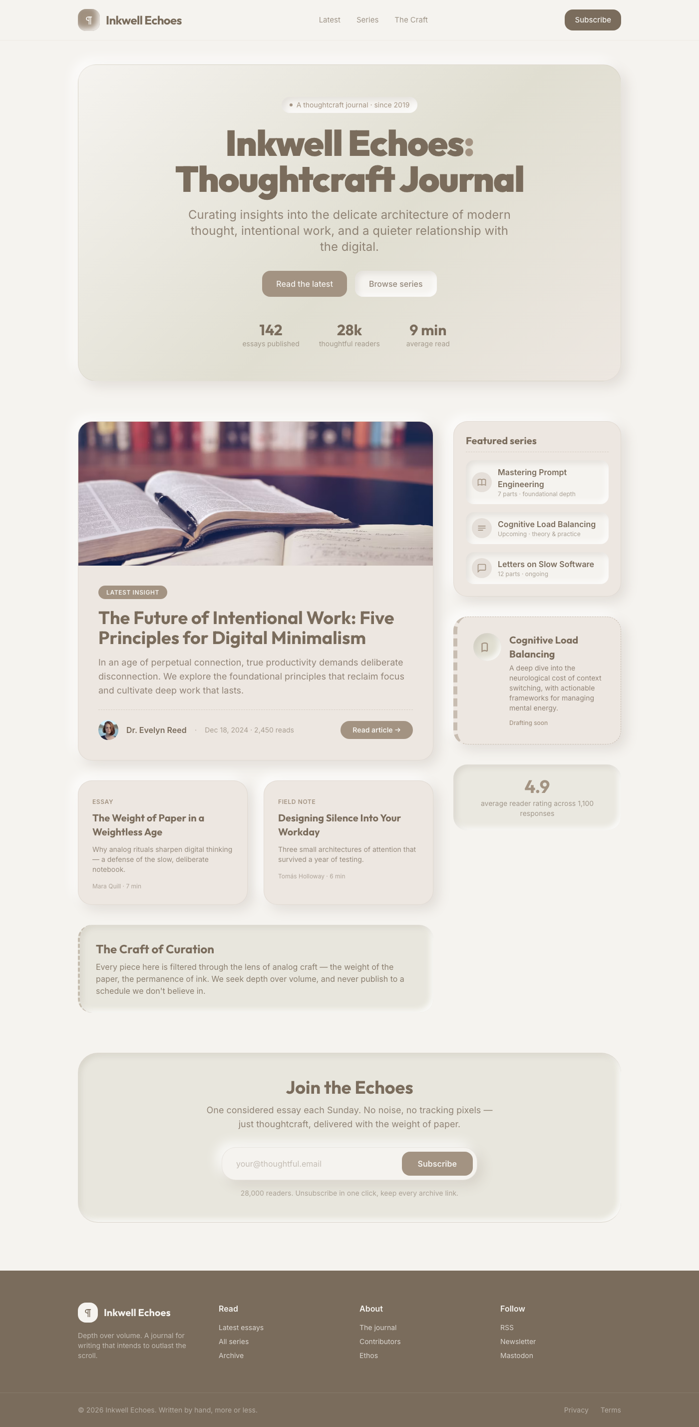
Inkwell Echoes: Thoughtcraft Journal
The experience should feel like interacting with meticulously curated, warm, physical objects, blending digital utility with the tactile comfort of high-end stationery. We will achieve this through soft, buttery depth and playful, extruded dimensionality.
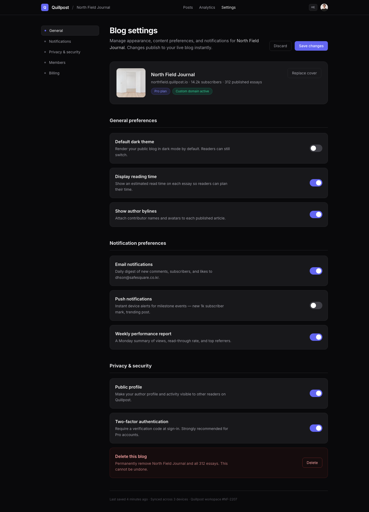
Linear App Dark Mode Blog Settings Page
A luxuriously crafted blog settings page component, designed with a dark mode aesthetic reminiscent of Linear. It features distinct sections for general, notification, and privacy preferences, each containing toggle-based settings presented within elegant, interactive cards. The design emphasizes generous whitespace, refined typography, and subtle depth through shadows and borders, ensuring a premium user experience.