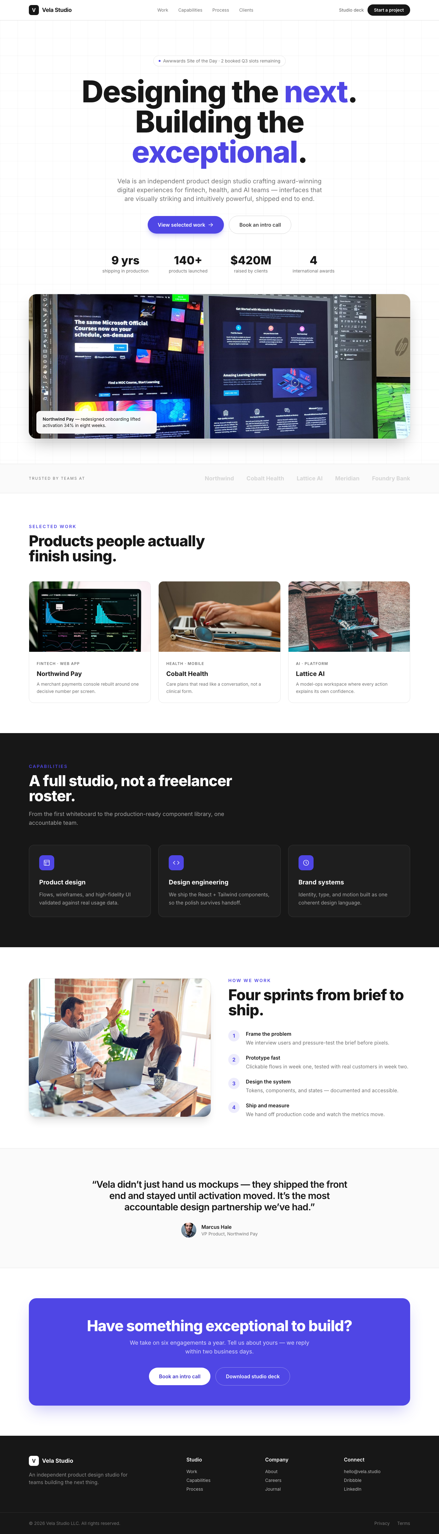
Aura Hero: Minimalist Portfolio Showcase
The 'Aura Hero' is a meticulously crafted hero section designed for premium portfolio websites. It features a stark white backdrop that highlights a central, content-rich card.
Design Narrative
Full Context
The 'Aura Hero' is a meticulously crafted hero section designed for premium portfolio websites. It features a stark white backdrop that highlights a central, content-rich card.
With a focus on impactful typography, generous spacing, and subtle interactive elements, it presents your professional narrative with unparalleled elegance and clarity, inviting users to engage with your work in a truly refined manner.
Related context
Related Playbooks & Collections
Jump between the strategy playbook and the curated collection connected to this design.
Playbooks
UX Psychology in Modern Interfaces
Translating behavioral economics triggers into UI copy and micro-interactions.
Read PlaybookSaaS Landing Page UX Strategy
Deploy Stripe, Linear, and Vercel–backed messaging stacks, social proof layouts, and multi-variant heroes in a single sprint.
Read PlaybookCollections
Portfolio Case Studies
Portfolio case studies structured around problem, process, and outcome so visitors understand impact fast.
View CollectionOnboarding & Activation Flows
Activation-focused onboarding patterns that guide users to value moments quickly without overloading them.
View CollectionGallery slider
More Portfolio concepts
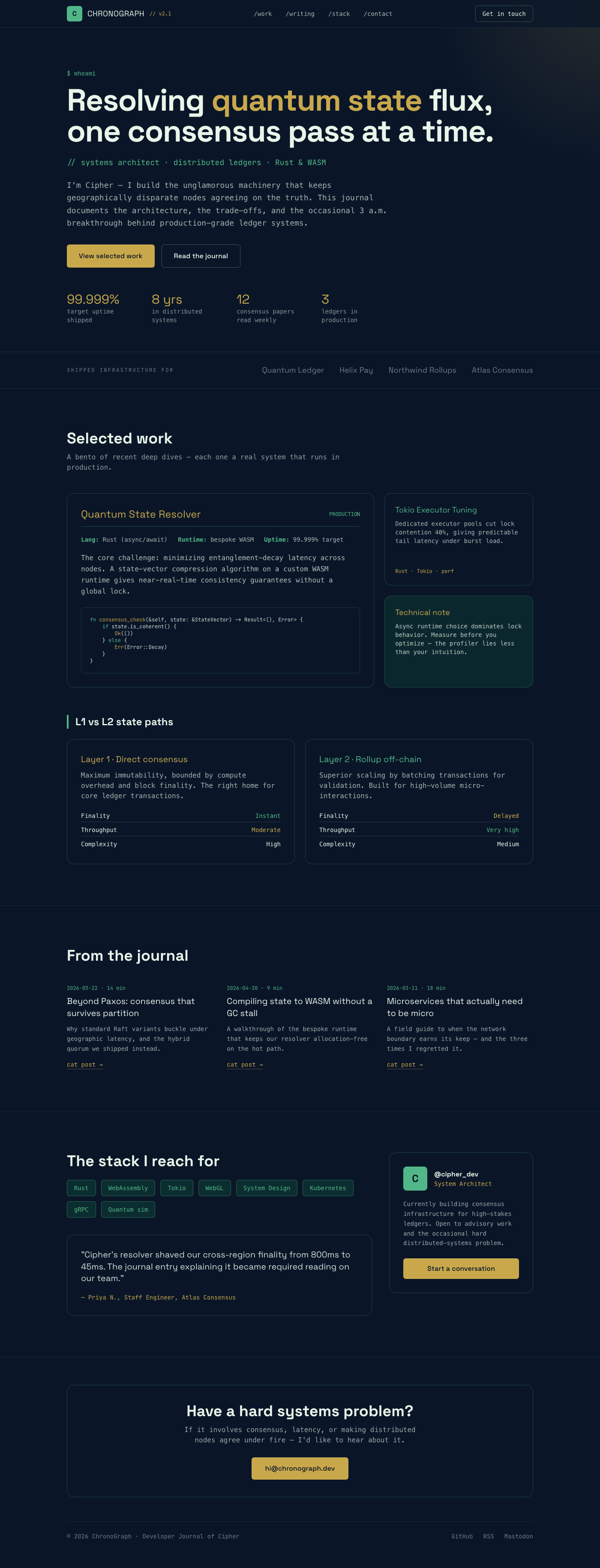
ChronoGraph Developer Journal
The emotional feeling should be one of esoteric, deeply technical mastery; the unforgettable element is the dynamic interplay between structured code blocks and fluid, organic background distortions.
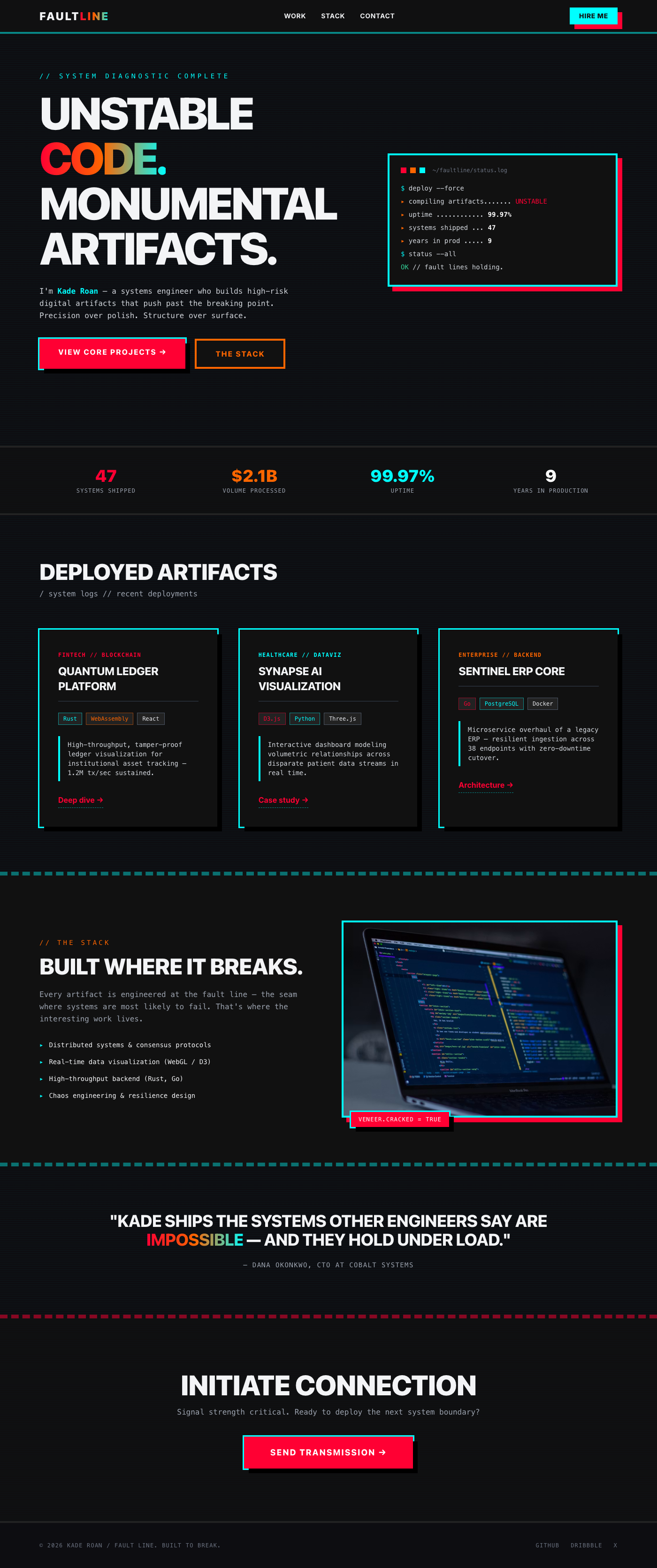
Fault Line: Digital Artifact Portfolio
It feels like a system breaking open, revealing raw, beautiful code underneath a veneer of slick polish. The visual hook is the aggressive, asymmetrical shadow casting, making every element look physically unstable and monumental.
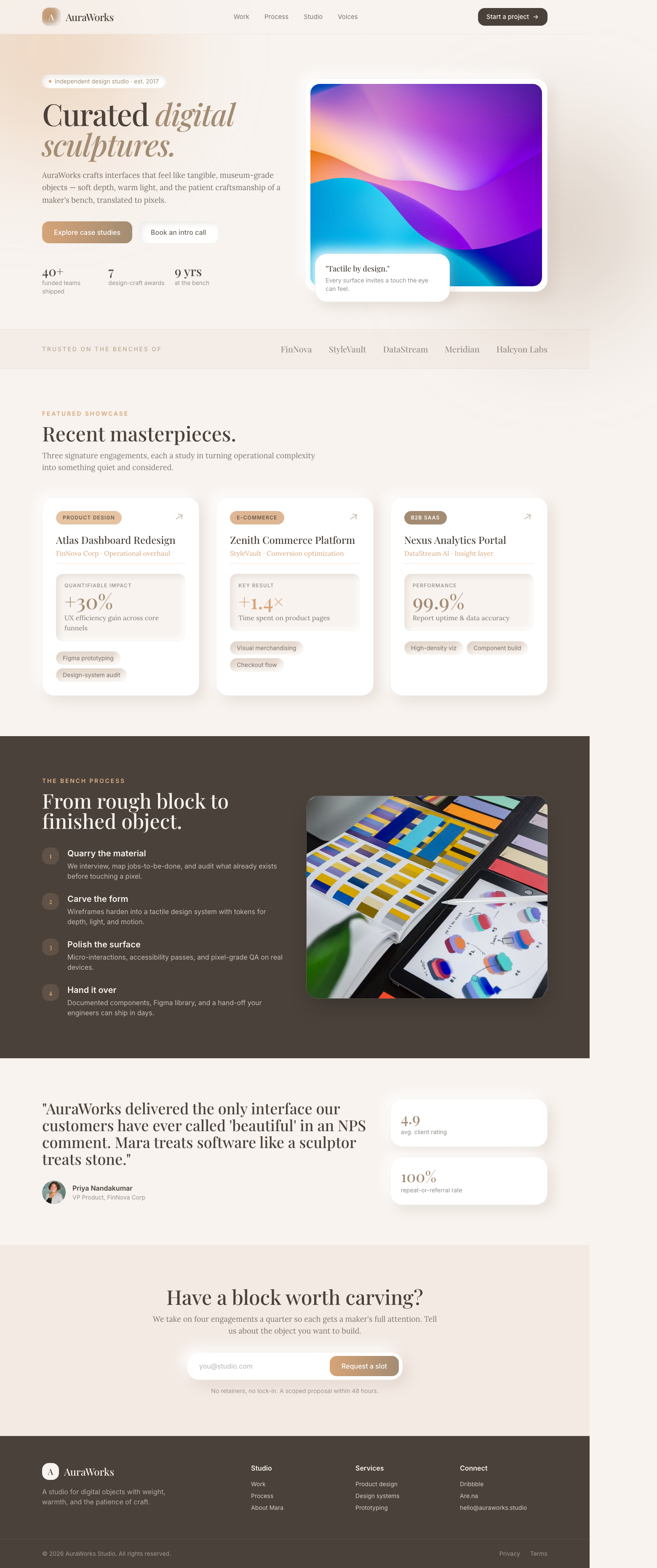
AuraWorks: Curated Digital Sculptures
The portfolio feels like interacting with high-end, tangible museum pieces, blending digital expertise with physical craftsmanship. Users are greeted by a warm, inviting glow suggesting depth and tactile quality.
Elegant Showcase of Craftsmanship and Vision
A clean, spacious layout emphasizing visual work through high-quality imagery. The structure guides the user immediately to the creator's primary call to action.
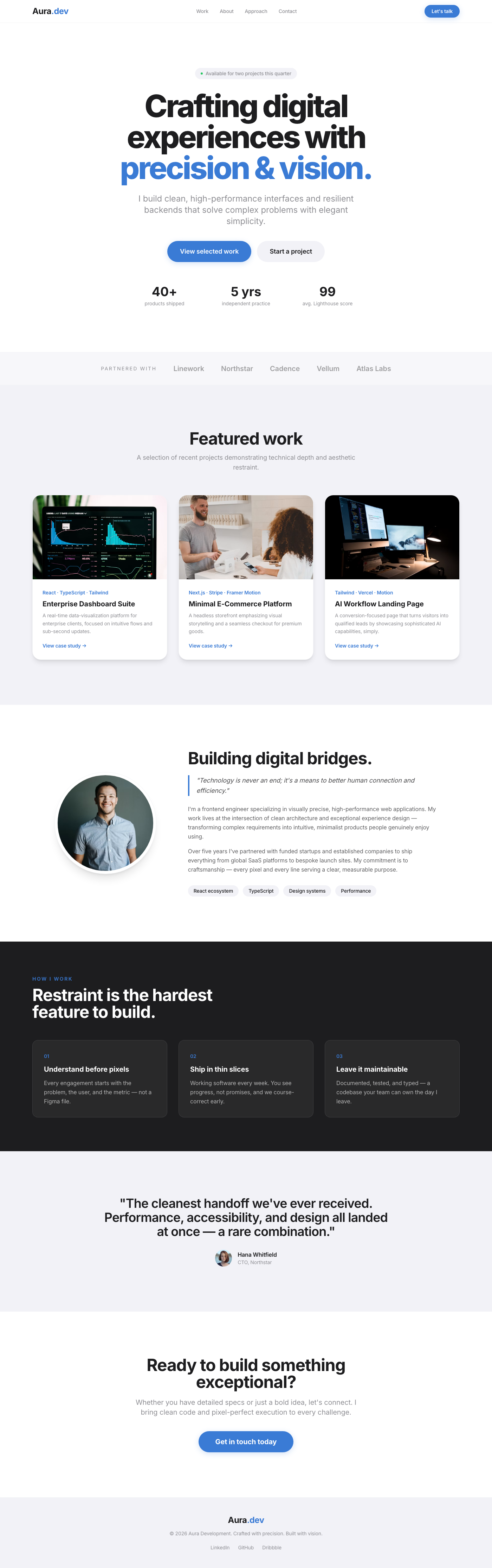
Stripe-Inspired Portfolio Hero: Visionary Impact
A luxuriously designed portfolio hero section, crafted to instantly convey expertise and sophistication. It features an expansive layout, bold yet refined typography, and subtle interactive elements, all rendered with a clean, modern aesthetic inspired by leading fintech platforms like Stripe. This component serves as an impactful first impression, drawing users into a world of award-winning digital design with elegance and clarity.
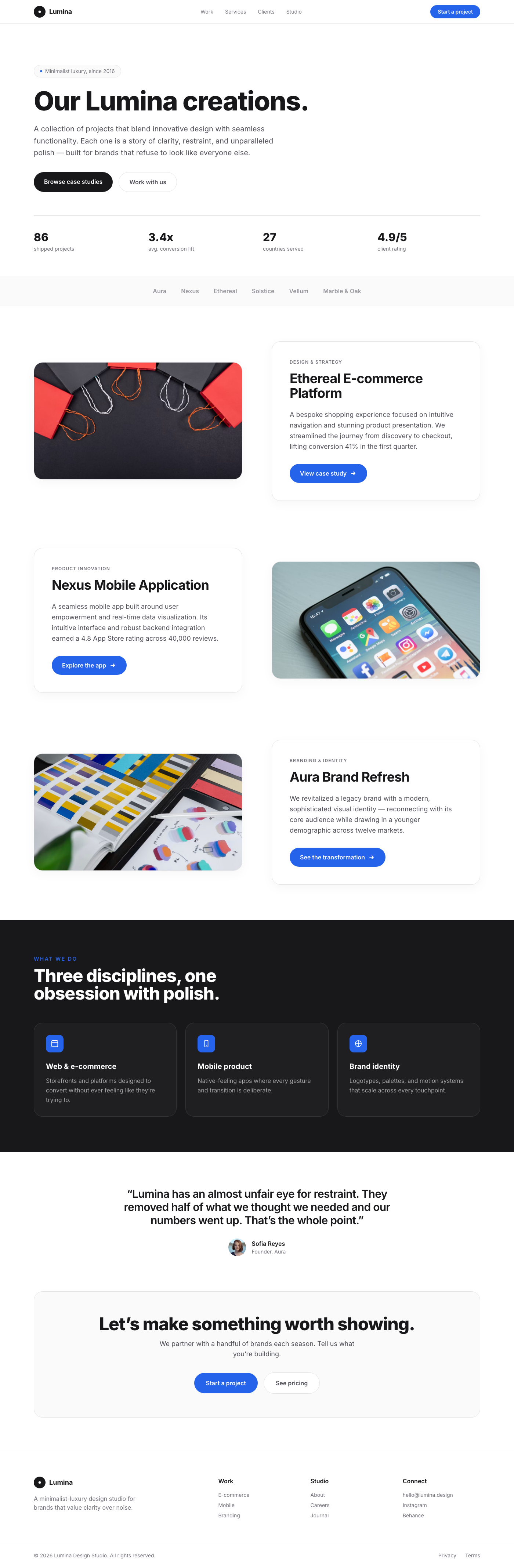
Lumina Portfolio Showcase
The Lumina Portfolio Showcase is a testament to minimalist luxury, offering a dynamic and engaging way to present portfolio projects or key features. Each section acts as a visually rich storytelling unit, inviting users to explore with its intuitive layout and captivating design. It's built for designers, agencies, or professionals seeking to display their work with unparalleled polish and sophistication.
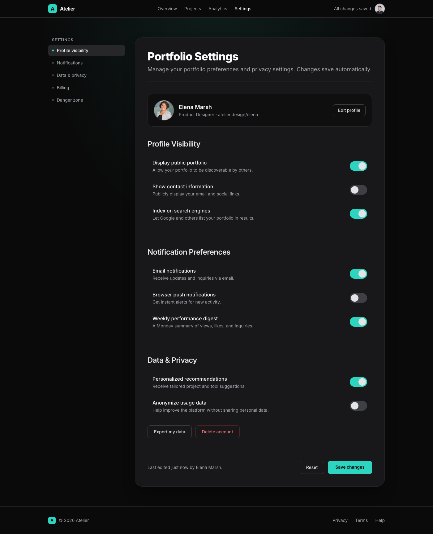
Elegant Dark Mode Portfolio Settings Page
This UI component presents a 'Portfolio Settings' page with a Linear App-inspired dark mode elegance. The design features a spacious layout, ensuring visual calm and ease of use. The main settings panel is a rounded card in a deep zinc-900, bordered by a subtle zinc-800 line and casting a soft, deep shadow. The header introduces the page with a bold title and a calming subtitle. Settings are categorized logically, each section beginning with a clear sub-heading. Individual setting options are presented as interactive rows, each containing a descriptive label and an elegant custom toggle switch. Hovering over a setting row reveals a gentle background change, providing smooth visual feedback. The typography leverages the Inter font, using strong weights for headings and soft, readable tones for body text. The accent color, a refined teal, highlights active toggle states, adding a touch of modern sophistication.
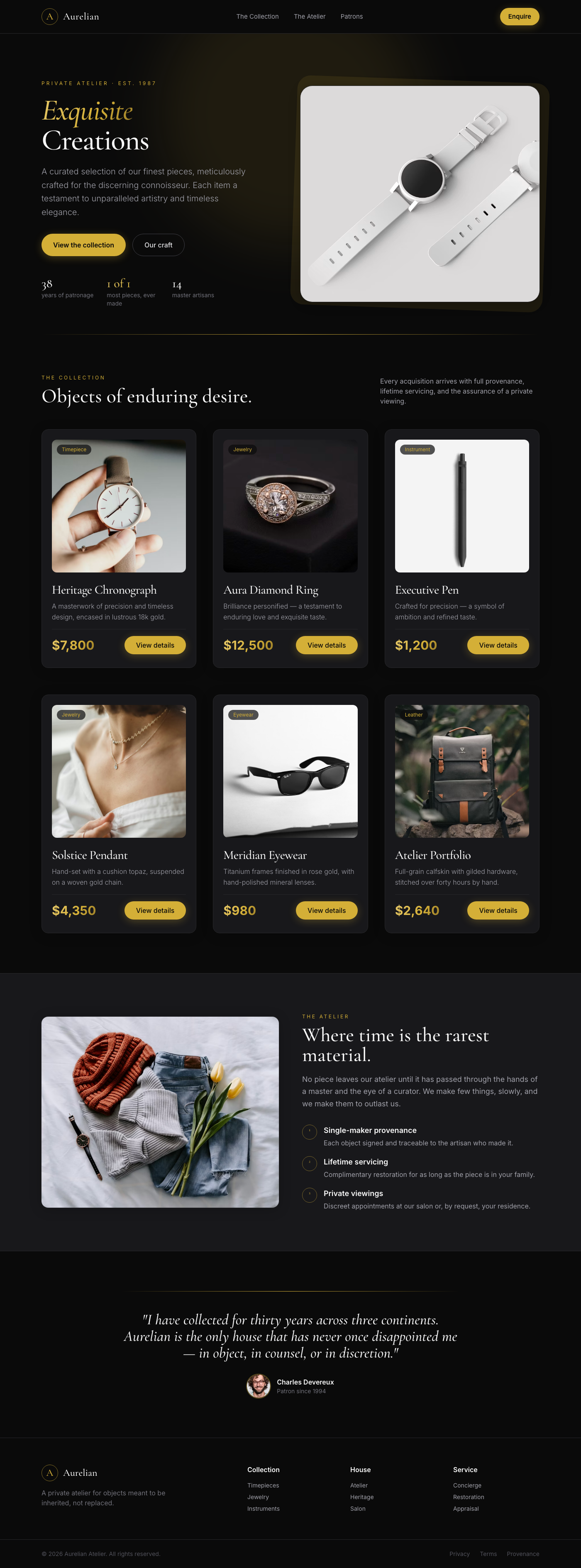
Aurelian Collection Showcase
The Aurelian Collection Showcase is a meticulously crafted UI component designed to present luxury products with unparalleled elegance. It features a responsive grid layout displaying individual product cards, each designed to highlight an item's prestige. The dark theme, accented with rich gold, provides a sophisticated backdrop. Each card includes a dominant product image, a concise title, a descriptive blurb, and a gold-highlighted price, all brought to life with smooth hover effects that add a layer of interactivity and premium feel. Ideal for high-end e-commerce, portfolio showcases, or digital luxury catalogs.