Modern Swiss Notification Center List
This component provides a clean, hierarchical notification list, embodying the principles of Modern Swiss Typographic design with its emphasis on clarity and function. For security, always sanitize notification content,…
Design Narrative
Full Context
This component provides a clean, hierarchical notification list, embodying the principles of Modern Swiss Typographic design with its emphasis on clarity and function. For security, always sanitize notification content, especially if user-generated, to prevent XSS vulnerabilities, and be cautious about displaying sensitive personal information.
From a UX standpoint, notifications are clearly differentiated by read status and time, offering quick readability and a 'Mark all as read' action for efficient management. This design prioritizes information hierarchy and user control, ensuring a smooth and unobtrusive experience for managing alerts and updates.
Related context
Related Playbooks & Collections
Jump between the strategy playbook and the curated collection connected to this design.
Playbooks
UI Optimization for Core Web Vitals
How to bake performance guardrails into design system tokens.
Read PlaybookSaaS Landing Page UX Strategy
Deploy Stripe, Linear, and Vercel–backed messaging stacks, social proof layouts, and multi-variant heroes in a single sprint.
Read PlaybookCollections
Design System Libraries
Design system pages that document tokens, components, and usage guidelines with clarity.
View CollectionDeveloper Docs Layouts
Documentation patterns that balance quick starts, reference depth, and copy-paste blocks for developer audiences.
View CollectionGallery slider
More Components concepts
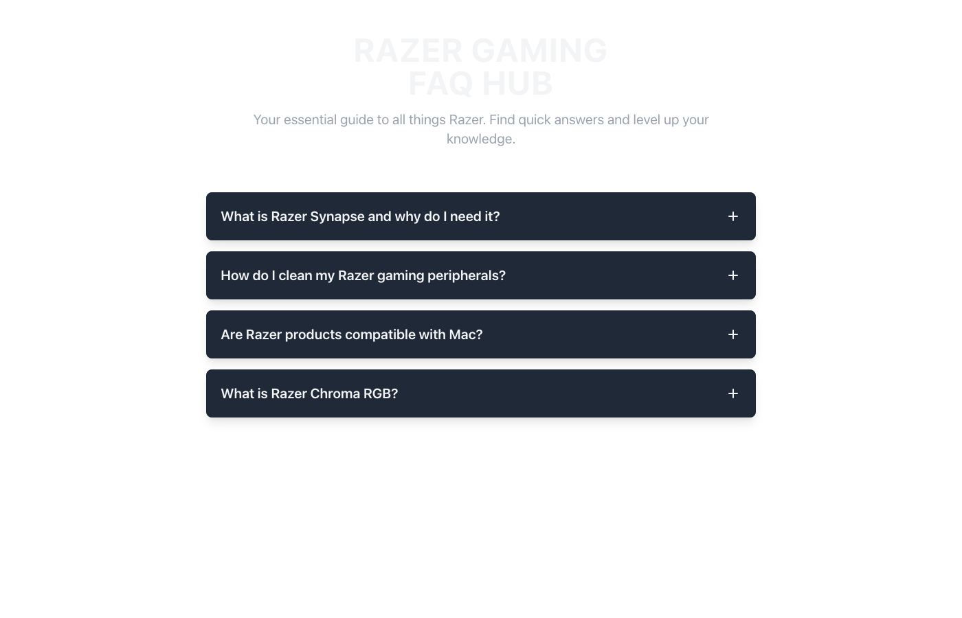
Razer FAQ UI Accordion
A cutting-edge accordion FAQ UI, meticulously designed with a high-contrast Razer Green & Black palette. Visual hierarchy is achieved through distinct panel backgrounds and vibrant green accents, guiding the user's eye. Dark backgrounds promote focus, while neon green highlights crucial interactive elements. This mobile-first design ensures a responsive, immersive, and accessible experience, embodying a sleek gaming aesthetic for optimal UX.
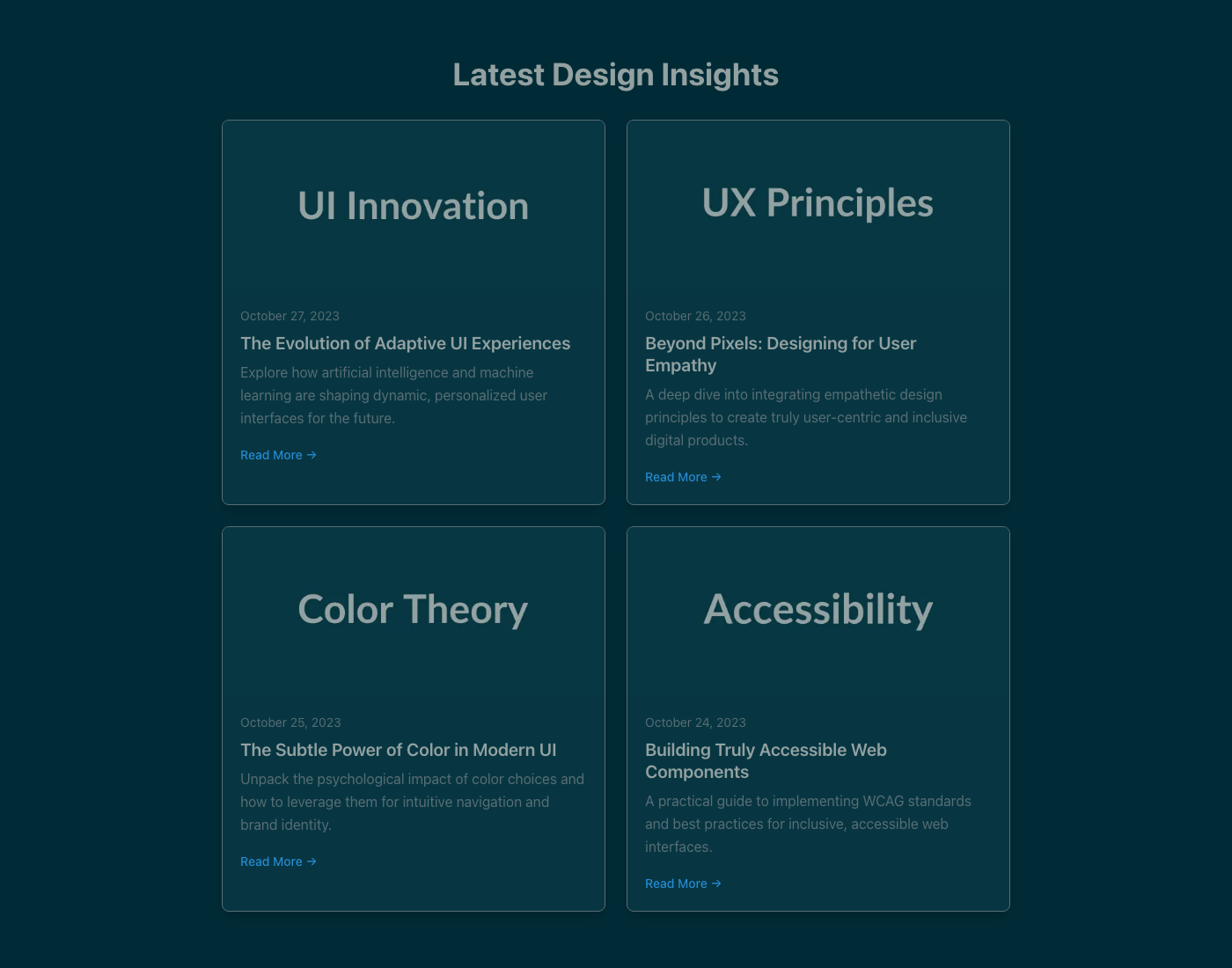
Modern Article Feed UI Component
A sleek, minimalist article feed designed for optimal eye comfort using the Solarized Eye-care Dark theme. High-contrast typography and intuitive visual hierarchy guide users through content, ensuring readability and a calm browsing experience. Focuses on accessibility and responsiveness for a production-ready UI.
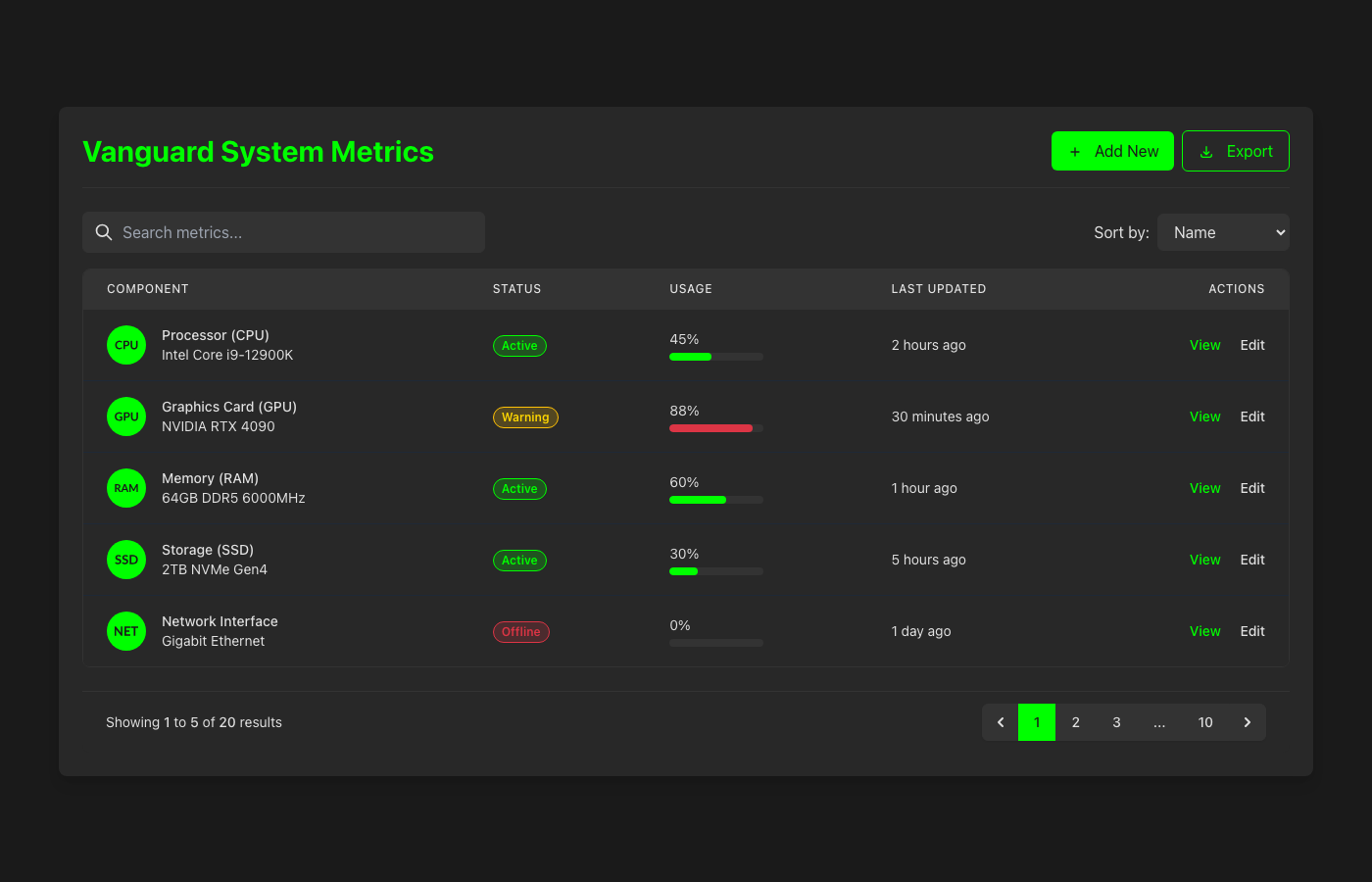
Vanguard Performance UI Table
A high-contrast, performance-driven data table UI component featuring a striking Razer Green & Black aesthetic. Designed for optimal visual hierarchy and immediate data comprehension, its dark theme reduces eye strain, while vibrant green accents guide user attention. This mobile-first, responsive design ensures a superior UX across all devices, maintaining a professional yet edgy visual style. Status indicators utilize functional, non-theme specific colors for clarity.
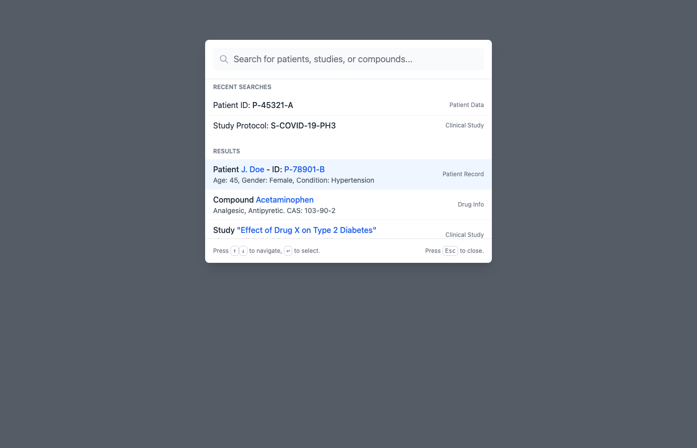
Clinical Quick Search Command Palette
This component provides a 'Command Palette' quick search interface, designed for efficient navigation and data retrieval within clinical and scientific applications. Its 'Clinical Scientific Clean' art direction emphasizes clarity, precision, and readability, leveraging a minimalist aesthetic with subtle accents to guide user attention. For security, ensure all search inputs are rigorously validated and sanitized on both client and server sides to prevent injection attacks, and results should adhere strictly to user access privileges. From a UX perspective, implement robust keyboard navigation, provide instant search feedback (including loading and no-results states), and ensure the design is fully responsive for seamless operation across various devices.
Floating Interactive Cards
This 'Floating Interactive Cards' component presents dynamic content in an engaging, three-dimensional layout, embodying the serene yet crisp aesthetic of the 'Nordic Arctic Clean' art direction. For optimal user experience, ensure card interactions provide clear visual feedback on hover and focus states, maintaining accessibility for keyboard and screen reader users through proper ARIA attributes and focus management. From a security perspective, all data rendered within these cards, especially if user-generated or fetched from an API, must be thoroughly sanitized and escaped to prevent XSS vulnerabilities and protect against data tampering. This production-ready implementation combines elegant visual design with robust functionality, offering a highly responsive and secure user interface element.
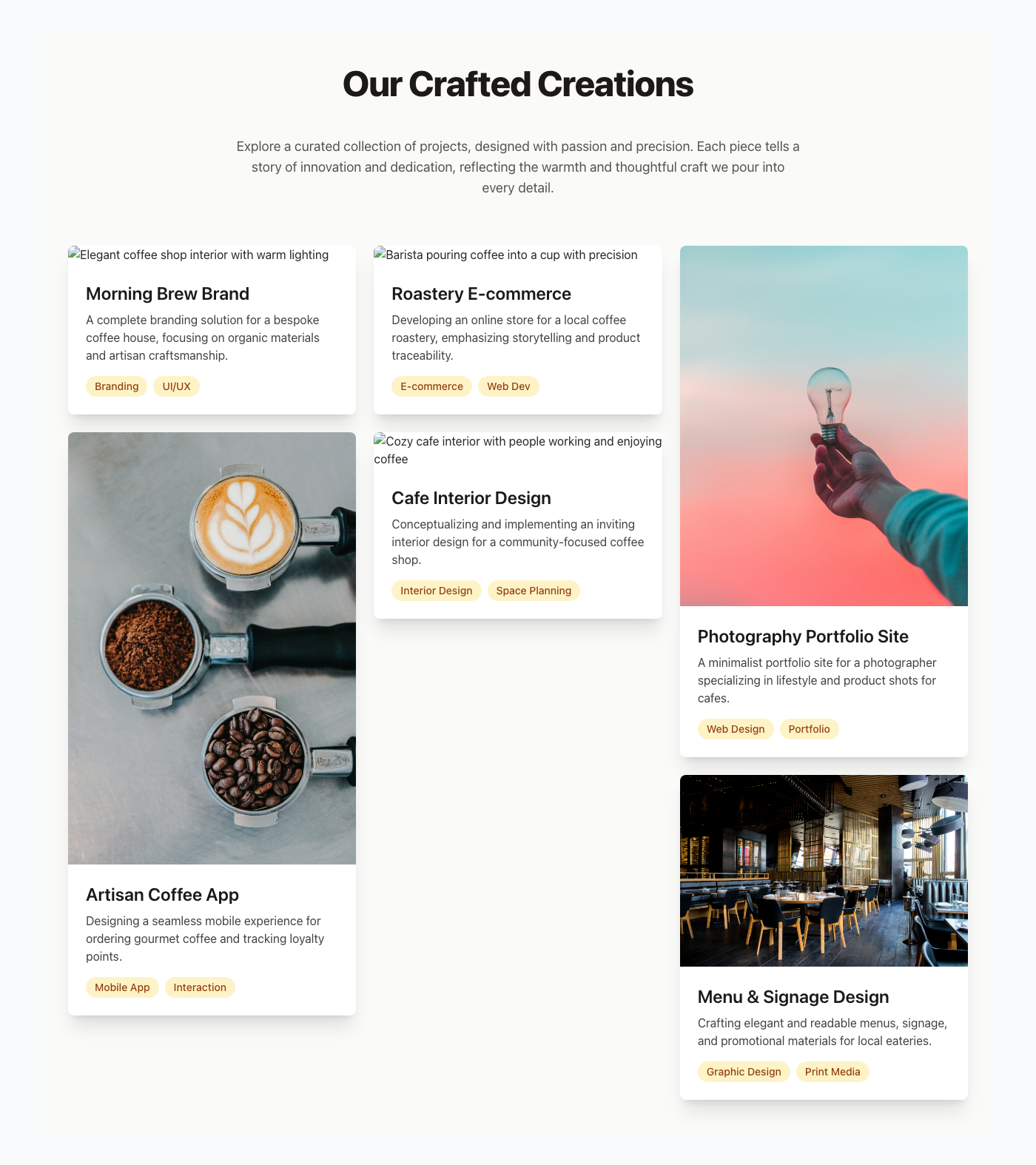
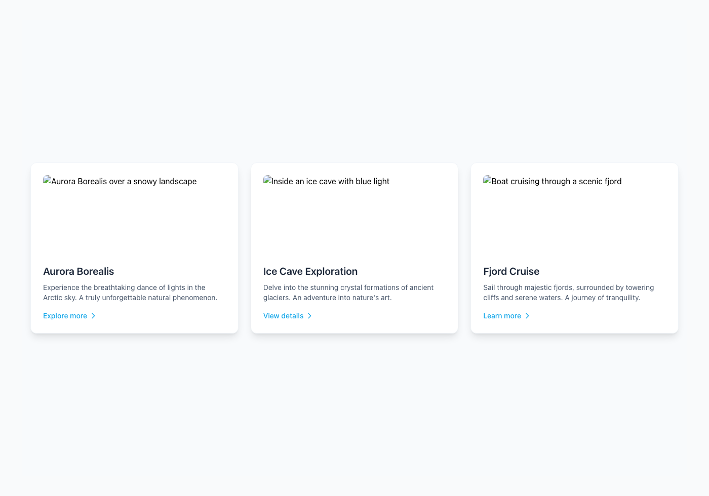
Project Portfolio Masonry
This Project Portfolio Masonry layout component provides an aesthetically pleasing and highly responsive display for various creative works, drawing inspiration from the comforting and inviting ambiance of a cozy coffee shop. To enhance user experience, ensure all images are optimized for web, implement `alt` text for accessibility, and consider subtle hover animations for interactive feedback without visual clutter. For security, rigorously sanitize any dynamic content displayed within project titles or descriptions to prevent XSS vulnerabilities, and always serve images from a trusted Content Delivery Network (CDN) with proper security configurations. This production-ready component is designed to beautifully showcase your projects, engaging visitors with a warm, professional, and easily navigable visual narrative.
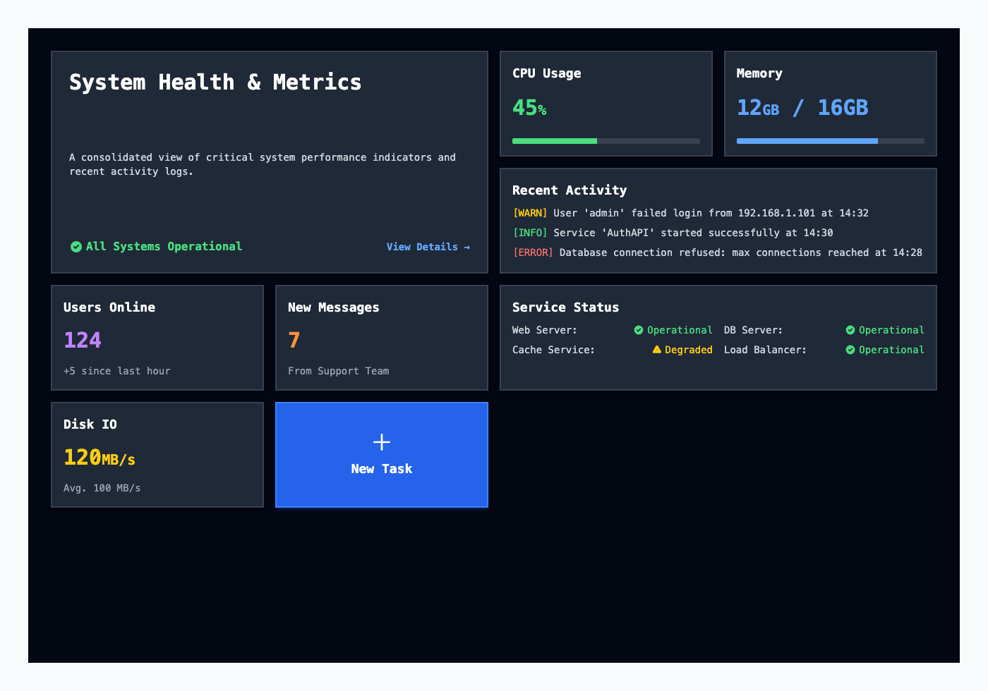
Neo-Brutalist High-Contrast Bento Dashboard
This high-contrast Bento Grid dashboard leverages a stark, functional design for immediate data comprehension, embodying the Neo-Brutalism aesthetic with sharp borders and distinct color blocks. Ensuring all interactive elements, like buttons and links, have clear focus states and sufficient color contrast (WCAG 2.1 AA+) is paramount for accessibility and user experience, guiding users through complex data efficiently. To bolster security, implement strict Content Security Policy (CSP) headers to prevent XSS attacks and sanitize all dynamic data rendered within these tiles, especially for elements like activity logs or user-generated content. Regularly audit dependencies for vulnerabilities and ensure data displayed aligns with the user's authorization level, employing robust server-side validation.
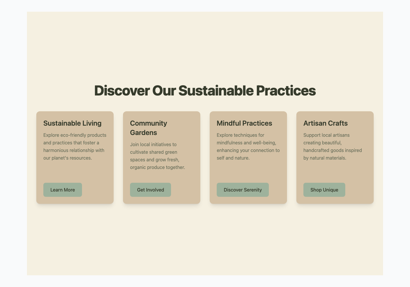
Floating Interactive Cards with Organic Earth Tones
This component showcases a series of 'Floating Interactive Cards', designed to present information clearly with a subtle, engaging presence on the page. The visual aesthetic adheres to 'Organic Earth Tones', utilizing a palette of natural greens, muted beiges, and soft creams to evoke a sense of calm and natural harmony. For optimal user experience, ensure cards are keyboard navigable and provide clear visual feedback on hover and focus states, enhancing discoverability and accessibility. When integrating interactive elements within such cards, always validate and sanitize all user inputs on the server-side to prevent common vulnerabilities like XSS or injection attacks, maintaining robust security.