Aura: Frosted Glass Landing Page Hero
The Aura component presents a luxurious and high-performance landing page experience. It's built around the 'Layered Overlay Components' concept, where key information and calls-to-action are presented on 'Glassmorphism…
Design Narrative
Full Context
The Aura component presents a luxurious and high-performance landing page experience. It's built around the 'Layered Overlay Components' concept, where key information and calls-to-action are presented on 'Glassmorphism Frosted' cards that appear to float above a dynamic, subtly textured background.
The hero section immediately establishes a premium brand image, while the feature cards provide digestible information, all tied together with sophisticated typography, refined colors, and delightful interactive elements. This component is designed for brands that want to convey innovation, elegance, and reliability, delivering a 'wow' factor that captivates visitors.
Related context
Related Playbooks & Collections
Jump between the strategy playbook and the curated collection connected to this design.
Playbooks
UX Psychology in Modern Interfaces
Translating behavioral economics triggers into UI copy and micro-interactions.
Read PlaybookSaaS Landing Page UX Strategy
Deploy Stripe, Linear, and Vercel–backed messaging stacks, social proof layouts, and multi-variant heroes in a single sprint.
Read PlaybookCollections
Waitlist & Early Access Pages
Early access landing pages that balance exclusivity, value clarity, and short signup forms.
View CollectionOnboarding & Activation Flows
Activation-focused onboarding patterns that guide users to value moments quickly without overloading them.
View CollectionGallery slider
More Landing Page concepts
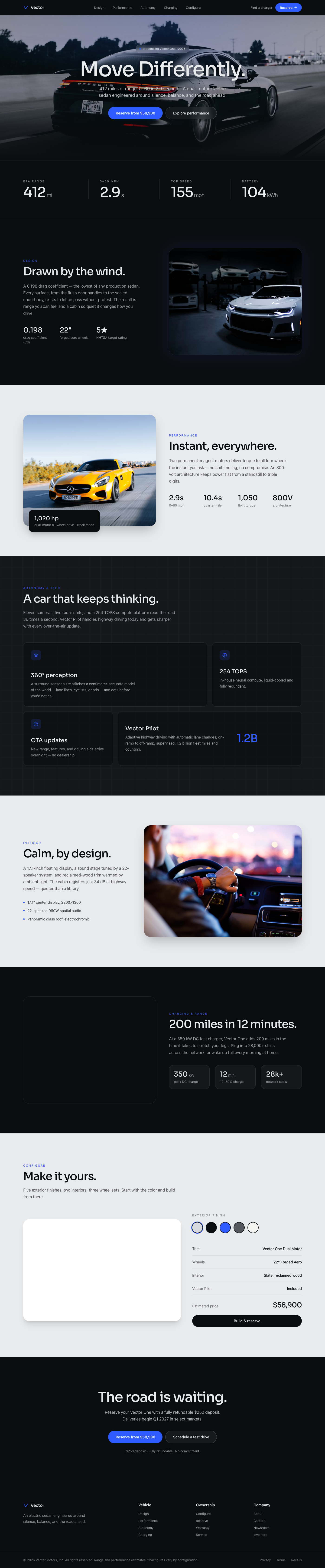
Vector EV — Move Differently
An Apple-clean automotive landing for an electric vehicle. Cinematic full-bleed car photography, oversized minimal headlines, a range/performance spec reveal, a color/trim configurator feel, and serene whitespace — automotive site at Apple polish.
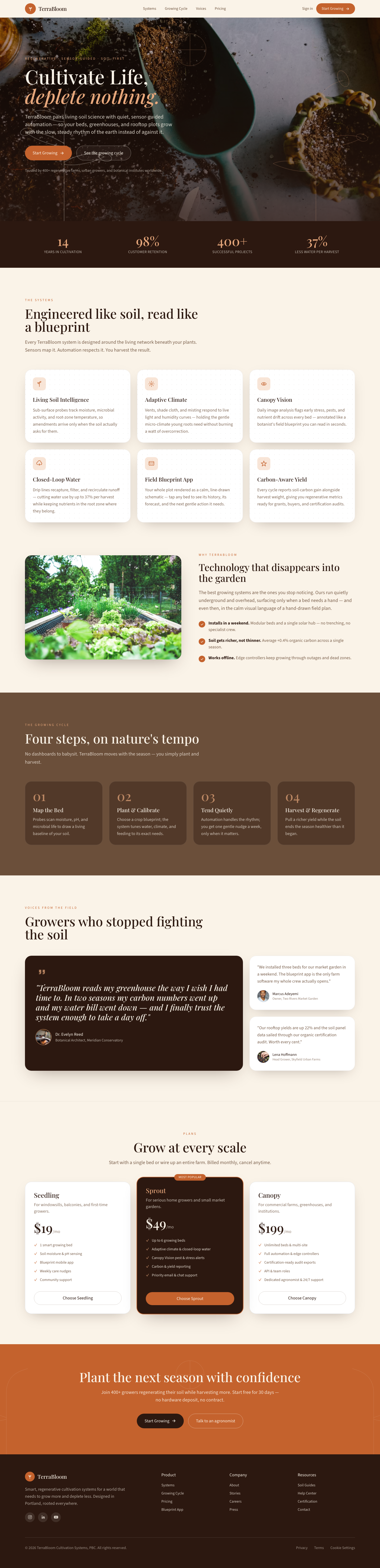
TerraBloom Cultivation Systems
Evoke the grounding sense of ancient, sun-drenched earth and the slow, steady rhythm of natural growth. The unforgettable visual choice is the integration of hand-drawn botanical line art overlaid subtly on photography, giving a blueprint feel.
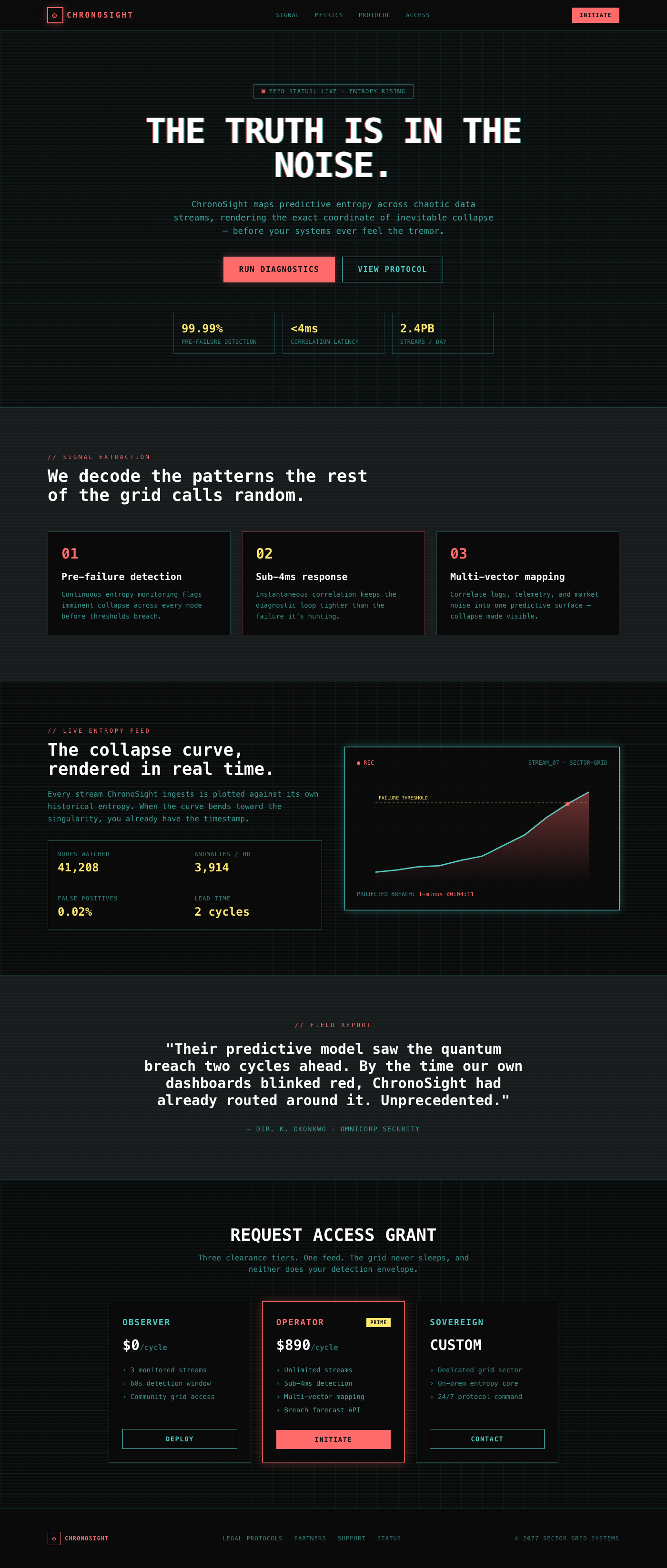
ChronoSight Data Stream Weaver
The feeling of peering into a forbidden, ultra-high-fidelity feed from a broken, beautiful future. This design achieves its arresting quality through aggressive, deliberate visual glitches and persistent, almost tactile scanline interference.
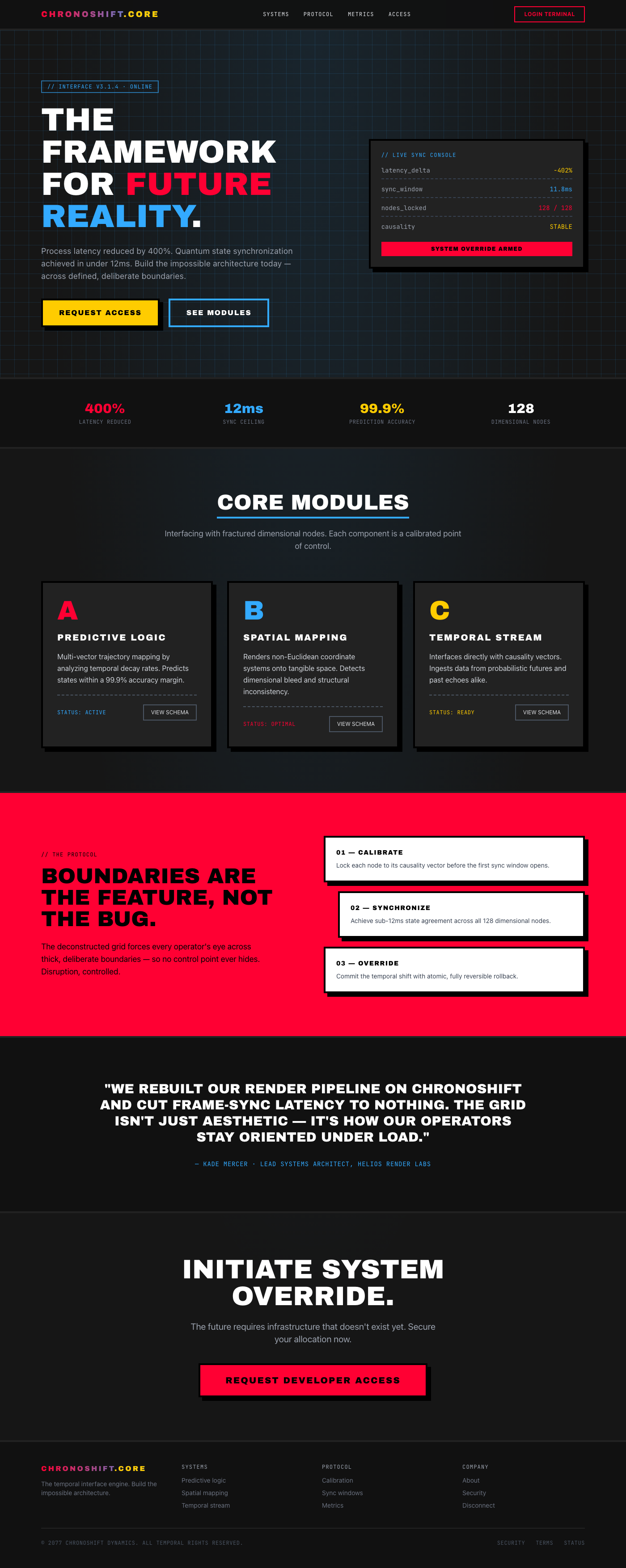
ChronoShift: Temporal Interface Engine
The feeling is one of powerful, controlled disruption—like looking through a glitch in reality. The visual hook is an aggressive, deconstructed grid system that forces the user's eye across defined, thick boundaries.
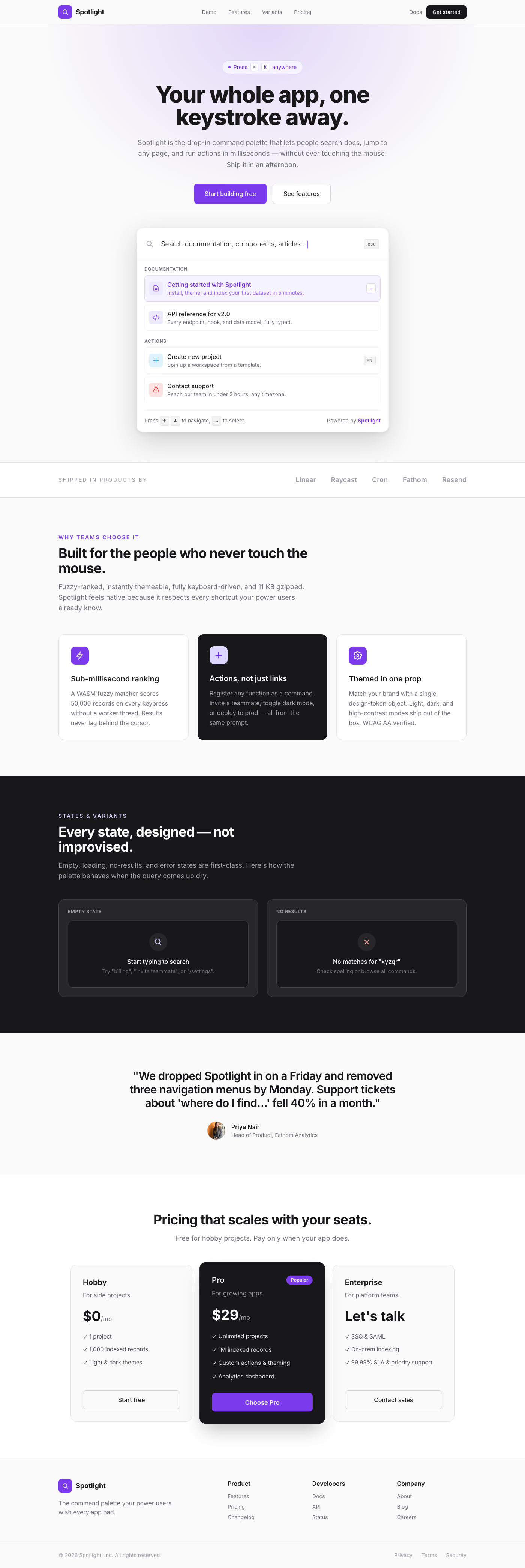
Premium Command Palette Quick Search
A luxurious, Vercel-inspired command palette designed for quick, efficient navigation and search. This component transforms a simple search bar into a powerful, interactive tool, perfect for elevating any landing page or web application. Its minimalist aesthetic, combined with thoughtful design elements like subtle shadows, generous spacing, and sophisticated typography, delivers an unparalleled user experience that feels both powerful and effortlessly elegant. Users can quickly find relevant information, navigate to specific sections, or access core features without leaving their current context.
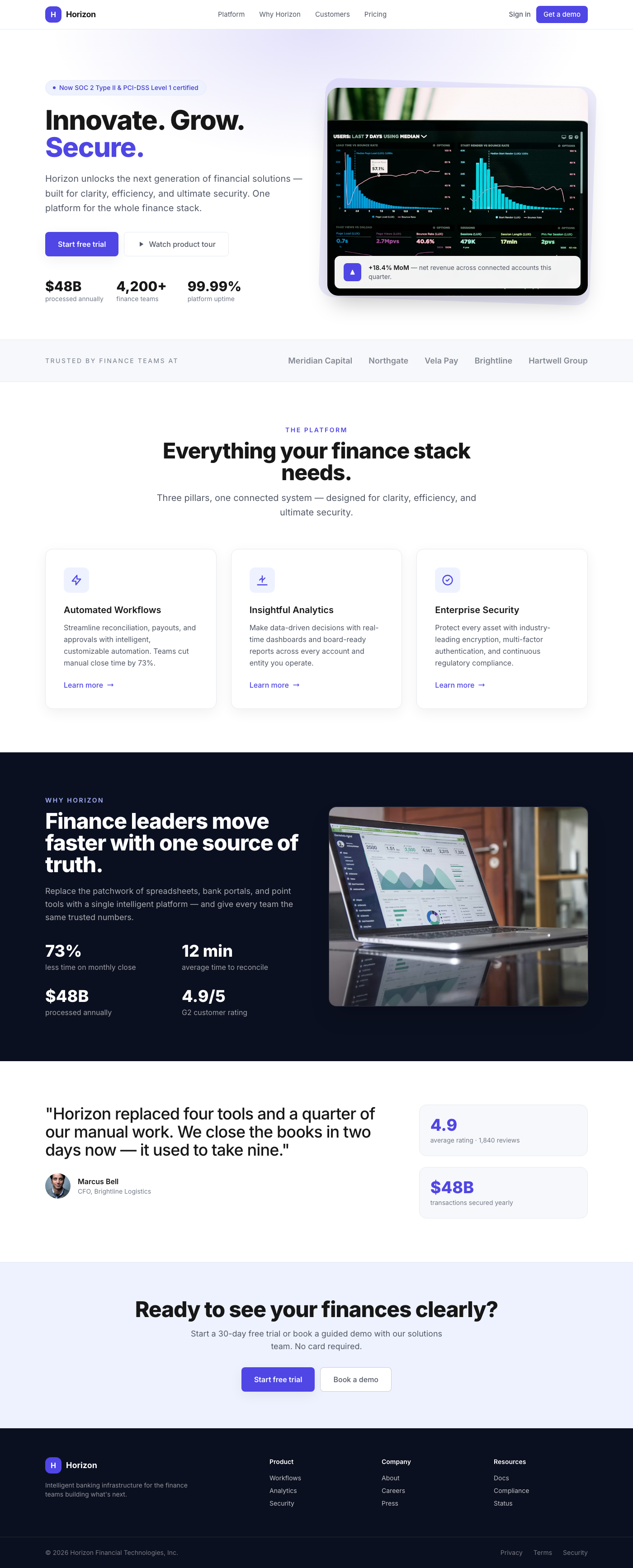
Fintech Horizon: Intelligent Growth Cards
This component presents a collection of interactive feature cards, ideal for a 'Why Choose Us' or 'Our Services' section on a landing page. Each card is designed to be a focal point, drawing attention with its clean layout, professional iconography, and satisfying hover effects. The overall impression is one of high quality, reliability, and modern elegance, perfectly suited for a fintech or upscale corporate website.
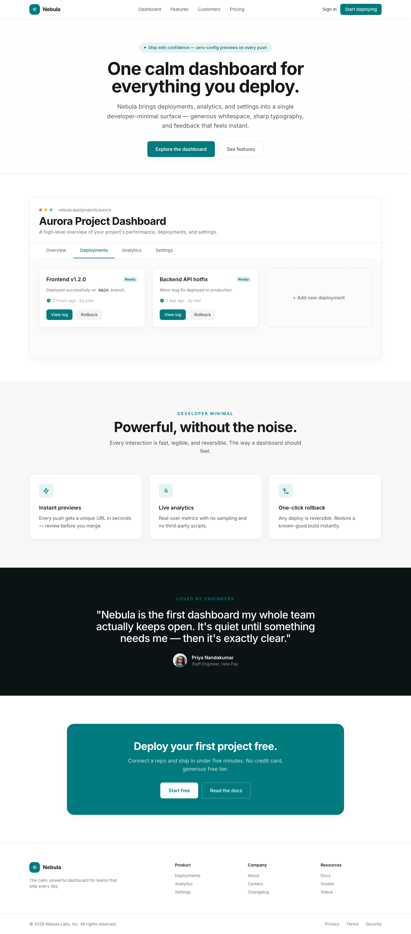
Nebula Dashboard: Tabbed Interface
The Nebula Dashboard offers a highly refined and functional tabbed interface for managing projects and viewing key data. Designed with a 'developer minimal' philosophy, it leverages generous whitespace, sophisticated typography, and subtle visual depth to create an experience that is both powerful and visually stunning. Interactive elements provide smooth, delightful feedback, ensuring a premium user journey comparable to leading platforms like Vercel.
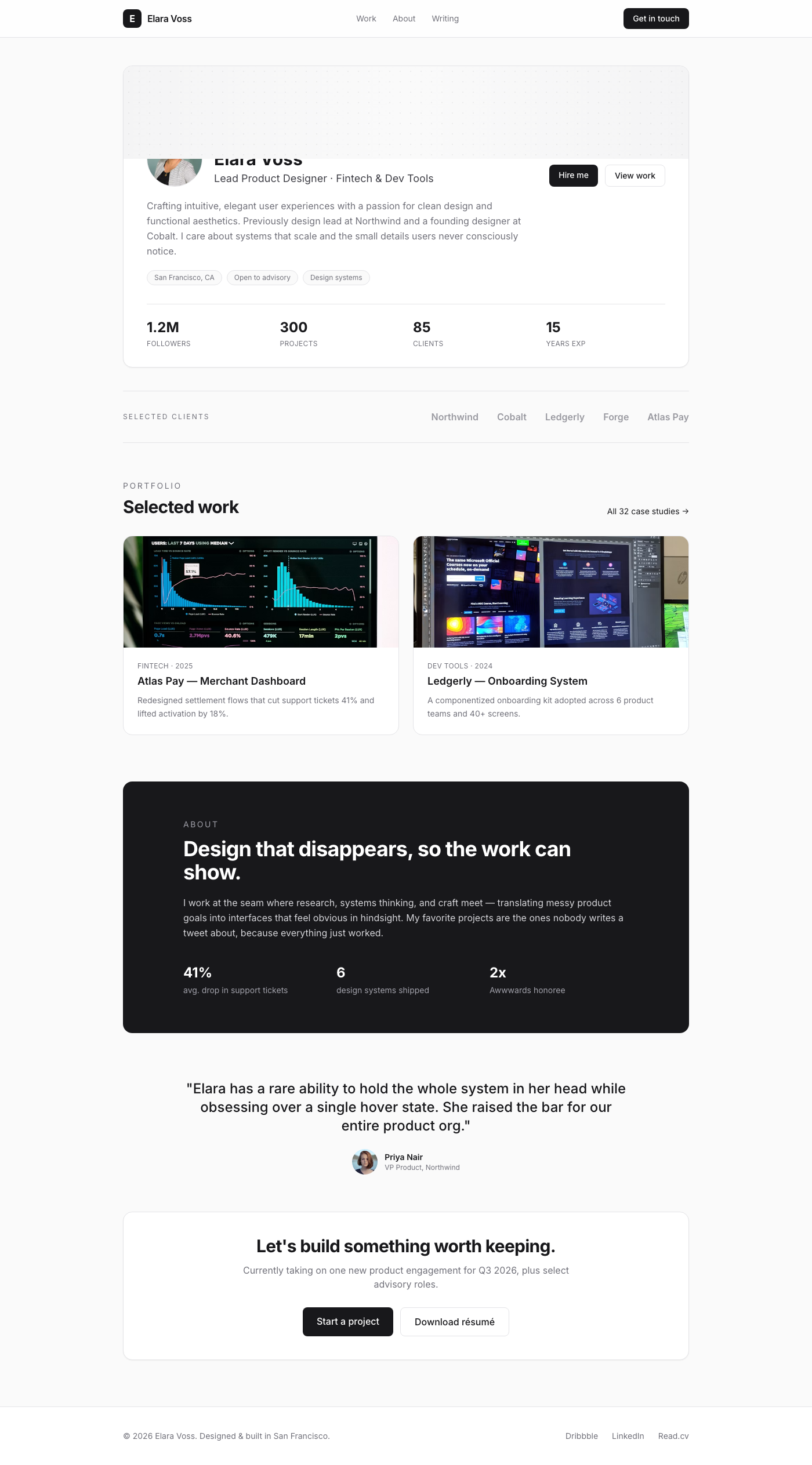
Notion Profile Header with Stats
This UI component delivers a sleek and highly readable profile header, ideal for showcasing individuals on landing pages, about sections, or internal team directories. It features a circular profile image, a bold name, a descriptive title, and a concise bio. Below the main profile, a clean, bordered section displays up to four crucial statistics, each with a bold value and an uppercase label. The design prioritizes content and typography, leveraging ample white space and a neutral color palette to create an experience reminiscent of Notion's clean user interface.