Opulent Aura Hero
The 'Opulent Aura Hero' is a masterclass in luxurious digital design. It leverages a dramatic 'Deep Black' backdrop as a canvas, allowing the 'Luxury Gold' accents and crisp white typography to truly shine.
Design Narrative
Full Context
The 'Opulent Aura Hero' is a masterclass in luxurious digital design. It leverages a dramatic 'Deep Black' backdrop as a canvas, allowing the 'Luxury Gold' accents and crisp white typography to truly shine.
The design prioritizes spaciousness, using extensive padding and strategic centering to ensure the core message is delivered with maximum impact and clarity. Subtle background patterns and soft shadows add a layer of sophisticated depth, preventing a flat aesthetic, while interactive elements respond with smooth, premium animations.
This component is engineered to make a powerful first impression, inviting users into an experience of unparalleled quality and refinement.
Related context
Related Playbooks & Collections
Jump between the strategy playbook and the curated collection connected to this design.
Playbooks
SaaS Landing Page UX Strategy
Deploy Stripe, Linear, and Vercel–backed messaging stacks, social proof layouts, and multi-variant heroes in a single sprint.
Read PlaybookGallery slider
More Component concepts
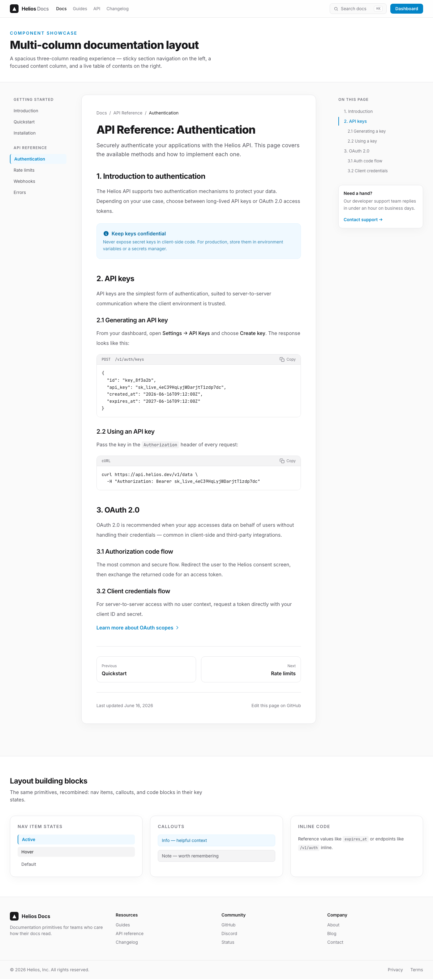
Vercel-Style Multi-column Technical Documentation Layout
This UI component delivers a premium, multi-column layout for technical documentation. It combines the aesthetic principles of Vercel — minimalism, clarity, and exceptional user experience — with the practical needs of presenting complex information. The design emphasizes a spacious, uncluttered presentation, sophisticated typography, and elegant visual depth to create a highly engaging and readable documentation experience for developers.
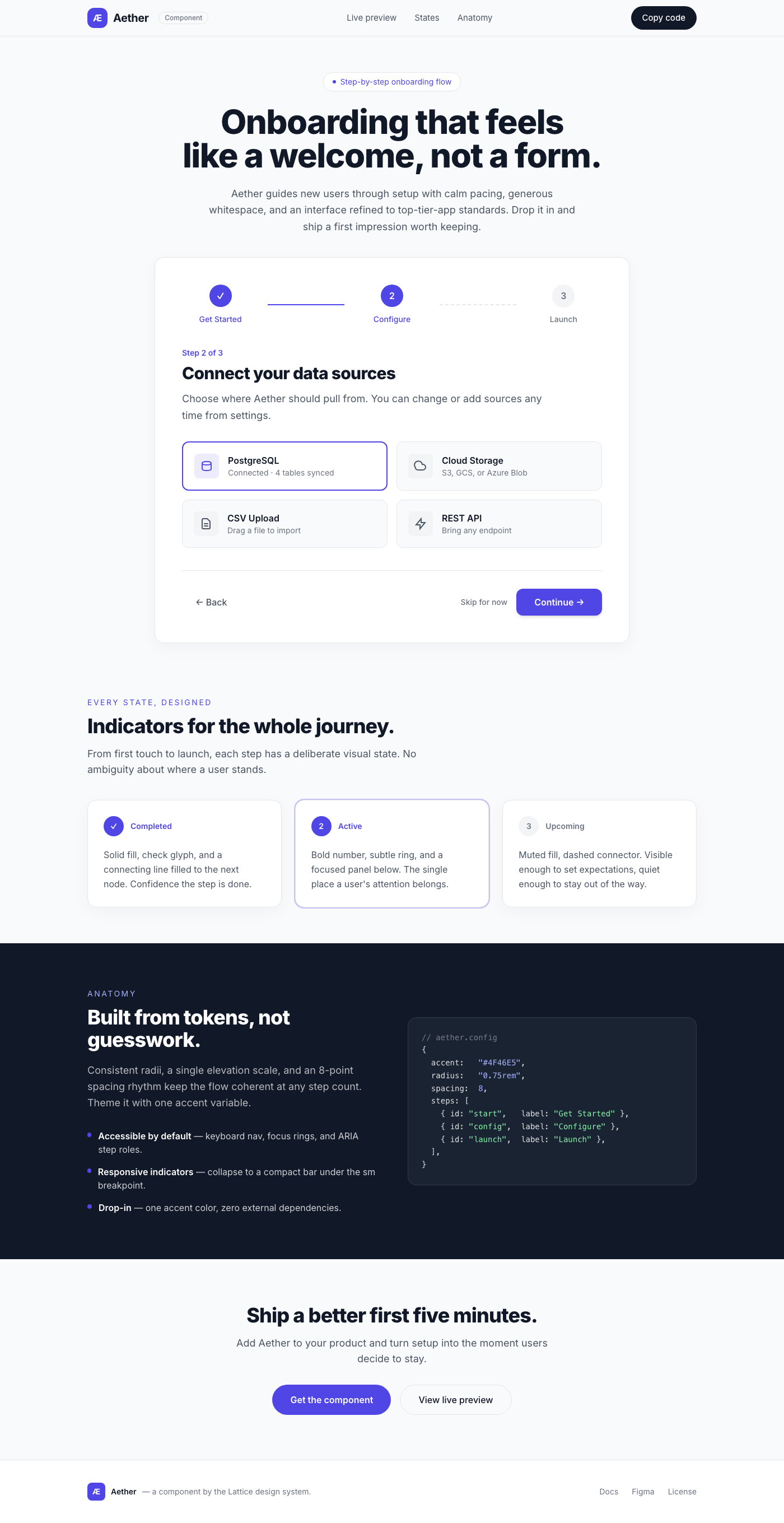
Aether Onboarding Flow
A 'Step-by-step Onboarding Flow' component designed for a premium user experience. This component guides users through multiple stages of setup with a clean, minimalist aesthetic, emphasizing clarity and ease of use. It features a spacious layout, elegant typography, subtle shadows, and smooth hover effects, delivering a luxurious and highly polished interface comparable to top-tier applications.
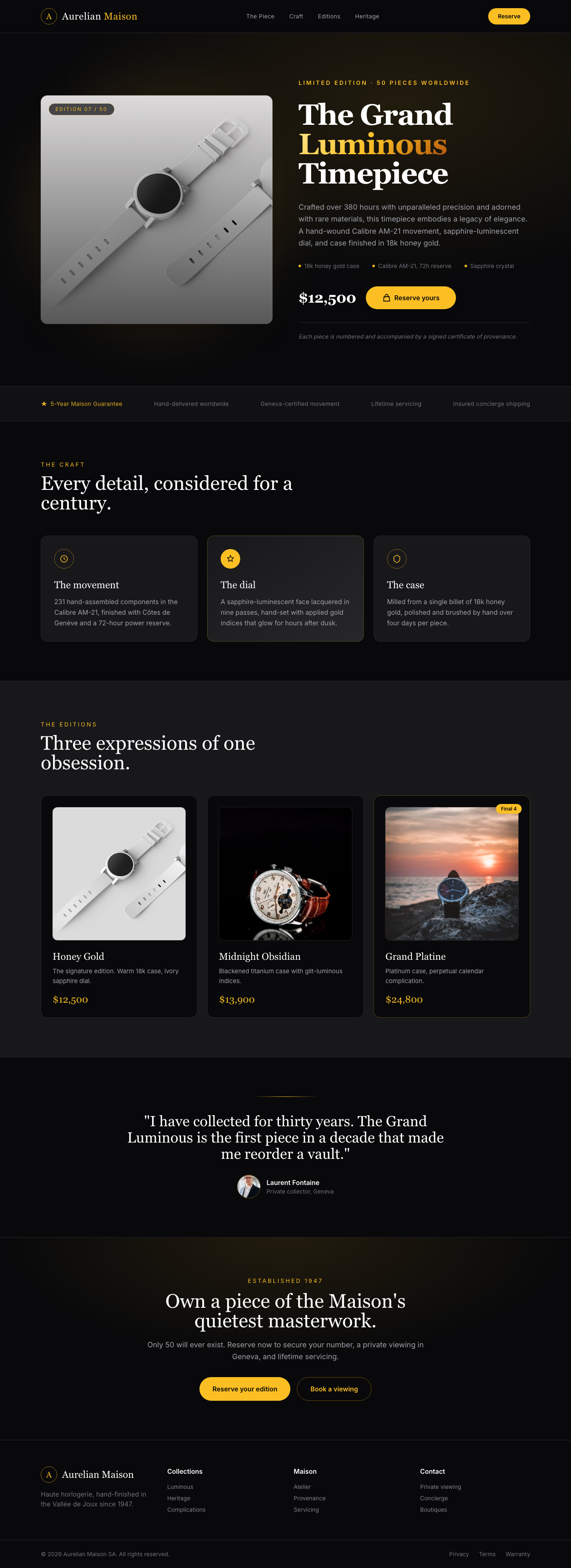
Grand Luminous Timepiece - Luxury Product Showcase
A breathtaking e-commerce product showcase component designed for singular, high-value items. It leverages a deep black background, opulent gold accents, and sophisticated typography to create an exclusive, luxurious presentation. Generous whitespace and subtle depth effects enhance the product's perceived value, making it an ideal choice for premium brands.
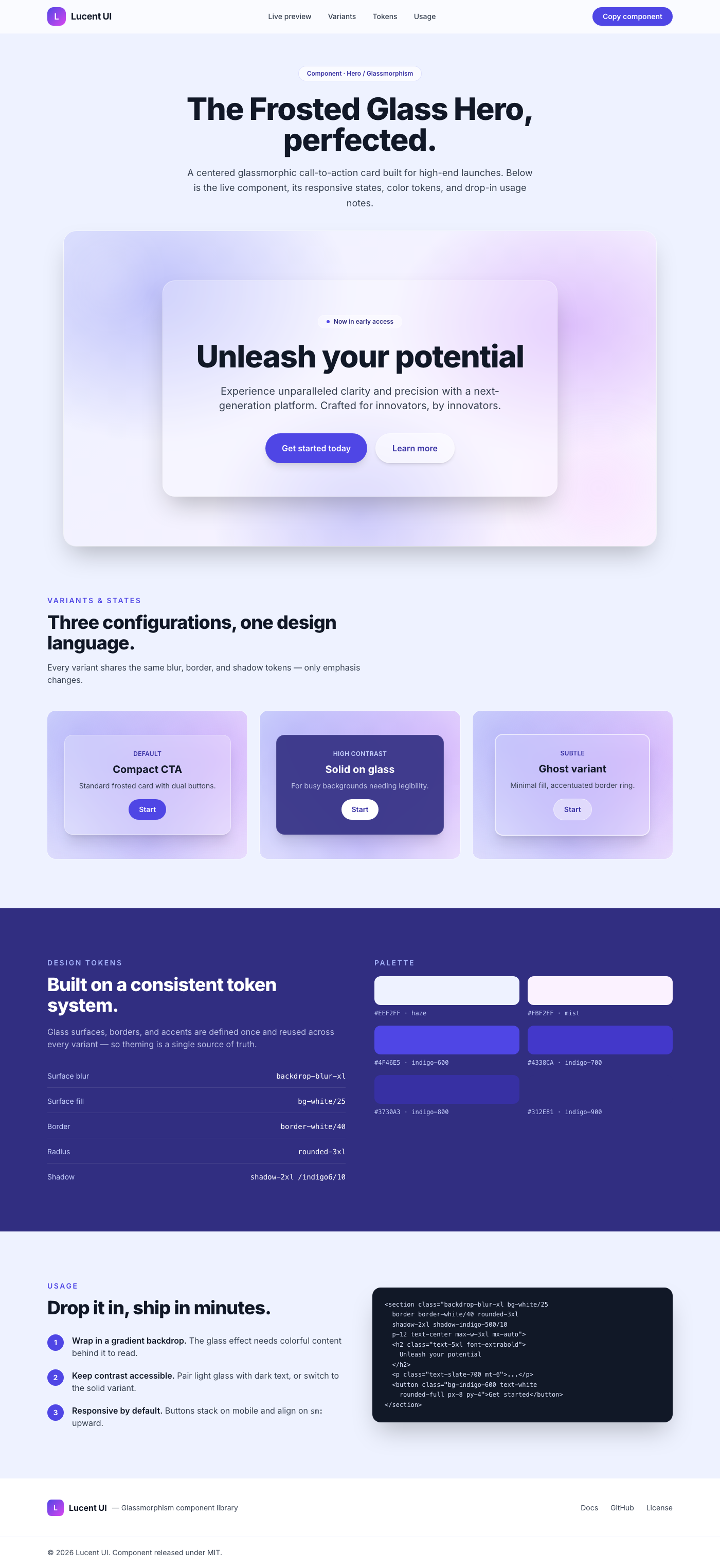
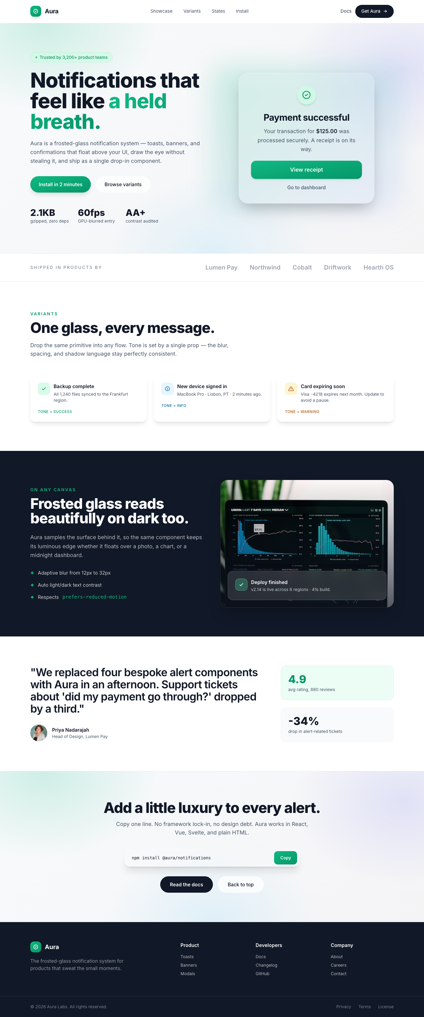
Frosted Glass Hero with Centered Call-to-Action
A truly premium hero section designed to captivate and convert. This layout features a stunning frosted glass card centrally positioned, showcasing a compelling headline, supportive sub-text, and clear calls-to-action. Ideal for high-end product launches, service offerings, or any web presence aiming for an elite and memorable first impression.
Aura Notification: Frosted Glass Overlay
Unveil the future of UI notifications with Aura. This exquisitely designed component transforms ordinary alerts into moments of pure visual delight. Crafted with the discerning user in mind, Aura employs a sophisticated frosted glass effect that gracefully floats above your content, drawing attention without distraction. Its generous whitespace, meticulously selected typography, and subtle, multi-layered shadows converge to create an experience that is both breathtakingly polished and effortlessly intuitive. Every interaction is a gentle whisper of luxury, from the soft glow of its surface to the silky smooth transitions on hover. Elevate your application's aesthetic to an unparalleled standard, making every interaction feel like a premium event. Aura isn't just a component; it's a statement.
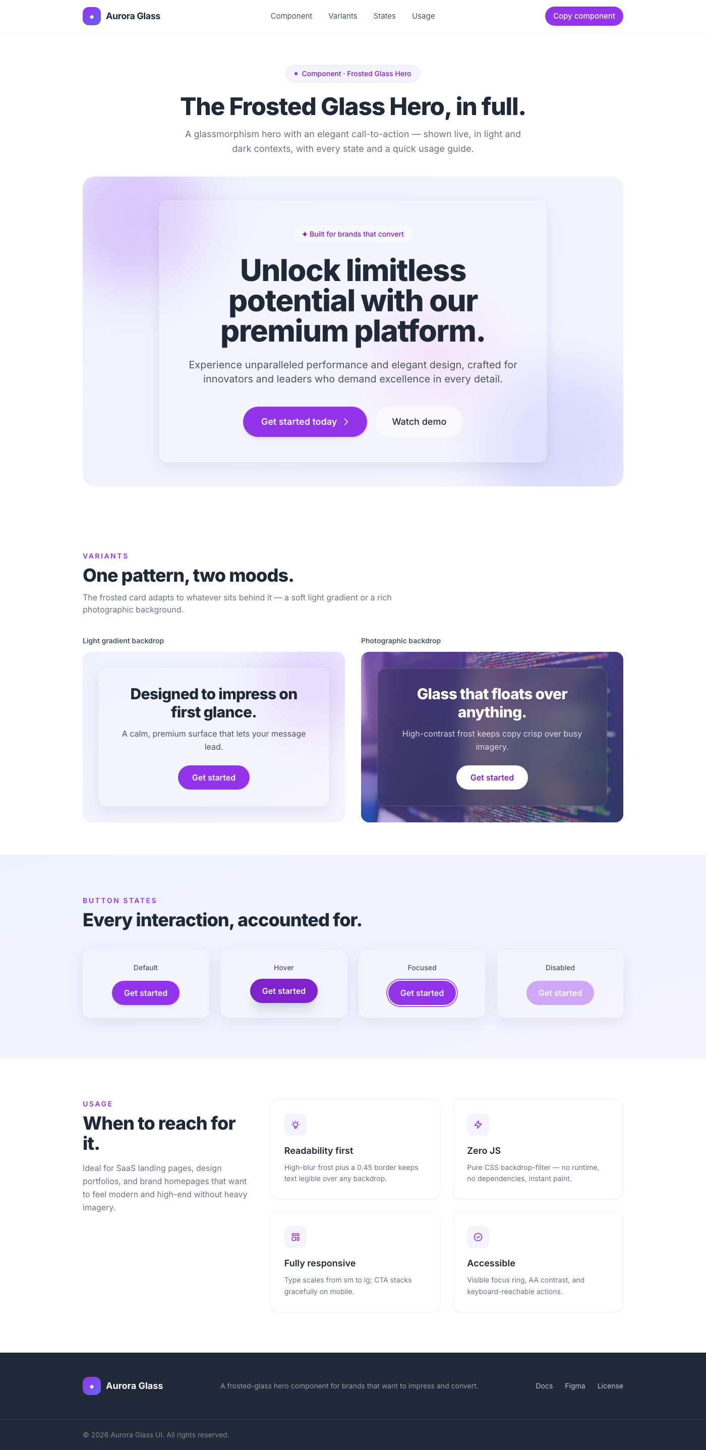
Frosted Glass Hero with Elegant Call-to-Action
This component is a premium hero section designed for websites aiming for a sophisticated, modern, and high-end aesthetic. It features a stunning glassmorphism-inspired frosted card that elegantly presents a key message and a central call-to-action. The design prioritizes readability, visual depth, and a luxurious user experience through careful attention to typography, spacing, subtle shadows, and interactive polish. Ideal for SaaS platforms, portfolios, or brand homepages that seek to impress and convert with a touch of modern elegance.
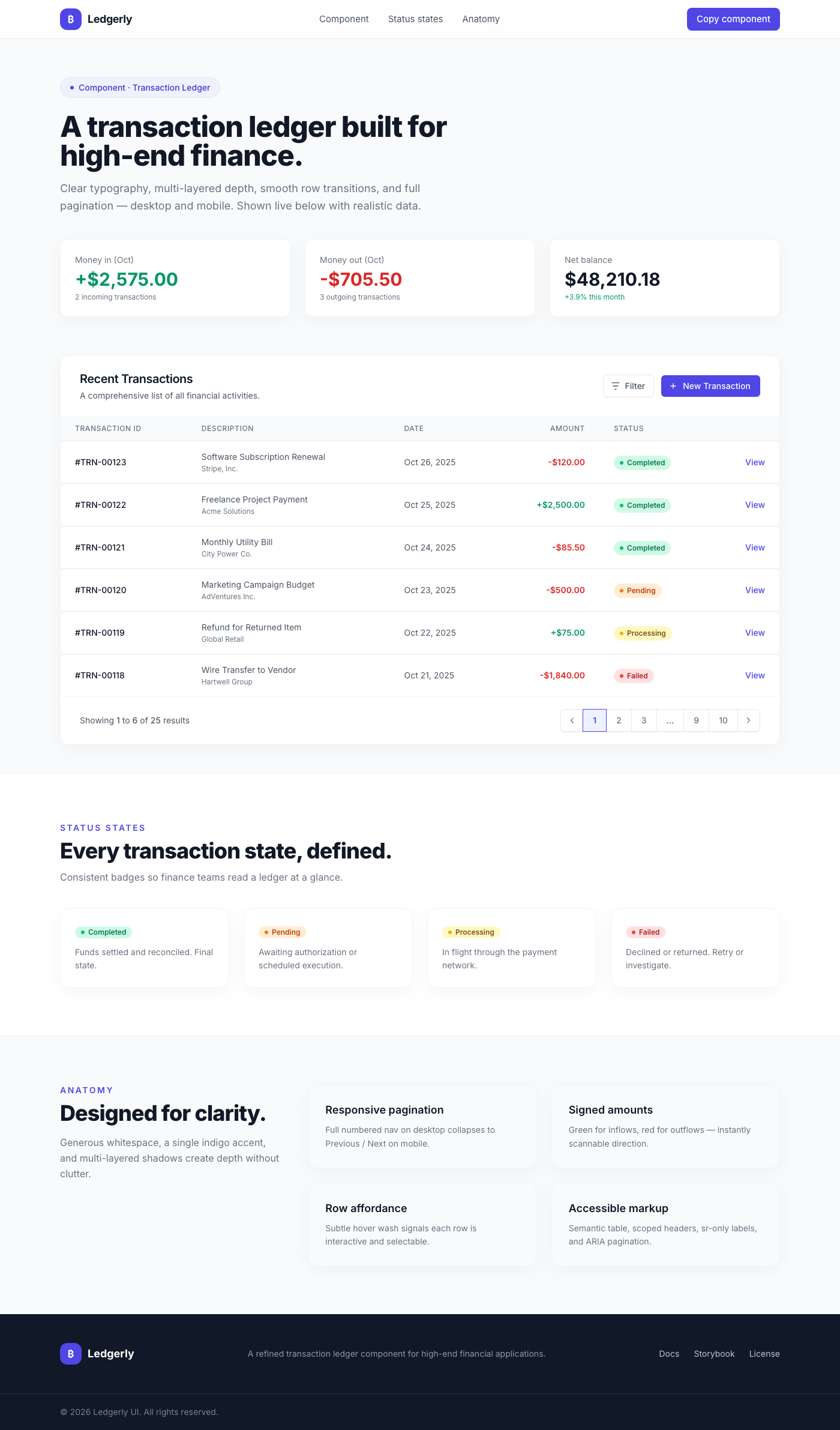
Fintech Transaction Ledger
The Fintech Transaction Ledger is a highly polished and functional UI component designed to present financial data with utmost clarity and elegance. It features a responsive table structure capable of displaying a variety of transaction details, including IDs, descriptions, dates, amounts, and statuses. The component integrates intuitive pagination for navigating large datasets, complete with both detailed desktop and simplified mobile controls. Its aesthetic is characterized by generous use of whitespace, sophisticated typography (Inter font family), and subtle, multi-layered shadows and borders that create a sense of depth and quality. Interactive elements like buttons and table rows include smooth hover transitions, providing a premium and engaging user experience. The color palette is modern and clean, utilizing a range of grays with a refined indigo accent to highlight key actions and states, making it ideal for high-end financial applications.